Code Monkey home page Code Monkey logo

easyblocks's Introduction

Easyblocks

The React toolkit for building completely customised visual page builders.

It's focused on simplicity for end-users (no HTML/CSS) and flexibilty for developers (built as a framework).

Live demo: https://easyblocks-demo.vercel.app/
Docs: https://docs.easyblocks.io/

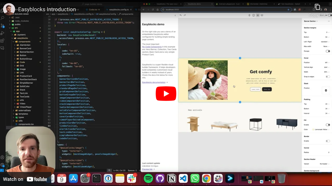
Easyblocks explained in under 10 mins:

Screenshot-2024-02-12-at-15-08-51.png

Main features

  • Embeddable: Easyblocks editor is designed to be embeddedable into other products
  • Out-of-the-box visual building logic: drag&drop, nested selections, inline rich text, multi-selection, styling fields (responsive), design tokens, history management, localisation, templates, dynamic data
  • Simple for end-users. Not based on HTML/CSS but on No-Code Components.
  • Bring your own components and templates. Easyblocks is built as a framework.You decide what components are available, their variants, styling options, simplicity levels, children components, constraints, etc.
  • Bring your own data. Connect any data source, fully control data fetching and data picker widget. The data can be dynamic.
  • Server-side rendering. Fully compatible with modern frameworks like next.js or Remix, but can also render to pure HTML/CSS. All the heavy lifting happens on the server - no browser rendering and layout shifts.

Why?

If you need a custom text editor there are so many solutions available: Slate, Lexical, TinyMCE, CKEditor, etc. But if you need a custom page builder there's a huge chance you must build one from scratch. And it’s an awfully expensive and tedious process.

The goal behind Easyblocks is to make it possible to create truly state-of-the-art visual page building experiences in weeks instead of years, without compromising flexibility.

How?

Easyblocks can handle a wide range of seemingly different visual experiences thanks to a very clear separation between what's common for all visual builders and what's custom and project-specific. The Easyblocks editor knows how to handle common visual builder logic (drag&drop, nested selections, inline rich text, responsive styling fields, etc), but at the same time doesn't know anything about project-specific things like your components, data sources or templates. Project-specific stuff can be defined with code using Easyblocks framework, which is based on a novel concept called No-Code Components.

Please go to our docs to learn more.

Authors

Easyblocks is built by the team behind Shopstory - a visual builder for headless CMSes. Easyblocks is basically an internal Shopstory engine cleaned up and open-sourced ❤️

Contact

You can leave the questions or issues here. Alternatively, contact us via:

  1. Twitter/X
  2. E-mail

High five! ✋

easyblocks's People

Contributors

maarten2424 avatar pawel-commerce-studio avatar pawelshopstory avatar r00dy avatar

Stargazers

 avatar  avatar  avatar  avatar  avatar  avatar  avatar  avatar  avatar  avatar  avatar  avatar  avatar  avatar  avatar  avatar  avatar  avatar  avatar  avatar  avatar  avatar  avatar  avatar  avatar  avatar  avatar  avatar  avatar  avatar  avatar  avatar  avatar  avatar  avatar  avatar  avatar  avatar  avatar  avatar  avatar  avatar  avatar  avatar  avatar  avatar  avatar  avatar  avatar  avatar  avatar  avatar  avatar  avatar  avatar  avatar  avatar  avatar  avatar  avatar  avatar  avatar  avatar  avatar  avatar  avatar  avatar  avatar  avatar  avatar  avatar  avatar  avatar  avatar  avatar  avatar  avatar  avatar  avatar  avatar  avatar  avatar  avatar  avatar  avatar  avatar  avatar  avatar  avatar  avatar  avatar  avatar  avatar  avatar  avatar  avatar  avatar  avatar  avatar  avatar

Watchers

 avatar  avatar  avatar  avatar

easyblocks's Issues

Feature: Tailwilnd support

I want to start a discussion on tailwind support for easyblocks. I've been working on a POC of this. The way it works is this:

Add a special prop in the styles function tw that returns classnames for no code components

const ItemWrappers = values.DummyComponentCollection.map((c: any) => {
  return `bg-[${values.backgroundColor}]`;
});

styled: {
  Root: {}, // we still include an empty styles object - but I think this should be removed
  ItemWrappers: ItemWrappers.map((i: any) => ({})),
},
props: {
  tw: {
    Root: `bg-[${values.backgroundColor}] pt-[${values.padding}]`,
    ItemWrappers, // there is support for arrays
  },
},

We still use the no code components as usual - but now they have a className property automatically applied. For example, if we defined the backgroundColor of Root to #ffffff then the component deefined like this

<Root.type {...Root.props />

would have the className

className="bg-[#ffffff]"

And if we defined it using responsive values for lg = #000000 and xl = #ffffff the className would be

className="bg-[#000000] xl:bg-[#ffffff]"

in compileComponent.tsx we decode the $res object created in the props.tw and add it to a __className attribute on the styled object. This logic is complex and handles doing this:

  • using the devices to append tailwind classes with sm, lg etc. e.g sm:pt-10. This includes adhering to the tailwind convention of small being the default and then larger sizes are exceptions
  • generating a single className string bsaed on the various classes defined
  • handling arrays of components and applying classNames to the array

In ComponentBuilder.tsx we move the __className to a prop on the react element

To handle actually rendering the tailwind css we leave that actually up to the person using the library. To make that easier, we add a subscribe callback to the editorWindowAPI that allows for receiving events that happen e.g. renderableContent

export type EditorWindowAPI = {
  editorContext: EditorContextType;
  onUpdate?: () => void; // this function will be called by parent window when data is changed, child should "subscribe" to this function

  // these callbacks are used by the useEasyblocksEditor hook
  onUpdateCallbacks?: Array<
    (eventType: EditorWindowAPICallbackEventType) => void
  >;
  subscribe: (
    callback: (eventType: EditorWindowAPICallbackEventType) => void
  ) => void;
  unsubscribe: (
    callback: (eventType: EditorWindowAPICallbackEventType) => void
  ) => void;

  meta: CompilationMetadata;
  compiled: CompiledShopstoryComponentConfig;
  externalData: ExternalData;
};

This can be used in the the project calling the EasyblocksEditor to scan editorWindowAPI.compiled to look for tailwind classes and update the CSS

In our case we have this library to generate CSS (https://github.com/mhsdesign/jit-browser-tailwindcss) and then we update the CSS in nextjs like this

<style jsx global>
  {`
    ${css}
  `}
</style>

I will submit a PR for this after we have some done more testing to make sure it is all working

We're currently converting the example components to use tailwind

The rationale of putting the logic in the styles function is that this makes moving over existing components to use tailwind. It also makes converting the logic more straightforward. We had tried using a separate tailwind function but the extensive amount of logic to get it working cause tons of issues and edge cases to deal with. Integrating into styles was more reliable by far

SHA1 named export not found

Steps to reproduce

  1. Set up new Remix app using Remix/Vite generator
  2. yarn add @easyblocks/editor @easyblocks/core
  3. Paste code from Getting Started guide into a new remix page
  4. yarn dev

Expected

  • Remix app starts

Actual

  • App crashes with following error:
[vite] Internal server error: Named export 'SHA1' not found. The requested module 'crypto-js' is a CommonJS module, which may not support all module.exports as named exports.
CommonJS modules can always be imported via the default export, for example using:

import pkg from 'crypto-js';
const { SHA1 } = pkg;

      at ModuleJob._instantiate (node:internal/modules/esm/module_job:124:21)
      at async ModuleJob.run (node:internal/modules/esm/module_job:190:5)

Other relevant data

tsconfig.json:

{
  "include": [
    "**/*.ts",
    "**/*.tsx",
    "**/.server/**/*.ts",
    "**/.server/**/*.tsx",
    "**/.client/**/*.ts",
    "**/.client/**/*.tsx"
  ],
  "compilerOptions": {
    "lib": ["DOM", "DOM.Iterable", "ES2022"],
    "types": ["@remix-run/node", "vite/client"],
    "isolatedModules": true,
    "esModuleInterop": true,
    "jsx": "react-jsx",
    "module": "ESNext",
    "moduleResolution": "Bundler",
    "resolveJsonModule": true,
    "target": "ES2022",
    "strict": true,
    "allowJs": true,
    "skipLibCheck": true,
    "forceConsistentCasingInFileNames": true,
    "baseUrl": ".",
    "paths": {
      "~/*": ["./app/*"]
    },

    // Vite takes care of building everything, not tsc.
    "noEmit": true
  }
}

package.json (truncated for sanity):

{
  "version": "1.0.0",
  "private": true,
  "sideEffects": false,
  "type": "module",
  "scripts": {
    "build": "remix vite:build",
    "dev": "remix vite:dev",
    "start": "remix-serve ./build/server/index.js",
    "typecheck": "tsc"
  },
  "dependencies": {
    "@easyblocks/core": "^1.0.4-alpha.0",
    "@easyblocks/editor": "^1.0.4-alpha.0",
    "react": "^18.3.0-canary-2f8f77602-20240229",
    "react-dom": "^18.3.0-canary-2f8f77602-20240229",
  },
}

vite config:

import { vitePlugin as remix } from '@remix-run/dev'
import { installGlobals } from '@remix-run/node'
import UnoCSS from 'unocss/vite'
import { defineConfig } from 'vite'
import tsconfigPaths from 'vite-tsconfig-paths'

installGlobals()

export default defineConfig({
  plugins: [remix(), UnoCSS(), tsconfigPaths()],

  server: {
    port: 8088,
    fs: {
      // Restrict files that could be served by Vite's dev server.  Accessing
      // files outside this directory list that aren't imported from an allowed
      // file will result in a 403.  Both directories and files can be provided.
      // If you're comfortable with Vite's dev server making any file within the
      // project root available, you can remove this option.  See more:
      // https://vitejs.dev/config/server-options.html#server-fs-allow
      allow: ['app'],
    },
    hmr: {
      overlay: false,
    },
  },
})

Feature: pass class names to the placeholderAppearence prop in component type fields

Motiviation: the placeholder is currently pretty rigid with the ability to set height, width or aspect ratio. But when the parent container's shape is dynamic it's not possible to automatically grow / shrink the placeholder to fill the parent

Solution: ability to pass class names to the component - this allows for tailwind to be used to style the placeholder

Perhaps this could even be expanded to completely replace the placeholders styling

{
  type: "component-collection",
  prop: "data",
  label: "List Items",
  accepts: ["icon-and-text"],
  placeholderAppearance: {
    classNames: "h-full w-full"
  },
}

Improvement (bug in some contexts): auto values are hard to follow when you flip between screen sizes

The issue is that when you flip screen sizes the auto value requires some analysis to find a field you want to change. I think visually it would be better if you could see the component instead of what it is currently e.g. "auto: false"

My thought with this is:

  • you would render the the field component (e.g. the toggle component instead of auto: false)
  • you would lower the opacity of the component to indicate it's an auto value - non auto values will stand out this way
  • you would show a chain link icon to the left of the component showing it is linked
  • hovering over the component will lower the opacity more and overlay the text "set value" centered horizontally and vertically
  • clicking on "set value" will show it the way it currently shows an overwritten auto value with the revert icon

Feature: Document migrations

The issue: The schema in the definitions might change but there isn't a standard way to deal with keeping the document in line with updates to the schema.

The idea is to add a migrate function and version field to the NoCodeComponentDefinition object. The migrate function would be called (probably when reading a document from the backend) and would run migrations in order based on the current version of the definition and the version of the data that is stored in the document to bring the document up to the latest version.

This would allow for document schemas to change over time with the developer able to implement migration steps that automatically deal with the documents as they are read instead of having to build a bulk migration process that is run on deployment.

Some examples of when this would be utilised:

  • renaming a field
  • moving a few fields (e.g. select fields) into a widget that has them all combined into one object
  • changing the type of the field e.g. number to select

"Feature": Discord server

It would be really great to be able to build a community around easyblocks and discuss ideas with the team / other developers

Feature: default for component collections

Motivation: In some cases you want to repeat the same item in a component collection over and over. It seems redundant to ask the user each time which component they want - especially when there is only one item in the component collection to choose from

{
  type: "select"
  prop: "type",
  params: {
    options: [{value: "icon-and-text", label: "Icon And Text"}, {value: "text-only", label: "Text"}]
  }
},
{
  type: "component-collection",
  prop: "data",
  label: "List Items",
  accepts: (value) => value.type, // optionally can be dynamically set
  autoPopulate: true // when there is only one value in accepts it will autopopulate
}

Shopify Liquid POC

As discussed on X it would be nice to have some POC with Shopify Liquid like instant.so does.

instant.so will create a section.liquid File with a Schema that can be modified in the Shopify customizer.

"Missing" error message from External data card

I have tried to add a new card template which renders data from external API and got a missing message while selecting the card.

  • I have created No-code component for my External data Card.
  • I have created a type ExternalCard in easyblocksConfig
    externalCard: { type: "external", widgets: [externalCardWidget], },

export const externalCardWidget: Widget = { id: "3", label: "externalCard", };

  • And then created a widget component using select

export function ExternalCardPickerWidget(props: WidgetComponentProps<string>) { return ( <select value={props.id ?? ""} onChange={(event) => { props.onChange(event.target.value === "" ? null : event.target.value); }} > <option value={""}>Select a article</option> {products.map((p) => ( <option value={p.id} key={p.id}> {p.title} </option> ))} </select> ); }

  • Added the new external data component to EasyblocksEditor components

externalCard

externalCard_missing

Idea: easyblocks plugins / modules

Currently things like the way easyblocks compiles components, the way easyblocks renders the canvas are tied into easyblocks. I think if these things are made modules that can be individually modified / replace then it would be easier to extend easyblocks.

For example - the way easyblocks displays an overlay (the blue box) to show you which component you've selected or to add more components in a component collection is baked into the product. But I think this could be a component that you can modify. For example, you mayb want to add other buttons to the overlay or maybe display it differently

Recommend Projects

  • React photo React

    A declarative, efficient, and flexible JavaScript library for building user interfaces.

  • Vue.js photo Vue.js

    🖖 Vue.js is a progressive, incrementally-adoptable JavaScript framework for building UI on the web.

  • Typescript photo Typescript

    TypeScript is a superset of JavaScript that compiles to clean JavaScript output.

  • TensorFlow photo TensorFlow

    An Open Source Machine Learning Framework for Everyone

  • Django photo Django

    The Web framework for perfectionists with deadlines.

  • D3 photo D3

    Bring data to life with SVG, Canvas and HTML. 📊📈🎉

Recommend Topics

  • javascript

    JavaScript (JS) is a lightweight interpreted programming language with first-class functions.

  • web

    Some thing interesting about web. New door for the world.

  • server

    A server is a program made to process requests and deliver data to clients.

  • Machine learning

    Machine learning is a way of modeling and interpreting data that allows a piece of software to respond intelligently.

  • Game

    Some thing interesting about game, make everyone happy.

Recommend Org

  • Facebook photo Facebook

    We are working to build community through open source technology. NB: members must have two-factor auth.

  • Microsoft photo Microsoft

    Open source projects and samples from Microsoft.

  • Google photo Google

    Google ❤️ Open Source for everyone.

  • D3 photo D3

    Data-Driven Documents codes.