This tutorial shows how to add new visualization modules to Datawrapper. In this example we are going to add a nice D3.js bubble chart so Datawrapper users can create them without writing a single line of code.

Additionally to reading this tutorial you can also check the commit history of this repository to follow the individual steps. Also, if you're not into reading lenghty explanations at all, feel free to jump right into the commented code.
In general, to extend Datawrapper with new features you need to create a plugin. Plugins can do a lot of things, and adding new visualizations is just one of them.
The plugins are stored inside the plugins folder, so we create a new folder d3-bubble-chart for our plugin.
Now you need to create the package.json file which provides some meta information about the plugin itself (very similar to NPM package.json). The attributes name and version are required. The name must be the same as the plugin folder name.
{
    "name": "d3-bubble-chart",
    "version": "1.0.0"
}
As our plugin wants to provide a new visualization we need to create the plugin class plugin.php. The plugin class will be loaded by Datawrapper and its init() function is invoked on every request.
<?php

class DatawrapperPlugin_D3BubbleChart extends DatawrapperPlugin {

    public function init(){
        // do some stuff here
    }
}
By now the plugin is already ready for installation. To do so you open a command line and run the following inside the Datawrapper root folder:
$ php scripts/plugin.php install d3-bubble-chart
Installed plugin d3-bubble-chart.To register the visualization we will execute the core method DatawrapperVisualization::register. It takes two arguments: the plugin that provides the visualization ($this) and an array with the visualization meta data ($visMeta).
We start easy with just some basic meta information: the visualization id and the title that is displayed in the chart editor.
<?php

class DatawrapperPlugin_D3BubbleChart extends DatawrapperPlugin {

    public function init(){
        $visMeta = array(
            "id" => "bubble-chart",
            "title" => "Bubble Chart (d3)"
        );
        DatawrapperVisualization::register($this, $visMeta);
    }
}At this point it's time to introduce the concept of axes that we are using in Datawrapper. Axes (or dimensions) are more or less the visual properties or your chart that are later mapped to columns of the uploaded dataset. For example, in a simple scatter plot there would be two axes for the x and y position of each dot. Each axis can define what column types it accepts.
In case of our bubble chart we at least need two axes for the bubble size and the label to be displayed on each bubble. The label axis accepts text and date columns while the size axis accepts only numerical columns.
<?php

class DatawrapperPlugin_D3BubbleChart extends DatawrapperPlugin {

    public function init(){
        $visMeta = array(
            "id" => "bubble-chart",
            "title" => "Bubble Chart (d3)",
            "axes" => array(
                "label" => array(
                    "accepts" => array("text", "date")
                ),
                "size" => array(
                    "accepts" => array("number")
                )
            )
        );
        DatawrapperVisualization::register($this, $visMeta);
    }
}
Once the axes are defined Datawrapper will automatically assign data columns to them when a new chart is created. The first text or date column is assigned to the label axis, and the first number column is assigned to the size column.
At first we need to create the JavaScript file that is loaded with the chart. Like any plugin file that we want to be publicly accessible, we must be locate it in a sub-folder named static/.
It's important to name the file exactly after the visualization id you defined in the $visMeta array above, so in this case we would name it bubble-chart.js.
In the basic skeleton for the file we simply call the framework function dw.visualization.register to register it's JS code. As first argument we pass the visualization id and last second argument is an object with a function render().
dw.visualization.register('bubble-chart', {

    render: function($element, dataset, axes, theme) {
        // render the visualization inside $element
    }

});
And this render() function is where all our code will go into.
Now it is the time where the actual fun starts, as we are switching to JavaScript to code our visualization. Let's begin with collecting and preparing the data.
The bubble chart code (that we adapted from this example) expects the data in a structure like this:
{ "children": [
    { "label": "Bubble 1", "value": 123 },
    { "label": "Bubble 2", "value": 234 }
]}
To access the chart's dataset we can use the references to the dataset and the chart axes. If you want to learn more about the API please check out the JavaScript API Reference in the wiki.
render: function($element, dataset, axes, theme) {
// create the empty structure
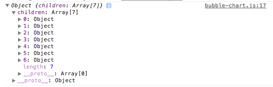
var data = { children: [] };
// loop over each row in our dataset
dataset.eachRow(function(i) {
// append new objects for each row
// with the values from the axes
data.children.push({
label: axes.label.val(i),
value: axes.size.val(i)
});
});
}To see if this works we can output the data using console.log. At this point it's a good idea to actually create a chart with some test data so we can test our code.
To code the visualization we start by adapting the bubble chart example kindly provided by Mike Bostock. One thing we have to change is the selector to which we append the svg element. Instead of appending to the body we will use the $element argument (which happens to be a jQuery selector).
var vis = d3.select($element.get(0)).append("svg")
    .attr("width", diameter)
    .attr("height", diameter)
    .attr("class", "bubble");
The other thing we change is the data. In our case we don't need to load an external JSON file so we don't need to wrap the visualization code in a d3.json call. Also we don't use the d3.scale.category10 palette yet, as all our circles will have the same color.
The full code at this point can be found here. However, if we test the chart in Datawrapper we will experience an error saying: Uncaught ReferenceError: d3 is not defined. Obviously, we forgot to tell Datawrapper that our visualization depends on the third-party library D3.js.
To do so we do two things: First we download d3.min.js and store it under static/vendor/.
Second we need to tell Datawrapper that it should load the library with the chart. Therefor we add the new attribute libraries to the visualization meta data we define in plugin.php. For each library we can provide two URLs, a local URL that is used in the Datawrapepr editor and a remote URL that will be used in the published chart.
"libraries" => array(array(
    "local" => "vendor/d3.min.js",
    "cdn" => "//cdnjs.cloudflare.com/ajax/libs/d3/3.3.11/d3.min.js"
)),
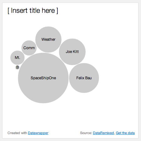
After fixing the D3.js dependency the resulting chart should look something like this:
You might have noticed that at this point the visualization uses a fixed size, which is not what we want in Datawrapper. Instead we will call this.size() to get the width and height available for the chart and use the smallest side as diameter.
var size = this.size(),  // returns array [width, height]
diameter = Math.min(size[0], size[1]);Next thing we do is to re-use the colors defined in the currently selected theme. So instead of the fixed color "#ccc" we are going to take the first color of the theme's palette.
node.append("circle")
    .attr("r", function(d) { return d.r; })
    .style("fill", theme.colors.palette[0]);
To ensure that the labels remain readable it's a good idea to check the Lab-lightness of the selected color and invert the label color if the background is too dark.
At this point our code is already infiltrated with style definitions that would better fit into a separate CSS file. Datawrapper makes this very easy by automatically including the CSS file that is named after the visualization id. So in our case we simply add a file bubble-chart.css into the static/ folder and that's it.
Then we can remove the .style() call and instead use a CSS class to invert the labels.
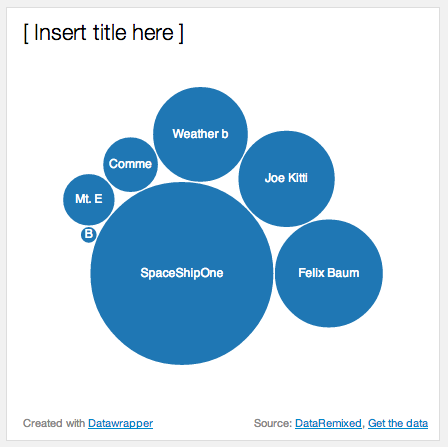
By now the visualization looks something like this:
As you know, the visualizations in Datawrapper usually can be customized by the user in some ways. Therefor the visualization can define a set of options that will be rendered as UI controls in the chart editor.
Let's say we want to allow users to turn off the bubble labels. All we need to do is to add the following line to the visualization meta definition and wrap the code that renders the labels in an IF-statement. To get the current setting we can use this.get('show-labels').
"options" => array(
    "show-labels" => array(
        "type" => "checkbox",
        "label" => "Show bubble labels",
        "default" => true
    )
)
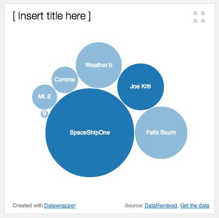
Now the sidebar we see our new checkbox, and after unchecking it the labels disappear. In the wiki you can find out more about the other option types that are available in Datawrapper.

Another nice feature of Datawrapper is the ability to highlight certain elements of a visualization. This is very easy to integrate into a visualization using two little steps.
At first we need to define which of our axes is storing the unique identifiers in our dataset. In our case this is the axis label, so we set the attribute highlight-key to "label" in the visualization meta attributes.
As second we need to alter the visualization code to check if a given element is highlighted, and then change the appearance accordingly. To make it easy we just change the default opacity of the circles to 50% and resetting it to 100% for all highlighted elements. All this can be done in CSS:
.node circle { opacity: 0.5; }
.node.highlighted circle { opacity: 1; }
Next we need to assign the class "highlighted" to all highlighted elements. To do so we can use the function chart.isHighlighted(key). Note that if no element is highlighted at all this function will return true for all elements.
And again, that's it. Now we can select elements in the chart editor and the remaining elements will be faded out a little bit:
For this tutorial this should be enough to demonstrate how you can add new visualization modules to Datawrapper. As you have seen, the integration of an existing D3.js visualization is pretty straight-forward, and can be done within an hour easily.
However, while what we achieved so far is certainly nice, a lot more work is needed to get the bubble chart up to Datawrapper quality™. This is something that is easily forgotten: A good chart consists of way more than just a few nicely arranged circles and some text. And that it is really hard work to prepare a visualization for all the future datasets that will cross its way.
Anyway, we hope you enjoyed this tutorial and will create some nice new visualization modules! If you do, please let us know so we can start a collection of nice plugins in the future.
Here are some quick ideas of what is still missing in our little bubble chart. Feel free to fork the repo and start coding! :)
- The actual values are not displayed in the bubble chart. A radius legend or direct labeling of large bubbles would help!
- Simply truncating labels according to the radius is an easy solution, but it is not very smart. Instead we should let the labels break into several lines.
- We could allow users to customize the colors for the bubbles, either using the built-in color picker in Datawrapper (as supported by the other chart types) or by adding another axis for data-driven coloring (as is it used in the map module).
- Finally, we could easily improve backward compatibility by using Raphael.js or plain HTML instead of SVG for rendering of the bubbles.


