carbon-design-system / carbon-components-svelte Goto Github PK
View Code? Open in Web Editor NEWSvelte implementation of the Carbon Design System
Home Page: https://svelte.carbondesignsystem.com
License: Apache License 2.0
Svelte implementation of the Carbon Design System
Home Page: https://svelte.carbondesignsystem.com
License: Apache License 2.0
Is there a clean way to use the Grid with Sapper? It appears that I need to use Sass, but is there a way to avoid using Sass and just use Sapper for this?
When using automated testing tools, a common practice is to define a data- selector to an element and query it like so: document.querySelector('[data-]').
Since $$props won't be spread to the parent element of a component (and there's no guarantee of that regardless), the parent element should contain some selector that is easy to query.
Additionally, the carbon-specific class name (e.g. "bx--") for the parent element is not reliable as it may change with future releases.
id prop to each component and leave it up to the consumer to pass an idI believe a component-specific data attribute is ideal.
<div data-component-accordion>...</div>OR with a shorthand/namespace
<div data-c-accordion>...</div>Query the node like so: document.querySelectorAll('[data-c-accordion]')
Perhaps an arbitrary value can be passed to the data attribute. This can help distinguish between multiple component instances.
<script>
  export let id = "";
  export let data = undefined;
</script>

<div data-c-accordion={data || id}>...</div>I'm running into an error when using anything that touches SkeletonText component:
$ (plugin svelte) ParseError: Attributes need to be unique
/src/components/SkeletonText/SkeletonText.svelte
...
  <p
    on:click
    on:mouseover
    on:mouseenter
    on:mouseleave
    class={cx('--skeleton__text', heading && '--skeleton__heading', className)}
    style={`width: ${width};`}
    {style} />
There are basically two "style" props.
At moment only DataTable is exported, but there an example of composed DataTable in story file? Is finished?
just trying out library for first time in a svelte project
ENOENT: no such file or directory, open 'node_modules/carbon-components-svelte/src/index.js'
I believe the package.json svelte property references src/index.js which is not published to npm
I just tested carbon with few components.
I got it running (Buttons, Dropdown)
But DatePicker was added by svelte as empty <div> - i do not see ui
I used simple <DatePicker /> as code with import for this.
bug?
Considerations:
bx--listbox components?value binding for selected items?At the moment, recommended way of importing styles of this library is by literally linking to the compiled and minified stylesheet file (~400kb). This file, as far as I understand, includes styles of all of the components.
While this is totally fine/usual way to deal with the css in react, it also kinda defeats the purpose of using svelte. It should not be necessary to include 400kb of CSS for a simple component which would take five carbon components and 15kb of JS.
Is there a consideration to allow building a css bundle of the used components (and dependancies) only?
Assigned to @Heydan83
DataTable (read-only, sortable)DataTableSkeletonDataTable + batch expansionDataTable + batch selectionDataTableSearch filters the current rows supplied to the DataTable
In 0.5.1 when a Button is used with text and an Icon, the Icon appears right next to the text, rather than the Icon being offset.
<Button kind="primary" type="submit" icon={ArrowRight16}>
        Let's Play!
      </Button>
The iconDescription as far as I can tell should not be displayed when a button has text and an icon.
When using a Header, followed by a Grid as in the following, the content of the Grid may hid underneath the Header, what's the appropriate way to deal with this?
<Header company="something" platformName="Something else"></Header>
<div class="bx--grid">
....
</div>
Dependency of DropBox, MultiSelect, ComboBox...
Can you please add the tutorial on how to use Carbon Components for Svelte App like the following page on Vue?
https://www.carbondesignsystem.com/tutorial/vue/overview
Thanks
carbon-design-system/carbon#4901
Expected changes
carbon-components...--checkbox-label-textRelated #169
Description
For the 1.0 release, forwarded events should be codified and made consistent.
For example, a component in which the underlying element is a button or link should forward the following:
Whereas, an input or select element may only forward certain events:
Although Storybook has been useful in guiding the initial development of the library, it would be more realistic if the library is consumed directly in a plain webpack application.
Particularly for Svelte, Storybook does not illustrate usage of components in a deliberate way. The consumption of components is currently hidden in .Story.svelte files.
Addon source plugin does not reveal the source code of invoking Svelte componentscarbon-components, carbon-icons-svelte are peer depscarbon-design-system/carbon-icons-svelte#20
Bump carbon-icons-svelte when visual regression is resolved.
Bundlers
template-rolluptemplate-webpacktemplate-sapper-rolluptemplate-sapper-webpackGiven a component that supports two-way binding (e.g. ContentSwitcher), is it redundant to also dispatch a change event with the current Switch id, index etc.?
The event may still be useful for a consumer who does not use two-way binding?
Before a stable release, the exported "props" value should be removed.
<script>
  export let props = {};
</script>

<div {...props}></div>
The initial purpose was to pass "remaining" props not explicitly defined to a specific element via Object spread (e.g. '...').
The goal was to avoid accessing $$props.
Proposed Solution
For each component, remove props and explicitly define and export individual variables.
For example:
<script>
-  export let props = {};
+ export let title = undefined;
</script>

- <div {...props}></div>
+ <div title={title}></div>
Drawbacks
on:click on:mouseover on:mouseenter on:mouseleave {style}How do we apply themes as described here?
Using:
<style type="text/sass" global>
@import "node_modules/carbon-components/scss/globals/scss/vendor/@carbon/themes/scss/themes";

$carbon--theme: $carbon--theme--g100;
@include carbon--theme();

@import 'node_modules/carbon-components/scss/globals/scss/styles';
</style>
Seems to have no effect at all.
Hi!
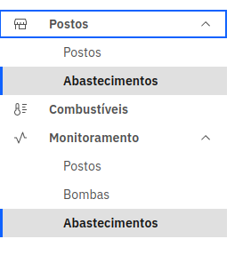
when Shell Side Nav have two itens with same name both show as active:
And any plans to make a UIShell compoments based too?
Detail
 React
React
A declarative, efficient, and flexible JavaScript library for building user interfaces.
🖖 Vue.js is a progressive, incrementally-adoptable JavaScript framework for building UI on the web.
 Typescript
TypeScript is a superset of JavaScript that compiles to clean JavaScript output.
An Open Source Machine Learning Framework for Everyone
 Django
The Web framework for perfectionists with deadlines.
 Laravel
A PHP framework for web artisans
Bring data to life with SVG, Canvas and HTML. 📊📈🎉
JavaScript (JS) is a lightweight interpreted programming language with first-class functions.
Some thing interesting about web. New door for the world.
A server is a program made to process requests and deliver data to clients.
Machine learning is a way of modeling and interpreting data that allows a piece of software to respond intelligently.
Some thing interesting about visualization, use data art
Some thing interesting about game, make everyone happy.
 Facebook
We are working to build community through open source technology. NB: members must have two-factor auth.
 Microsoft
Open source projects and samples from Microsoft.
 Google
Google ❤️ Open Source for everyone.
 Alibaba
Alibaba Open Source for everyone
 D3
D3
Data-Driven Documents codes.
 Tencent
China tencent open source team.