Code Monkey home page Code Monkey logo

firefox-ui-fix's Introduction

Lepton (old name: Proton Fix)

Table of Contents


šŸ””šŸ”” Does the theme not work after installation?

You should copy user.js file before the theme works.

The option system depends on user configuration, and nothing applies without settings.
Also, real-time changes are difficult because of technical limitations and require a restart.

Some settings can be conflicted and should be explicitly set to false.
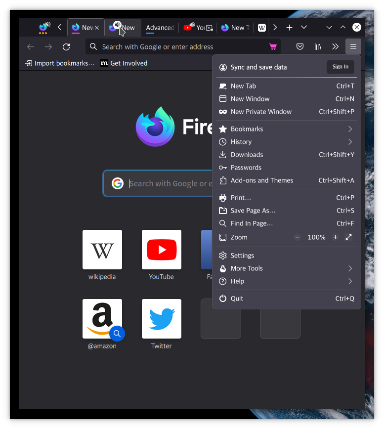

šŸ””šŸ”” Is your Firefox version v102 or lower?

You have to set userChrome.compatibility.accent_color to true additionally.


Introduction

Proton is Firefoxā€™s new design, starting from Firefox 89.
Photon is the old design of Firefox which was used until version 88.

Protonā€™s overall feel is good, but there were a few things I didnā€™t like and wanted to improve.
Thatā€™s why this project was born, and Lepton to denote light theme layer.

Disclaimer: It works on Firefox 89 and above!!

Wiki
Installation GuideScreenshotsTutorialOptionsCompatibility Issues SolutionTipsShow Off Your Config

https://user-images.githubusercontent.com/25581533/119774062-20942280-beb1-11eb-80aa-c18dd52f18d7.png

(Leptonā€™s design ā¬†ļø)

Feature List (Click)

  • Color
    • Default light/dark theme contrast enhancement
    • Colorful context menu
    • More dark mode support
    • Windows/Mac/Linux system theme support
    • Windows 7 compatibility
  • Icons
    • Panel
    • Context Menu
    • Global Menu
    • Libraryā€™s open context
    • Video Player
  • Padding Narrower
    • Tab
    • Panel
    • Menu
    • Density
    • Othersā€¦
  • Tab Bar Layouts
    • Tabs on Bottom
    • One Liner
    • Vertical Tab Support
  • Tab Design
    • General:
      • Connect with toolbar (buttons like tabs)
    • Selected:
      • Box Shadow: Highlight the selected tab
      • Bottom Rounding: Natural
    • MultiSelected
      • Adjust Color: Easily recognizable
    • Unselect:
      • Divide Line: React to hover like chrome
    • Unloaded:
      • Dimmed: Looks like inactive
    • Clipped:
      • Clearer Text: Adjusted clipped gradation
      • Closed Button: Visible on hover
    • Sound:
      • Remove Second Label
      • Show Favicon: Always show favicon
      • PIP Icon
    • Container Tab:
      • Highlight line position: Displayed under tab
  • Button Design
    • New tab: Looks like tab
  • Activity Stream Design
    • Search Bar:
      • Focused Shadow: Same as the accent color
      • Hand off to Awesomebar
    • Icons:
      • Size: Fill (Changes dynamically to your size)
  • Error Page Design
    • Illustrations: Restore error page illustrations
  • Video Player
    • Background Style
    • Size at fullscreen
  • Fullscreen
    • Overlap mode
  • Others
    • Animations
    • Hidden & Auto Hide
    • Activate calculator at address bar
    • Mouse pointer for each context

Installation Guide

Installation script (experimental)

Linux/Mac users:

bash -c "$(curl -fsSL https://raw.githubusercontent.com/black7375/Firefox-UI-Fix/master/install.sh)"

Windows users: Run with powershell (Does not work at Win7?)

Powershell -c "Set-ExecutionPolicy Bypass -Scope Process -Force; [System.Net.ServicePointManager]::SecurityProtocol = [System.Net.ServicePointManager]::SecurityProtocol -bor 3072; iwr https://raw.githubusercontent.com/black7375/Firefox-UI-Fix/master/install.ps1 -useb | iex"

Manual Installation

You can see the installation guide with screenshots on the wiki.

  1. Download files
    • Click the green ā€œ:arrow_down: Codeā€ button above
    • Select ā€œ:package: Download ZIPā€
  2. Find your profile directory
    • Open about:support in a new tab
    • Find the Profile Directory(Linux) / Profile Folder(Windows) entry
    • Click the Open Directory(Linux) / Open Folder(Windows) button
  3. Copy downloaded files
    • Extract the downloaded zip file
    • Copy the user.js file to the previously opened profile directory
    • Create a new directory inside your profile directory called chrome
    • Copy the remaining files from the extracted zip-file into previously created the chrome directory
  4. Restart Firefox
    • Click the Clear startup cacheā€¦ at the top of about:support

If you prefer Photon, see Leptonā€™s photon-style.
If you prefer Proton, see Leptonā€™s proton-style.

WHY Proton?

I think a lot has improved.

https://user-images.githubusercontent.com/25581533/119773764-a6639e00-beb0-11eb-8023-498b6293c4b2.png

(Protonā€™s design ā¬†ļø)

  • Neatly organized menu
  • Icon beautiful enough to remind you of Edge
  • Nice color scheme
  • Satisfied Rounding
  • Modal window & Scrollbar!!

WHY Not Proton?

However, there are also many flaws.

https://user-images.githubusercontent.com/25581533/119773812-b5e2e700-beb0-11eb-923c-55ae1a8ca249.png

(Photonā€™s design ā¬†ļø)

  • Is it a tab or a button?
  • Where are the menu icons?
  • Icons in ActivityStream are too small
  • Padding gaps are wide
  • āš ļø Address bar 3-point menu, screenshot moves to toolbar (canā€™t fix)

Padding Comparisons

https://user-images.githubusercontent.com/25581533/120262626-8c97d180-c289-11eb-87a6-68e285d6d77c.png https://user-images.githubusercontent.com/25581533/120253257-6ae11f00-c276-11eb-93cf-393f9845f30b.png https://user-images.githubusercontent.com/25581533/118402352-1e33fc00-b659-11eb-89fc-3cb38207fe39.png https://user-images.githubusercontent.com/25581533/124066951-0eb21c00-da29-11eb-9ac4-c6b82a268c6f.png

  • Photon (Quantum)
  • Proton
  • Lepton

Sponsors & Contributors

Thanks to all sponsors & contributors to this project for providing help and developing features!

Sponsors

https://user-images.githubusercontent.com/25581533/203210367-9f2eed69-666a-4218-acde-128892aa09d8.png

  • A donation was received from Safira on Ko-Fi
  • Private sponsors: 3

Contributors

A list of all contributors can be found in CREDITS.

Bug / Questions?

If you found a bug, please contact issue.
If you have any questions or inquiries, please contact discussions.

FAQ

  • Black pixels around the selected tab bottom corners
    https://user-images.githubusercontent.com/5571586/120401980-edf58a00-c2f5-11eb-9e64-ce50c5b189b2.png

Please follow the Installation Guide,
or set about:configā€™s svg.context-properties.content.enabled to true .

  • The closed button and some panel menu icons are not visible.
    https://user-images.githubusercontent.com/77958663/130395848-7af58241-bbbf-4273-bb62-14382c44098d.png https://user-images.githubusercontent.com/25581533/120487528-93b40200-c3a5-11eb-98ad-3498beb9f38e.png

Please follow the Installation Guide,
or copy the icons directory to chrome .

  • Less icons in the panel with photon-style
    https://user-images.githubusercontent.com/25581533/123761424-5746c980-d8b1-11eb-9a0f-83fb305f9f08.png https://user-images.githubusercontent.com/25581533/123762962-d4bf0980-d8b2-11eb-8492-d497d330c72a.png

    I didnā€™t put all the icons like before.
    https://user-images.githubusercontent.com/25581533/123602947-dd4b0d80-d7e8-11eb-93a6-2b263bdd99f7.png

firefox-ui-fix's People

Contributors

adamp01 avatar akay avatar aleksandra0056 avatar andmagdo avatar b00ze64 avatar badprogramshere avatar black7375 avatar dependabot[bot] avatar dr460nf1r3 avatar gbdlin avatar hellojaccc avatar ishitatsuyuki avatar jonta avatar jupjohn avatar magicaldrizzle avatar mamen avatar menndouyukkuri avatar nomes77 avatar nyubis avatar oondanomala avatar phoebe-leong avatar ricewind012 avatar roland-5 avatar roy-orbison avatar rsquared226 avatar ryenyuku avatar sanderthedragon avatar simyunsup avatar surapunoyousei avatar zapsnh avatar

Stargazers

 avatar  avatar  avatar  avatar  avatar  avatar  avatar  avatar  avatar  avatar  avatar  avatar  avatar  avatar  avatar  avatar  avatar  avatar  avatar  avatar  avatar  avatar  avatar  avatar  avatar  avatar  avatar  avatar  avatar  avatar  avatar  avatar  avatar  avatar  avatar  avatar  avatar  avatar  avatar  avatar  avatar  avatar  avatar  avatar  avatar  avatar  avatar  avatar  avatar  avatar  avatar  avatar  avatar  avatar  avatar  avatar  avatar  avatar  avatar  avatar  avatar  avatar  avatar  avatar  avatar  avatar  avatar  avatar  avatar  avatar  avatar  avatar  avatar  avatar  avatar  avatar  avatar  avatar  avatar  avatar  avatar  avatar  avatar  avatar  avatar  avatar  avatar  avatar  avatar  avatar  avatar  avatar  avatar  avatar  avatar  avatar  avatar  avatar  avatar  avatar

Watchers

 avatar  avatar  avatar  avatar  avatar  avatar  avatar  avatar  avatar  avatar  avatar  avatar  avatar  avatar  avatar  avatar  avatar  avatar  avatar  avatar  avatar  avatar  avatar  avatar  avatar  avatar  avatar  avatar  avatar  avatar  avatar  avatar  avatar  avatar  avatar  avatar  avatar  avatar  avatar  avatar  avatar  avatar  avatar  avatar  avatar  avatar  avatar  avatar  avatar  avatar  avatar  avatar  avatar  avatar  avatar  avatar  avatar

firefox-ui-fix's Issues

Remove gap between pinned and unpinned tabs

First of all thanks for this repo. I totally agree with the pro/cons about proton on README.

I added this to my local copy:

  #tabbrowser-tabs[haspinnedtabs]:not([positionpinnedtabs]) > #tabbrowser-arrowscrollbox > .tabbrowser-tab[first-visible-unpinned-tab] {
    margin-inline-start: 0 !important;
  }

It removes the gap between pinned and unpinned tabs. Add it to the repo if you think it is a good addition.

Also, as I use a light theme I needed to tweak line 115 and change the color to var(--tabs-border-color) to get tab separators showing. I am not using any additional theme on Firefox, but with the previous value the tab separators won't show.

    background-color: var(--tabs-border-color) !important;

Thanks again and have a nice day.

"Eyedropper" and "Extensions for Developers" have their icons switched

Describe the bug
In the More Tools submenu, "Extensions for Developers has an eyedropper icon, while the eyedropper has a terminal icon.

Expected behavior
The eye dropper has an eye dropper!

Screenshots
Menu -> More Tools

Environment (please complete the following information):

  • Firefox Version: 89.0
  • OS:
    • Linux
    • Windows
    • Mac
    • Others:
  • Theme:
    • Light
    • Dark
    • Alpenglow(System: Light)
    • Alpenglow(System: Dark)
    • System Default
      • GTK Theme Name(Only Linux User): [sample] Adwaita, Adwaita-Dark, Breath, Breath-Dark

Additional context
None.

Spacing between icons and menu-items in main menu is missing on macOS

Describe the bug
No spacing between menu entry and icon in main menu, see also:
image

Expected behavior
The same space as in all other menus, see for example the addon overflow menu:
image

Environment (please complete the following information):

  • Firefox Version: Nightly: 90.0a1, Build 20210526094846
  • OS: macOS 11
  • Theme: Dark

Additional context
Love your work, I love the course Mozilla is taking with proton now.

Image next to firefox sync information seems to be broken

Describe the bug
Image next to firefox sync information in the hamburger menu seems to be broken when firefox sync is active.
Happens on both lepton and photon, didn't test other branches yet

Expected behavior
The mozilla account avatar displayed

Screenshots

Before (Clean environment) After photon
original photon-style

Environment (please complete the following information):

  • Firefox Version: 89.0b15
  • OS:
    • Linux
    • Windows
    • Mac
    • Others:
  • Theme:
    • Light
    • Dark
    • Alpenglow(System: Light)
    • Alpenglow(System: Dark)
    • System Default
      • GTK Theme Name(Only Linux User): [sample] Adwaita, Adwaita-Dark, Breath, Breath-Dark

For tracking issue

Make container lines larger

Is your feature request related to a problem? Please describe.
The small line below the favicon is very discreet.
The other active container indicators, like the ones in the address bar, are not as visible in the light theme and make the extensions area even more bloated.

Describe the solution you'd like
The line could be extended to the width of the tab (as it was in the previous design), at least for the active tab.

Pinned tabs become "x to close" when active

I've installed this UI fix, but it has a really bad side effect: when a pinned tab is selected, it changes the icon to an X for closing the pinned tab. This makes it way too easy to close a pinned tab by accident, contrary to the idea that a pinned tab should be permanent.

Until you fix this, I will have to return to my previously saved profile.

Active pinned tabs are wider than inactive ones

Describe the bug
The width of a pinned tab is increased when selected as the active tab, visibly pushing other tabs when going between pinned and normal tabs.

Expected behavior
Pinned tabs having the same width when active, so as to not bump other tabs around.

Screenshots
tabs

Environment (please complete the following information):

  • Firefox Version: 89.0
  • OS: Windows
  • Theme: Dark

Additional context
Compact mode is enabled.

I'm not 100% sure this deserves to be called a bug, but I wanted to report it anyway.
Thanks so much for making this fix though!

Tab UI Broken with GNOME 40 (Xorg)

First of all, great job! The theme is REALLY beautiful!

I installed the version at 85d6d04.

I am using GNOME 40 (under Xorg with ArchLinux, didn't try Wayland). I find both dark and light themes have broken tabs. The native theme looks find though. Below are screenshots for all three cases:

Screenshot from 2021-06-01 16 18 27

Screenshot from 2021-06-01 16 18 07

Screenshot from 2021-06-01 16 17 33

Roadmap

This is part of the plan I have been thinking about since May, and priorities are subject to change.

Stage 1 - Project Neutrino [Attainment]

The first stage is a really light and less interactive neutrino.

Goal

By establishing an overall design and addressing various complaints arising from Proton, users should be free from friction when interacting with browsers.
The result of a CSS setup that builds natural UI/UX that is expected or better from a typical browser.

Features

Color

  • Contrast improvement in default theme
  • Windows/GTK default theme support
  • Full dark mode and part of the full theme
  • Windows7 Compatibility

Icon

  • Panel
  • Context Menu
  • Global Menu

Padding

  • Tab Bar, Toolbar, Panel, Popup Menu, Context Menu
  • UI Dencity Support

Tab

  • Connect
  • Bottom Round Corner
  • Divide line (separator)
  • Separator
  • Responding to Tab states
  • Photon Style

Installer

  • Windows
  • Linux/Mac
  • Network-Local-Release
  • Upgrade

Others

  • Pointer
  • Smooth Scrolling
  • Restore illustration

Stage 2 - Project Electron [Getting ready]

The second is the electron, which is light and has various chemical bonds.
Make theme optional and scalable.

Goal

It is designed in such a way that what used to be multi-source for several distributions is integrated into one source and each has a default value.
Now distros are just a convention, source management and UI customization are easy.

Various compatibility settings and customs that were difficult to apply as defaults can be easily applied with user.js.

The source changes by introducing SASS and building it.
It is structured and makes it easy to handle complex or frequently used patterns and backwards compatibility.

Features

Minimalism

  • One liner
  • Auto Hide UI
  • Hidden UI
  • Centered UI
  • Monospace font

Tab

  • Various shape
  • Various shadow
  • Vertical tab addon support

Color

  • Dark mode with blue accents
  • More dark mode
    • PDF
    • Addon
  • Blur mode

Stage 3 - Project Muon

The third is the process of creating Lepton's own UI/UX beyond Firefox itself, which is much more massive than electrons as well as neutrinos.
JS introduces dynamic features and implements UI/UX and features that cannot be done with CSS or normal add-ons.

Goal

It covers most of the features that a general user would want, and there are enough killing points to consider if you are a Firefox user or even switch to another browser.
Even if JS is introduced, there should be little performance degradation.

After providing the setting UI, build a complete modern web development environment based on TS and Noder.
Until then, there should be no mangling/compression etc. to make it easy for users to add/remove each features.

Features

UI Custom Setting

  • Full Theme
  • Can be selected in the settings tab

Animations

Bookmark Animation - Reference
bookmark-animation

Sound Wave
Whale

Component

  • Restore Page Action [doorhanger, pin/unpin]
  • StatusBar
  • Powerful Sidebar [Like whale, opera]
  • Select popup menu [Like PopClip]
  • Mobile Window
  • Powerful Image Viewer
  • Simple Image Editor (Integrated viewer, screenshot)
  • Other miscellaneous buttons

Tab Manage

Setting

  • Table of Contents generator
  • Lepton Setting
  • Telemetry off setting
  • Advanced mode (Like Firefox Tweaker)

Integrantions

Others

Stage 4 - Project Tau

The last fourth is Tau, which is 10 times heavier than Muon, adding features for power users and special users, which are no longer seen as light theme layers.

Goal

It can be said that almost all the needs of general users have been met through Stage2.
Now, we focus on thinking of various power users or implementing advanced features.

Features

Dedicated Programs

Powerful Tools

Protocol Supports

Proposal for improving appearance

Please make folders in the sidebar of the bookmarks completely flooded color, such as blue. Now their frame look is just terrible.
I also want a dedicated tab to be not just highlighted by a blue stripe from above, but there was a complete fill with color, for better visual perception and speed of finding it among a variety of open tabs.

Update README.org to be more readable

Love the project, however, in order to become more user-friendly, can you please update the project's README.org file to become more readable?

For instance:

  1. Put a space between Lepton and (old name...) "Lepton(old name: Proton Fix)"
  2. Capitalize the words "proton" and "firefox" in "proton is firefox's new design."
  3. Include a section of why Lepton/Photon is needed (just explain in words)
  4. Include spaces in "If you prefer Photon(88 or earlier)..."

These are just minor issues. All-in-all the project is already good, I just wanted to suggest some cleanup to the README.org to make it easier to read for newcomers.

Context Menu Icons

Describe the solution you'd like
It would be great if you could add icons to the context menu, when right clicking on a webpage. (Save Page As, Screenshot, Search with Google etc...)

Additional context
Thank you for the great work you have done so far.

Multi-account containers new tab context selection menu display issue

Describe the bug
With Multi-Account Containers extension installed, the menu to select new tab context doesn't display correctly (height is to low) when opened by dragging the new tab button down with left mouse button.

Expected behavior
The menu should be displayed as in the in the original proton theme or like when right-clicking the new tab button.

Screenshots
Proton - Drag down:
containers_proton

Lepton - Drag down:
containters_lepton

Lepton - Right-click:
containers_leption_rmb

Environment (please complete the following information):

  • Firefox Version: 89.0
  • OS:
    • Linux
    • Windows
    • Mac
    • Others:
  • Theme:
    • Light
    • Dark
    • Alpenglow(System: Light)
    • Alpenglow(System: Dark)
    • System Default

Photon Style light theme color

Is your feature request related to a problem? Please describe.
https://www.reddit.com/r/firefox/comments/nly44l/this_week_proton_fixwill_be_called_lepton_tab/h075uu4?utm_source=share&utm_medium=web2x&context=3

I prefer when all programs has similar design on the system. Windows 10 by default has light titlebars (light theme by default). But Firefox has light controls with dark titlebar (system theme), but it can be fixed by switching to the light theme. And light theme in your fix differs from original photon
u/Yoskaldyr

Describe the solution you'd like
We can consider adjusting color.

Additional context
It's just something to keep in mind.

Merge firefox-selection-fix

Since some time, Firefox has the annoying feature to select the text in the URL bar, when you click it. There is a fix here:
https://github.com/SebastianSimon/firefox-selection-fix

It looks like you could merge your projects into some project that allows to select which features to restore trying to maintain several fixes to the Firefox UI, that were created when the changes were introduced.

Customize Install (i.e icons only)

Is your feature request related to a problem? Please describe.
I was referred to this theme as a solution to get the panel icons back and this certainly works for that, however I am wondering if there is a way to customize which features could be installed. I've manually made an icons only edition here
https://github.com/Possibly-Matt/Firefox-UI-Fix
I quite like the floating style tabs, but I like the tab dividers in this theme.

Describe the solution you'd like
A clear and concise description of what you want to happen.
I'm not too well versed on javascript/css or how other themes do this but perhaps a configuration file could be read by js and only specific css run?
My version wasn't too painful to edit because of the good commenting :) so thanks for that. So really customizing this theme should only take as long
Alternatively multiple versions of the addon but that sounds like such a pain to maintain and ultimately not worth it

Change Tab shape

Is it be possible to change the tab shape and outlining stroke information?

black pixels around the selected tab bottom corners

Describe the bug
black pixels around the selected tab bottom corners

Expected behavior
no black pixels around the selected tab bottom corners

Screenshots
image

Environment (please complete the following information):

  • Firefox Version: [write from about:support - version]

  • OS:

    • Linux --> (5.12.7-arch1-1)
  • Theme:

Additional context
Using Firefox Nightly --> [90.0a1 (2021-05-14) (64-bit)]

Menu entry in german translation cut off

Describe the bug
The menu entry "Neues privates Fenster" is shrinked to "Neues privates Fens...".
See the attached screenshot

Expected behavior
"Neues privates Fens..." should appear as "Neues privates Fenster"

Environment (please complete the following information):

  • Firefox Version: 89.0
  • OS:
    • Linux
  • Theme:
    • System Default
      • GTK Theme Name(Only Linux User): [sample] Adwaita, Adwaita-Dark, Breath, Breath-Dark

menu

Could we disable the new sliding animation in the top right corner menu?

Hi,

Could we add this to the :root section of your userChrome.css?
--panelui-subview-transition-duration: 1ms !important;

diff --git a/userChrome.css b/userChrome.css
index 30172b6..bc259b0 100644
--- a/userChrome.css
+++ b/userChrome.css
@@ -15,6 +15,8 @@
     --arrowpanel-menuitem-margin: 0 var(--arrowpanel-menuicon-padding) !important; /* Original: 0 8px */
     --arrowpanel-menuitem-padding: 5px !important; /* Original: 8px */
     --arrowpanel-padding:        0.8em !important; /* Original: 16px or .cui-widget-panel, .cui-widget-panel::part(arrowcontent) => 4px 0 */
+
+    --panelui-subview-transition-duration: 1ms !important; /* Disable top right corner menu sliding animation (0ms will not work!) */
   }
 
   :root[uidensity=compact] {

I just don't want to have an annoyingly animating smartphone UI in the top right corner menu. Unfortunately the sliding animation can neither be turned off by setting the OS preference regarding animations, nor by any other option as it's hardcoded into browser.css (within browser/omni.ja).

Thanks.

Remove address bar bookmark/container buttons, white bottom border of tab bar

image
There used to be an option to remove/add these buttons bookmark/container on the address bar via page actions (3 dots button). Now it's gone and these buttons are forced here. I don't use these buttons at all (bookmark via drag and drop, container via shortcut). I must not be alone. I tried to play around with no success so far, any help would be really appreciated !

image
There is now this bottom border below the tab bar that every theme ignore hence it is colored white and that's annoying.

I can't find these elements in the UI, so if anyone knows these I would be gladly to help !

Describe the solution you'd like

  • Remove the buttons
  • Remove the bottom border

Describe alternatives you've considered

  • Set bottom border transparent / same background color

Additional context
FF89 - Windows 10

The tab bar has several weird issues...

  • Lower corners of the current selected tab have random black pixels in them
    firefox_jhS0TAJEVy
  • Tabs have gaps between their left edge and the right edge of the tab adjacent to them, both when selected and when highlighted.
    firefox_RySASg0VqQ
  • However, some tabs have the opposite problem, making the border between the tabs appear to be 2 pixels wide instead of 1:
    firefox_3MN6uY8BMF
  • The "new tab" button looks like it's been vertically stretched by 1 pixel
    firefox_jXLCfcIpvB
    Please please please fix these, they're positively driving me mad. I'm using Firefox 89.0, by the way.

Pinned tab favicon showing

Is your feature request related to a problem? Please describe.

The close button for a pinned tab is shown instead of the favicon

Describe the solution you'd like

The close button should be replaced by the favicon for the website for aesthetic reasons. Just like in Photon:

https://i.imgur.com/vLcN3rW.png

The current pinned tab situation in Lepton:

https://i.imgur.com/e6JAFJ3.png

Describe alternatives you've considered
N/A

Additional context
This issue is a feature request, and the fix is merely for aesthetic reasons

Alternative tab close button arrangement: close button on all tabs + visible on hover

Is your feature request related to a problem? Please describe.
The default Firefox close-button behaviour is awkward when more than 9 tabs are visible: the close button only appears after you select one of the tabs (when >9 tabs). In addition, your current userChrome.css shows the close button whenever a pinned tab is active, thereby hiding the pinned tab's favicon.

Describe the solution you'd like
I have long been using the following in my own userChrome.css and I respectfully recommend that you include the following code, or its equivalent, in your own userChrome.css file:

.tabbrowser-tab:not([pinned="true"]):hover .tab-close-button:not([selected="true"]) {
display: -moz-box !important;
}

Currently, just adding the above code to your userChrome.css doesn't work as it should. However, I'd like to request that you replicate (in your own userChrome.css) the behaviour of the above code.

Describe alternatives you've considered
The userChrome.css file included in your otherwise excellent package follows the standard Firefox behaviour described above. I believe that my solution is better.

Close button hides favicon in active pinned tab

Describe the bug
When a pinned tab is selected and active, the close button hides the tab's favicon.

Expected behavior
A pinned tab should not have a close button; this goes against the principle of pinning a tab.

Screenshots
See screenshots attached.

Environment (please complete the following information):

  • Firefox Version: 89.0
  • OS: Windows 10
  • Theme: Photon Colors

Additional context
I've suggested an alternative approach in a separate feature request: #45

Screenshot 1 (Pinned tab not selected):
Pinned tab not selected

Screenshot 2 (Pinned tab selected):
Pinned tab selected

H

Describe the bug
A clear and concise description of what the bug is.

Expected behavior
A clear and concise description of what you expected to happen.

Screenshots
If applicable, add screenshots to help explain your problem.

Environment (please complete the following information):

  • Firefox Version: [write from about:support - version]
  • OS:
    • Linux
    • Windows
    • Mac
    • Others:
  • Theme:
    • Light
    • Dark
    • Alpenglow(System: Light)
    • Alpenglow(System: Dark)
    • System Default
      • GTK Theme Name(Only Linux User): [sample] Adwaita, Adwaita-Dark, Breath, Breath-Dark

Additional context
Add any other context about the problem here.

Version that puts tabs below address bar AND bookmarks toolbar

Is your feature request related to a problem? Please describe.
No.

Describe the solution you'd like
Either a version that puts the tabs bar below the address and bookmarks bar OR a piece of code I can plop into the css to do it on my own.

Describe alternatives you've considered
Rolling back firefox.

Context Menu color

Thanks for your workļ¼ this is more straightful ui.
anyway i wonder is there a way to change Context Menu colorļ¼Ÿ
怎context menu color will auto correct depend on Background Tab Text Color your theme used怏
https://i.imgur.com/7mqFSic.png
image

the different color just feel strange, is there a way to change itļ¼Ÿthanksļ¼

Windows 7 tabbar always bright theme

Is your feature request related to a problem? Please describe.
On Windows 7 the header bar is always in lightmode style. Even when using the darkmode it is also white.
Bugzilla issue for that: https://bugzilla.mozilla.org/show_bug.cgi?id=1702480
Possibly an browser selector can be used, so other designs are not affected.

Describe the solution you'd like
Have a workaround for that, so we can see i can see it in dark again.

Describe alternatives you've considered
Wait until mozilla is fixing it.

Unbenannt

Can it be implemented as normal addon?

I'm using FF on several machines, work, home, notebook, ...
I love the FF feature, that syncs addons across machines. I install a new machine, login to my FF account, and have all addons installed, including AdBlocker,...

If this were an addon, I wouldn't have to see this ugly proton UI at all :)

Some panel menu items are incorrectly aligned with the icon support.

Describe the bug
The following menu items don't have spacing that accounts for the icons, resulting in the icons starting in the icon gutter:

  1. More Tools > Task Manager
  2. More Tools > Remote Debugging
  3. More Tools > Browser Console
  4. More Tools > Responsive Design Mode
  5. More Tools > Page Source
  6. Help > Submit Feedback

Expected behavior
The text for menu items without an icon should be aligned with the text for menu items with icons.

Environment (please complete the following information):

  • Firefox Version: 89.0 (Release)
  • OS:
    • Linux
    • Windows
    • Mac
    • Others:
  • Theme:
    • Light
    • Dark
    • Alpenglow(System: Light)
    • Alpenglow(System: Dark)
    • System Default
      • GTK Theme Name(Only Linux User): [sample] Adwaita, Adwaita-Dark, Breath, Breath-Dark

Coloured folder icons in bookmarks menu

Feature request.
First and foremost, thank you very much for this black7375! It's a very nice layout and redesign tweaking + blending of Photon and Proton. The bookmarks icon has changed to an outline of the folder instead of the fill in coloured version I had previously. Is there a relatively pain free fix for this?

Describe the solution you'd like
Revert back to filled in bookmarks folder icon, as opposed to the outlined version introduced in Proton.

More documentation needed, please

Describe the bug
A clear and concise description of what the bug is.
Please describe how to get the "compact" menus, with smaller vertical spacing.
Expected behavior
A clear and concise description of what you expected to happen.
I expected the menus to be fixed to look like before release 89.0. They are still too spread out vertically. The toolbars look better, though.
Screenshots
If applicable, add screenshots to help explain your problem.

Environment (please complete the following information):

  • Firefox Version: [ 89.0]
  • OS:
    • Linux
    • Windows: 10 Home
    • Mac
    • Others:
  • Theme:
    • Light
    • Dark
    • Alpenglow(System: Light)
    • Alpenglow(System: Dark)
    • System Default
      • GTK Theme Name(Only Linux User): [sample] Adwaita, Adwaita-Dark, Breath, Breath-Dark

Additional context
Add any other context about the problem here.
Also, there is no background color difference between the three toolbars, hard to see. Also, the active tab is not well highlighted--my eyes are not that good.

Recommend Projects

  • React photo React

    A declarative, efficient, and flexible JavaScript library for building user interfaces.

  • Vue.js photo Vue.js

    šŸ–– Vue.js is a progressive, incrementally-adoptable JavaScript framework for building UI on the web.

  • Typescript photo Typescript

    TypeScript is a superset of JavaScript that compiles to clean JavaScript output.

  • TensorFlow photo TensorFlow

    An Open Source Machine Learning Framework for Everyone

  • Django photo Django

    The Web framework for perfectionists with deadlines.

  • D3 photo D3

    Bring data to life with SVG, Canvas and HTML. šŸ“ŠšŸ“ˆšŸŽ‰

Recommend Topics

  • javascript

    JavaScript (JS) is a lightweight interpreted programming language with first-class functions.

  • web

    Some thing interesting about web. New door for the world.

  • server

    A server is a program made to process requests and deliver data to clients.

  • Machine learning

    Machine learning is a way of modeling and interpreting data that allows a piece of software to respond intelligently.

  • Game

    Some thing interesting about game, make everyone happy.

Recommend Org

  • Facebook photo Facebook

    We are working to build community through open source technology. NB: members must have two-factor auth.

  • Microsoft photo Microsoft

    Open source projects and samples from Microsoft.

  • Google photo Google

    Google ā¤ļø Open Source for everyone.

  • D3 photo D3

    Data-Driven Documents codes.