这是ConstraintLayout的一个demo,详细介绍了一些属性和用法。
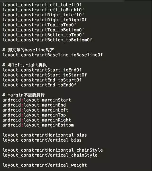
ConstraintLayout的基本属性如下图所示:
| RelativeLayout | ConstraintLayout |
|---|---|
| android:layout_alignParentLeft="true" | app:layout_constraintLeft_toLeftOf="parent" |
| android:layout_alignParentTop="true" | app:layout_constraintTop_toTopOf="parent" |
| android:layout_alignParentRight="true" | app:layout_constraintRight_toRightOf="parent" |
| android:layout_alignParentBottom="true" | app:layout_constraintBottom_toBottomOf="parent" |
| android:layout_centerInParent="true"。设置android:layout_centerInParent="true"属性就不需要设置以上4个属性了 | 全部设置以上4个属性,相当于RelativeLayout里面的layout_centerInParent="true" 属性, |
2.1 方位属性
每个View都有的边缘属性:left right top bottom 默认的View是在左上方排列的,如果有多个,后加上的View会盖在以前的View上。
在ConstraintLayout中新增了4子view的相关性的属性:
app:layout_constraintLeft_toRightOf="id"
app:layout_constraintRight_toLeftOf="id"
app:layout_constraintTop_toBottomOf="id"
app:layout_constraintBottom_toTopOf="id"
app:layout_constraintLeft_toRightOf="id" 意思是:设置这个属性的View相对于引用id的这个view的右边,相当于RelativeLayout里面的 android:layout_toRightOf="id"属性
app:layout_constraintRight_toLeftOf="id" 意思是:设置这个属性的View相对于引用id的这个view的左边,相当于RelativeLayout里面的 android:layout_toLeftOf="id"属性
app:layout_constraintTop_toBottomOf="id"` 意思是:设置这个属性的View相对于引用id的这个view的下边,相当于RelativeLayout里面的 android:layout_BottomOf="id"属性
app:layout_constraintBottom_toTopOf="id" 意思是:设置这个属性的View相对于引用id的这个view的上边,相当于RelativeLayout里面的 android:layout_toTopOf="id"属性
【记忆方式】只记 横杠后面的字段 的意思。
举例说明: 有一个TextView 还有一个Button。
- (1)给TextView 设置
app:layout_constraintLeft_toRightOf="@id/btn"属性,表示TextView位于Button的右边 - (2)给TextView 设置
app:layout_constraintRight_toLeftOf="@id/btn"属性,表示TextView位于Button的左边 这时是看不见TextView,实际上TextView渲染到Button的左边了,在屏幕外边, 如果给她做一个右边平移动画,你会看到它还是会显示出来的。 - (3)给Button 设置
app:layout_constraintLeft_toRightOf="@id/tv"属性,表示Button位于TextView的右边 - (4)实际使用中,多个View 之间有位置关系的时候,建议相互有位置关系的View分别设置一个方位属性。
如下:TextView在Button左边,Button在TextView的右边。
<TextView
    android:id="@+id/tv"
    android:layout_width="wrap_content"
    android:layout_height="wrap_content"
    android:text="@string/textview_name"
    app:layout_constraintRight_toLeftOf="@id/btn" />

<Button
    android:id="@+id/btn"
    android:layout_width="wrap_content"
    android:layout_height="wrap_content"
    android:text="@string/btn_name"
    app:layout_constraintLeft_toRightOf="@id/tv" />
同理:TextView在Button下边,Button在TextView的上边。
<TextView
    android:id="@+id/tv"
    android:layout_width="wrap_content"
    android:layout_height="wrap_content"
    android:text="@string/textview_name"
    app:layout_constraintTop_toBottomOf="@id/btn" />

<Button
    android:id="@+id/btn"
    android:layout_width="wrap_content"
    android:layout_height="wrap_content"
    android:text="@string/btn_name"
    app:layout_constraintBottom_toTopOf="@id/tv" />
2.2 子View坐标
LinearLayout的weightSum属性。它能很好的适配线性布局下的某个子控件。 在ConstraintLayout中也有相类似的子view属性,来达到这样的布局适配效果。
根据这样的属性,我们可以完全了解子View在ConstraintLayout里面所处的left与top权重, 构成一个以view开始绘制的点的坐标系,这样就很好的实现了子view的整体权重适配。
-
(1) 一个很常见的功能,我们现在希望在右下角增加一个浮动按钮。
app:layout_constraintHorizontal_bias="0.9" app:layout_constraintVertical_bias="0.9"
-
(2) 权重 除上述用法之外,也可以实现类似于LinearLayout的权重的特性。我们增加3个textview来冒充tab。 我们看横向的依赖,3个tab两两设置了约束(即你在我们的左边,我在你的右边),最外层的设置了parent约束; 再加上我们把宽度都设置为了match_constraint,这样我们就完成了3个tab等分。
app:layout_constraintHorizontal_weight="2" 水平方向权重为2 app:layout_constraintVertical_weight="3" 垂直方向权重为3
在上例基础上还有一个属性:有3个值可以选择: app:layout_constraintHorizontal_chainStyle="spread" app:layout_constraintHorizontal_chainStyle="spread_inside" app:layout_constraintHorizontal_chainStyle="packed"
因为上例所有控件宽度设置为match_constraint,因为默认就是spread这个值。 packed这个值的时候,宽度必须是非0

2.3 适配属性之goneMargin,是一个自定义控制的属性。效果貌似不是很明显。
示例:
app:layout_goneMarginLeft="50dp"
app:layout_goneMarginTop="50dp"
app:layout_goneMarginRight="50dp"
app:layout_goneMarginBottom="50dp"
横向排列的两个Button,第一个Button设置为gone,第二个设置app:layout_goneMarginLeft="50dp", 那么就回出现在A位置上往右边移动50dp
2.4 宽高比适配
app:layout_constraintDimensionRatio="W,1:2"

在这里指明的"W,1:2"<w一定大写>的值,是明确指代类似图上的margin与view本身的1/2的比例值,
如果没有写对于父控件的相关约束属性,那么就是两边的margin叠加起来,子view就往某一边伸缩。

同样,限定值为"H, 1:2"是Height变化伸缩的效果。

这样一个子view就会根据ConstraintLayout本身而去完成比例适配,相当方便。
android.support.constraint.Guideline 该类比较简单,主要用于辅助布局,即类似为辅助线,横向的、纵向的。
该布局是不会显示到界面上的。
所以其有个属性为:
android:orientation取值为"vertical"和"horizontal".
除此以外,还差个属性,决定该辅助线的位置,通过这3个属性其中之一来确定属性值位置:
layout_constraintGuide_begin
layout_constraintGuide_end
layout_constraintGuide_percent
比如:
begin=30dp,即可认为距离顶部30dp的地方有个辅助线,根据orientation来决定是横向还是纵向。 end=30dp,即为距离底部。 percent=0.8即为距离顶部80%
这个很简单,请看 activity_main8.xml
混合效果演示:
请看 activity_main5.xml 这么复杂的布局,完全没有嵌套布局,很清爽。


 React
React
 Typescript
 Django
 Laravel
 Facebook
 Microsoft
 Google
 Alibaba
 D3
D3
 Tencent