vue-croppa
A simple straightforward customizable lightweight mobile-friendly image cropper for Vue 2.0.
Features
- Straightforward: What you see is what you get
- Highly customizable: You can almost customize anything except the core functionalities
- Lightweight: 24kb in total (33kb since v0.3.0)
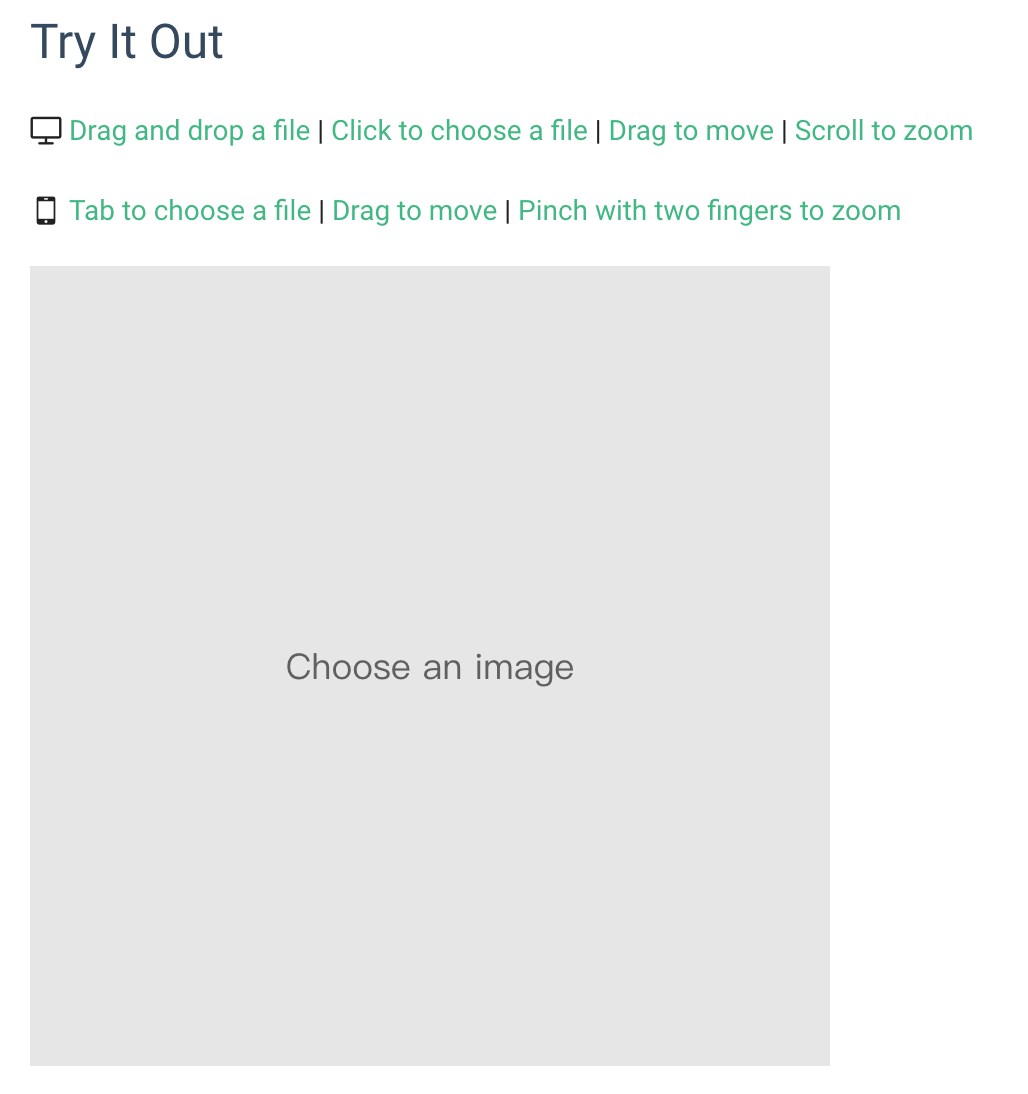
- Mobile-friendly: Supports drag to move and pinch with two fingers to zoom on mobile devices
- EXIF orientation: v0.2.0+ Support correctly show image with EXIF orientation
Browser Support
- IE 10+
- Firefox 3.6+
- Chrome 6+
- Safari 6+
- Opera 11.5+
- iOS Safari 6.1+
- Android Browser 3+
Template Example
<croppa v-model="myCroppa"
        :width="400"
        :height="400"
        :canvas-color="'default'"
        :placeholder="'Choose an image'"
        :placeholder-font-size="0"
        :placeholder-color="'default'"
        :input-accept="'image/*'"
        :file-size-limit="0"
        :quality="2"
        :zoom-speed="3"
        :disabled="false"
        :disable-drag-and-drop="false"
        :disable-click-to-choose="false"
        :disable-drag-to-move="false"
        :disable-scroll-to-zoom="false"
        :disable-rotation="false"
        :prevent-white-space="false"
        :reverse-scroll-to-zoom="false"
        :show-remove-button="true"
        :remove-button-color="'red'"
        :remove-button-size="0"
        :initial-image="'path/to/initial-image.png'"
        @init="handleCroppaInit"
        @file-choose="handleCroppaFileChoose"
        @file-size-exceed="handleCroppaFileSizeExceed"
        @file-type-mismatch="handleCroppaFileTypeMismatch"
        @image-remove="handleImageRemove"
        @move="handleCroppaMove"
        @zoom="handleCroppaZoom"></croppa>
NOTE: This is an almost-full-use example. Usually you don't need to specify so many props, because they all have default values. Most simply, you can even do:
<croppa v-model="myCroppa"></croppa>Method Examples
this.myCroppa.remove()

this.myCroppa.zoomIn()

alert(this.myCroppa.generateDataUrl())
Quick Start
1. Import vue-croppa into your vue.js project.
Using build tools:
npm install --save vue-croppaimport Vue from 'vue'
import Croppa from 'vue-croppa'
Vue.use(Croppa) // If your build tool supports css module
import 'vue-croppa/dist/vue-croppa.css'Not using build tools:
<link href="https://unpkg.com/vue-croppa/dist/vue-croppa.min.css" rel="stylesheet" type="text/css">
<script src="https://unpkg.com/vue-croppa/dist/vue-croppa.min.js"></script>Vue.use(Croppa)2. Now you have it. The simplest usage:
<croppa v-model="myCroppa"></croppa>new Vue({
// ... other vm options omitted
data: {
myCroppa: {}
},
methods: {
uploadCroppedImage() {
this.myCroppa.generateBlob((blob) => {
// write code to upload the cropped image file (a file is a blob)
}, 'image/jpeg', 0.8) // 80% compressed jpeg file
}
}
})Live example: https://jsfiddle.net/jdcvpvty/2/
NOTE:
- Since v0.1.0, you can change the default component name to anything you want.
import Vue from 'vue'
import Croppa from 'vue-croppa'

Vue.use(Croppa, { componentName: 'my-image-cropper' })<my-image-cropper v-model="myCroppa"></my-image-cropper>- Since v0.1.1, you can get the component object with
Croppa.component. This is useful when you want to register the component by yourself manually.
Vue.component('croppa', Croppa.component)// Register async component (Webpack 2 + ES2015 Example). More about async component: https://vuejs.org/v2/guide/components.html#Async-Components
Vue.component('croppa', () => import(Croppa.component))Documentation
🌱 Props
v-model
A two-way binding prop. It syncs an object from within the croppa component with a data in parent. We can use this object to invoke useful methods (Check out "Methods" section).
- type:
object - live example: https://jsfiddle.net/jdcvpvty/2/
width
Display width of the preview container.
- type:
number - default:
200 - valid:
val > 0
height
Display height of the preview container.
- type:
number - default:
200 - valid:
val > 0
placeholder
Placeholder text of the preview container. It shows up when there is no image.
- type:
string - default:
'Choose an image'
placeholder-color
Placeholder text color.
- type: same as what
CanvasRenderingContext2D.fillStyleaccepts. - default:
'#606060'
placeholder-font-size
Placeholder text font size in pixel. When set to 0, the font size will be ajust automatically so that the whole placehoder only takes up 2/3 of the container's width.
- type:
number - default:
0
canvas-color
Initial background color and white space color if there is an image.
- type: same as what
CanvasRenderingContext2D.fillStyleaccepts. - default: before v0.2.0 -
'#e6e6e6'; after v0.2.0 -'transparent'
quality
Specifies how many times larger the actual image is than the container's display size.
- type:
number - default:
2 - valid: `isInteger(val) && val > 0
zoom-speed
Specifies how fast the zoom is reacting to scroll gestures. Default to level 3.
- type:
number - default:
3 - valid:
val > 0
accept
Limits the types of files that users can choose.
- type: same as what
acceptattribute of HTMLinputelement takes. - default:
'.jpg,.jpeg,.png,.gif,.bmp,.webp,.svg,.tiff'
file-size-limit
Limits the byte size of file that users can choose. If set to 0, then no limit.
- type:
number - default:
0
disabled
Disables user interaction.
- type:
boolean - default:
false
disable-drag-and-drop
Disables the default "drag and drop a file" user interaction. You can instead �trigger the file chooser window programmatically by "click to choose" functionality or invoking chooseFile() method.
- type:
boolean - default:
false
disable-click-to-choose
Disables the default "click to choose a file" ("tab" on mobile) user interaction. You can instead �trigger the file chooser window programmatically by "drag and drop" functionality or invoking chooseFile() method.
- type:
boolean - default:
false
disable-drag-to-move
Disables the default "drag to move" user interaction. You can instead move the image programmatically by invoking moveUpwards() / moveDownwards() / moveLeftwards() / moveRightwards() methods.
- type:
boolean - default:
false
disable-scroll-to-zoom
Disables the default "scroll to zoom" user interaction. You can instead zoom the image programmatically by invoking zoomIn() / zoomOut() methods.
- type:
boolean - default:
false
disable-pinch-to-zoom
Disables the default "pinch with two fingers to zoom" user interaction on mobile. You can instead zoom the image programmatically by invoking zoomIn() / zoomOut() methods.
- type:
boolean - default:
false
disable-rotation
(v0.2.0+) Rotation methods won't work if this is set to true
- type:
boolean - default:
false
reverse-zooming-gesture
Deprecated @v0.0.20+ Please use reverse-scroll-to-zoom� instead. The name isn't proper because you can not reverse pinch to zoom.
Reverses the zoom-in/zoom-out direction when scrolling.
- type:
boolean - default:
false
reverse-scroll-to-zoom
Reverses the zoom-in/zoom-out direction when scrolling.
- type:
boolean - default:
false
prevent-white-space
Prevents revealing background white space when moving or zooming the image.
- type:
boolean - default:
false
show-remove-button
Specifies whether to show the built-in remove-button. You can change the button's color and size using the following two props. If you still find it ugly, hide it and use the remove() method to implement your own trigger.
- type:
boolean - default:
false
remove-button-color
Changes the default color of the remove-button. Accepts any css color format.
- type:
string - default:
'red'
remove-button-size
Specifies the remove-button's width and height (they are equal). If set to 0, then it use the default size.
- type:
number - default: default size is ajust accordingly to container's size
initial-image
(v0.1.0+) Set initial image. You can pass a string as the url or an Image object (HTMLImageElement instance). This is an alternative way to set initial image besides using slot. Useful when you want to set cross origin image as initial image.
- type:
stringorobject(HTMLImageElement instance) - default:
undefined
initial-size
(v0.2.0+) works similar to css's background-size. It specifies the image's size when it is first loaded on croppa.
- type:
string - default:
'cover' - valid: one of
'cover','contain','natural'
initial-position
(v0.2.0+) works similar to css's background-position. It specifies the image's position relative to croppa container when it is first loaded.
- type:
string - default:
'center' - valid:
'center'(default value)'30% 40%'(similar to background-position in css)'top''bottom''left''right''top left'or'left top''top right'or'right top''bottom left'or'left bottom''bottom right'or'right bottom'
🌱 Slots
initial
- You can provide an initial image by putting an
<img>node as a named slotinitial. For example:
<croppa v-model="myCroppa">
  <img slot="initial" :src="initialImageUrl" />
</croppa>
NOTE:
- You need to explicitly call
.refresh()method after changing inital image. - If you provide both the slot and
initial-imageprop, the slot will be the one that is used.
placeholder
- If you are not satified with the simple text placeholder. Since v0.3.0, you can apply an
<img>slot namedplaceholderto get an image placeholder! The image will be draw on croppa under the placeholder text when it is empty.
<croppa v-model="myCroppa">
  <img slot="placeholder" src="static/placeholder-image.png" />
</croppa>
NOTE:
- It is recommended to use a small-sized image as the placeholder image.
- The image will be drawn with 100% width and height of croppa container, i.e. it will cover the container. So it is recommended to use a images with the same aspect ratio as the container.
- Find demo "Image Placeholder" in the demo page
🌱 Methods
getCanvas()
- returns the canvas object
getContext()
- returns the canvas context object
getChosenFile()
getActualImageSize()
- Return an object
{ width, height }describing the real image size (preview size* quality)
moveUpwards( amountInPx: number )
moveDownwards( amountInPx: number )
moveLeftwards( amountInPx: number )
moveRightwards( amountInPx: number )
zoomIn()
zoomOut()
rotate(step: number)
- 1 step = 90 deg
- positive number: rotates clockwise
- negative number: rotates counterclockwise.
flipX()
- Horizontally flip image.
flipY()
- Vertically flip image.
chooseFile()
- Opens the file chooser window to Choose an image. Useful when default click-to-choose interaction is disabled.
myCroppa.reset()
- To Be Deprecated This will be deprecated in the future due to misnaming
😅 . Please useremove()instead. - Removes the current image, can be used to implement your own remove-button.
remove()
- Removes the current image, can be used to implement your own remove-button.
refresh()
- Reinitialize the component. Useful when you want to change initial image.
hasImage()
- Return boolean value indicating whether currently there is a image.
generateDataUrl( type: string, compressionRate: number )
- Returns a data-URL containing a representation of the image in the format specified by the
typeparameter (defaults to png). compressionRate(v0.2.0+) defaults to1, you can pass a number between 0 and 1 to get a compressed output image.
generateBlob( callback: function, mimeType: string, compressionRate: number )
- Creates a Blob object representing the image contained in the canvas. Look up argument definition here.
promisedBlob( mimeType: string, compressionRate: number )
- This method returns a
Promisewrapping aroundgenerateBlob(), so that you can useasync/awaitsyntax instead of a callback to get blob data, it's simpler.
const blob = await this.myCroppa.promisedBlob()getMetadata()
- Require v0.3.0+
- Get metadata that describes current user manipulations (moving, zooming, rotating).
var metadata = this.myCroppa.getMetadata()
console.log(metadata)

/* in console
{
  startX:-535.5180530546083,
  startY:-358.0699623303261,
  scale:2.2502626424905396,
  orientation:6
}
*/- Find demo "Use Metadata" in the demo page.
applyMetadata(metadata)
- Require v0.3.0+
- Apply metadata to get to a certain manipulation state (moving, zooming, rotating).
metadatacan have one or more of these 4 properties:startX,startY,scale,orientation. Usually you will use the object returned bygetMetadata().
var metadata = {
  startX:-535.5180530546083,
  startY:-358.0699623303261,
  scale:2.2502626424905396,
  orientation:6
}

this.myCroppa.applyMetadata(metadata)- Find demo "Use Metadata" in the demo page.
supportDetection()
- Return an object indicating browser supports. Like this:
{
  basic: true, // supports basic functionality
  dnd: false // does not support drag and drop
}
🌱 Events
init
- handler(croppa)
croppais a croppa object to invoke methods - same as whatv-modelbinds.
file-choose
- emitted when user choose an image from the poppup window or "drag and drop" a file into the container.
- handler(file)
fileis a file object - same as whatgetChosenFile()returns.
file-size-exceed:
- emitted when the chosen file's size exceeds the limit specified by prop fileSizeLimit.
- handler(file)
fileis a file object - same as whatgetChosenFile()returns.
file-type-mismatch:
- emitted when the chosen file does not match the specified type, which btw is specified using prop
accept. - handler(file)
fileis a file object - same as whatgetChosenFile()returns.
new-image
- emitted when new valid image is set onto croppa (v0.2.0).
image-remove
- emitted when image remove from croppa.
move
zoom
draw
- emitted on every view update (including init, move, zoom, rotate) when it is not empty. It is useful when you want to add attachment on image.
- handler(ctx)
ctxis theCanvasRenderingContext2Dobject for you to draw anything you want on the current image. You can also get it with the methodgetContext().
- Find demo "Attachments" in the demo page.
initial-image-loaded
- emitted when initial image loaded. It can be useful when you provide initial image with the
initial-imageprop.
🌱 Customize styles
- Check out default css styles. You can add more css styles to those selectors to get a different look. Be careful if you try to overwrite existing styles.
- Note that CSS styles will not have any effect on the output image.
Development
1. Fork and clone the repo.
2. Install dependencies.
$ cd vue-croppa
$ npm install
$ cd docs
$ npm install3. Start developing.
# under vue-croppa/
$ npm run dev
# under vue-croppa/docs/
$ npm run devEdit file ./docs/simple-test.html and open http://localhost:3000/simple-test.html to test while developing.
4. Build
# under vue-croppa/
$ npm run build


 React
React
 Typescript
 Django
 Laravel
 Facebook
 Microsoft
 Google
 Alibaba
 D3
D3
 Tencent