Code Monkey home page Code Monkey logo

at-ui's Introduction

AT UI

NPM david-dm travis

AT-UI is a modular front-end UI framework for developing fast and powerful web interfaces based on Vue.js.

中文 README

Features

  • Based on Vue
  • A npm + webpack + babel front-end development workflow
  • Support ES2015
  • CSS Style independent, make consistent user interfaces (See: AT-UI-Style)
  • Friendly API

Environment Support

Links

Install

  • Recommended use npm
npm install at-ui
  • Or using <script> tag for global use
<script type="text/javascript" src="at.min.js"></script>

Usage

Because the style of AT-UI is independent. It's a separate project. So we should install AT-UI-Style in need before we use AT-UI. Use npm or script tag according to your preference.

npm install at-ui-style

or

<link rel="stylesheet" href="at.min.css" />

Contribution

Finding bugs, sending pull requests or improving our docs - any contribution is welcome and highly appreciated. To get started, head over to our contribution guidelines. Thanks!

License

MIT

at-ui's People

Contributors

atinux avatar calvin92 avatar changjoo-park avatar diego-lipinski-de-castro avatar fritx avatar jchehe avatar kayvanmazaheri avatar koppthe avatar lukasdrgon avatar stevenyuysy avatar thejaredwilcurt avatar thomaslener avatar void-soul avatar yoyo837 avatar

Stargazers

 avatar  avatar  avatar  avatar  avatar  avatar  avatar  avatar  avatar  avatar  avatar  avatar  avatar  avatar  avatar  avatar  avatar  avatar  avatar  avatar  avatar  avatar  avatar  avatar  avatar  avatar  avatar  avatar  avatar  avatar  avatar  avatar  avatar  avatar  avatar  avatar  avatar  avatar  avatar  avatar  avatar  avatar  avatar  avatar  avatar  avatar  avatar  avatar  avatar  avatar  avatar  avatar  avatar  avatar  avatar  avatar  avatar  avatar  avatar  avatar  avatar  avatar  avatar  avatar  avatar  avatar  avatar  avatar  avatar  avatar  avatar  avatar  avatar  avatar  avatar  avatar  avatar  avatar  avatar  avatar  avatar  avatar  avatar  avatar  avatar  avatar  avatar  avatar  avatar  avatar  avatar  avatar  avatar  avatar  avatar  avatar  avatar  avatar  avatar  avatar

Watchers

 avatar  avatar  avatar  avatar  avatar  avatar  avatar  avatar  avatar  avatar  avatar  avatar  avatar  avatar  avatar  avatar  avatar  avatar  avatar  avatar  avatar  avatar  avatar  avatar  avatar  avatar  avatar  avatar  avatar  avatar  avatar  avatar  avatar  avatar  avatar  avatar  avatar  avatar  avatar  avatar  avatar  avatar  avatar  avatar  avatar  avatar  avatar  avatar  avatar  avatar  avatar  avatar  avatar  avatar  avatar  avatar  avatar  avatar  avatar  avatar  avatar  avatar  avatar  avatar  avatar  avatar

at-ui's Issues

Collapse menu on smaller screens

It would be great if it could become possible to collapse the menu into a burger-like menu when the visitor is on smaller screens.

at-menu weird click:after behaviour and router-links not working in dev-env

I have the following code and made a gif to show my problem.

bug_menu

1.) The wrong menu-items get highlighted. Seems like a 2 menu-item delay
2.) Router-Links (at-menu router) aren't working in dev environment - only in after bundling in prod.
3.) Before that I've used the router feature - <router-link><at-menu-item></at-menu-item></router-link> which resolved the 1st Problem and reverse the 2nd - links worked in dev but not in prod.

`

        <div class='nav-left'>
            <router-link :to="{ path: '/' }"><img class="header-logo" src="./../../assets/logo_noborder.png"></router-link>
            <at-menu-item :to="{ path: '/sponsors' }" name="1" class="general-menu-one"><i class="icon icon-award"></i>Sponsors</at-menu-item>
            <at-menu-item :to="{ path: '/users'}" name="2" class="general-menu-two"><i class="icon icon-users"></i>Users</at-menu-item>
        </div>
        <div  class='nav-right'>
                <div v-if="isAuthenticated" class="nav-right-user">
                    <at-submenu router>
                        <template slot="title"><i class="icon icon-user">User</i></template>
                        <at-menu-item :to="{ path: '/user/' + currentUserName }" name="1" class="usermenu-item-three"><i class="icon icon-home"></i>Profile</at-menu-item>
                        <at-menu-item :to="{ path: '/balance'}" name="2" class="usermenu-item-two"><i class="icon icon-layers"></i>Balance</at-menu-item>
                        <at-menu-item :to="{ path: '/settings'}" name="3" class="usermenu-item-three"><i class="icon icon-settings"></i>Settings</at-menu-item>
                        <at-menu-item v-on:click.native="logout()" :to="{ path: '/logout'}" name="6" class="usermenu-item-four"><i class="icon icon-log-out"></i>Logout</at-menu-item>
                    </at-submenu>    
                </div>
                <div v-if="!isAuthenticated" class="nav-right-login">
                    <at-button class="btn btn-apply" @click="login()">Login</at-button>
                </div>
        </div>
        </at-menu>`

Would appreciate help on that - thank you :)

AT-UI Components Causing Issues

This is one example
<at-input v-model="inputValue" placeholder="Please input"></at-input>
On initial load, it is working fine but when we are visiting any dead URL and going back from the page, all issues are popping up (due to AT-UI components).

We tried to use few components and it is throwing error in the console

  1. Error while initializing app RangeError: Maximum call stack size exceeded
  2. Property or method "inputValue" is not defined on the instance but referenced during render. Make sure that this property is reactive, either in the data option, or for class-based components, by initializing the property
    3.TypeError: Cannot read property '$options' of undefined

Active tab

Hey guys,

Thanks for the great work. I've been playing around with the library and got stuck trying to activate a given tab pane on load. Is there a way to do this via props or should I just use the active tab class?

Thanks!

Using native built-in type attribute names - `at-button`

Hi,
Just wanted to point, the type attribute of native button is a closed list:
https://developer.mozilla.org/en-US/docs/Web/HTML/Element/button#Attributes
and has a special meaning, even in a text-based browsers:
https://www.cs.bu.edu/teaching/unix/lynx/

The at-button binds type property into native button property/attr. Hence the at-button of defult type:

<at-button type="primary">Primary Button</at-button>

translates to:

<button data-v-4352c070="" type="default" class="at-btn at-btn--default" data-v-a01f69b8="">
...
</button>

which seems fine, but is wrong, as default (and presumed) type is a button type
while the others are custom, library specific domain language terms:

<at-button type="text">Text Button</at-button>

becomes button with:

type='text'

The text is not a correct attribute by specs.

The pick of domain specific translation for a native term seems to prevents me from using builtin native feature like using cancel or submit types of buttons to use some built-in native behaviours in the browsers.

Let me know if you want a help with this,

Thanks!

Getting error because of AT - UI Component [NUXT]

I am getting the following error when we are using AT UI input component on NUXTJS framework:
[nuxt] Error while initializing app InternalError: too much recursion
Stack trace:
_traverse@http://localhost:8080/_nuxt/common.2bf36607221e21f9dbc9.js:6095:7
_traverse@http://localhost:8080/_nuxt/common.2bf36607221e21f9dbc9.js:6112:19
_traverse@http://localhost:8080/_nuxt/common.2bf36607221e21f9dbc9.js:6108:19
_traverse@http://localhost:8080/_nuxt/common.2bf36607221e21f9dbc9.js:6112:19

Here is my component code:

<template>
   <div class="eSubscribe">
            <a href="javascript:void(0)" class="subTxt" :class="{'hide':ishide}" @click.prevent="showEmail"><i class="icon icon-mail"/> Subscribe to New Offers</a>
            <div class="emailForm" :class="{'collapsed': iscollapsed}">
              <at-input size="large" placeholder="Enter your Email ID" append-button>
                <div slot="append">
                  <span>Subscribe</span>
                </div>
              </at-input>
            </div>
          </div>
</template>

<script>
	export default {
	  data () {
    return {
      ishide: false,
      iscollapsed: false
    }
  },
  methods: {
    showEmail () {
      this.ishide = !this.ishide
      this.iscollapsed = !this.iscollapsed
    }
	  }
	}
</script>

Update

Is the framework still getting updates? I see future in this but its buggy in some things and misses components, wish i had time to support

.flex-center text-align

Because .flex-center class has text-align: center style children elements (like select) break:

token 2017-09-07 10-35-46

单个组件引用报错

Steps to reproduce

  1. 按照quickstart 初始化项目
    vue init at-ui/at-template my-project
  2. 在main.js中注释掉 全局引用
import Vue from 'vue'
import App from './App.vue'
import 'at-ui-style'
// import AtUI from 'at-ui'

// Vue.use(AtUI)

new Vue({
  el: '#app',
  ...App
})
  1. 在App.vue页面将示例代码拷上去
import { AtInput } from 'at-ui'

export default {
  components: {
    AtInput
  },
  data () {
    return {
      value: 'O2Team'
    }
  }
}
<template>
  <div>
    <at-input v-model="value" placeholder="请输入..."></at-input>
  </div>
</template>

Which browser?

chrome 版本 62.0.3202.94(正式版本) (32 位)

What is expected?

显示input

What is actually happening?

console报错
vue.esm.js?efeb:574 [Vue warn]: Unknown custom element: - did you register the component correctly? For recursive components, make sure to provide the "name" option.

Reproduction Link

Where is 'at-ui-style'

When i run npm i, it report error like this:
ERROR in ./docs/main.js
Module not found: Error: Can't resolve 'at-ui-style' in 'D:\source-control\git\at-ui\docs'

at-modal

Hi. Some issues with the at-modal components. How can I prevent the modal from closing automatically when I click the confirm button? Is there a method I can call to programmatically close it? Would also be nice to see if there are methods to be able to detect when modal is open and when modal is closed. Maybe like an onShow and onHide.

Dropdown 组件 demo 有 bug

重现路径

Dropdown 下拉菜单 -> 激活的方式 -> 点击Click 菜单 -> 点击某个选项,Dropdown 没有关闭

期望方式

点击某个选项后,应该能正常关闭 Dropdown

Table filters

I would like to make a PR for table filters, but first I would like to know which kind of filters people would like to use in at-table.

  1. Is a search bar for filtering a good idea? I wouldn`t like to scape the table scope for first, but if useful thats a thing to consider.
  2. Basic filters -> give options.
  3. Complex filters -> give options.

Thoughts on front-end and back-end sorting? I guess front-end only for now or give options to the developer/user?

Some egs.: the most generic example: age column, filter and show only rows with age over 38, or between age X and Y. Tags filter like ElementUI table is a thing to consider too, its so useful. Date filter.

Obs.: I won`t overload the table element as well so, go light. I pretend to start after discussing and getting thoughts on this, specially by @koppthe

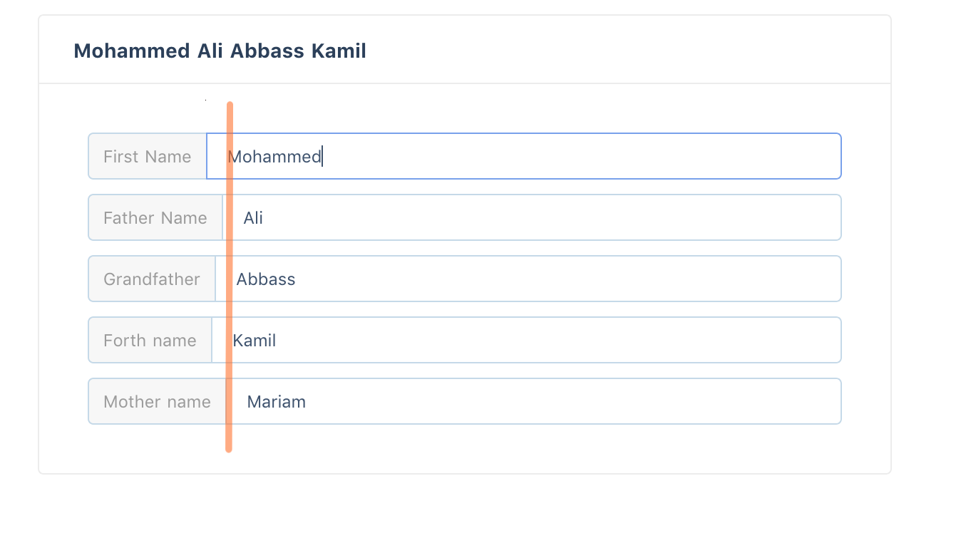
Pre / Post Label alignment

Hello dears,
is it possible to align the pre-label input as shown in the orange line of the image below?

screen shot 2017-11-15 at 21 45 51

and thanks for your lovely UI framework :)

slider do not work with deep model

for the slider component, if I use it in this way:

<at-slider v-model="states[participator.uid].volume"></at-slider>

then I won't be able to change its value.

menu is laggy

Is there a reason why the "Side Inline Navigator" toggling sooo laggy? Ive tested it in many pcs and its quite annoying :/

Setting width option on Loading Bar doesn't work and throws Vue warning

Setting the loading bar width via the config doesn't change the height, it remains at 2px.

When calling any of the triggers for the loading bar i.e this.$Loading.error() Vue emits the following console warning:
[Vue warn]: The data property "width" is already declared as a prop. Use prop default value instead.
This happens regardless if the width was set via .config() or not.

Steps to reproduce:

this.$Loading.config({
    width: 4,
});

this.$Loading.start();

Versions:
Vue: 2.4.3,
at-ui: 1.2.0-beta.2

At-modal property showClose=false not working

Customizable modal have a property showClose which have default value true. After passing value false is still showing cancel button.

Copied just example from the documentation.

Steps to reproduce

Which browser?

Google Chrome
"at-ui": "^1.3.0",
"at-ui-style": "^1.5.0",
"vue": "^2.5.8",
"vue-router": "^2.8.1",
"vuex": "^3.0.1"

What is expected?

After passing showClose=False, close button shouldn't be visible in modal

Best Regards,
Andrzej

[at-button] couple of features about at-button

1.add full width property
(I know at-button can be add custom class but I think it should have)

2.disabled property should depend on params to control it
(I don't find disabled property in document)

SyntaxError: Invalid or unexpected token => @charset "UTF-8";

I am using Nuxt.js, and used its boilerplate to build the Nuxt.js template.
This is the problem I am getting after importing import 'at-ui-style' code.

nuxt:render Rendering url / +3m
[vue-router] Failed to resolve async component default: SyntaxError: Invalid or unexpected token
[vue-router] uncaught error during route navigation:
/Users/bluemix/Odoo_OpendEduCat/auc_nuxtjs/node_modules/at-ui-style/css/at.css:1
(function (exports, require, module, __filename, __dirname) { @charset "UTF-8";
                                                              ^

SyntaxError: Invalid or unexpected token
    at createScript (vm.js:80:10)
    at Object.runInThisContext (vm.js:139:10)
    at Module._compile (module.js:576:28)
    at Object.Module._extensions..js (module.js:623:10)
    at Module.load (module.js:531:32)
    at tryModuleLoad (module.js:494:12)
    at Function.Module._load (module.js:486:3)
    at Module.require (module.js:556:17)
    at require (internal/module.js:11:18)
    at r (/Users/bluemix/Odoo_OpendEduCat/auc_nuxtjs/node_modules/vue-server-renderer/build.js:7758:16)
    at Object.<anonymous> (server-bundle.js:3839:18)
    at __webpack_require__ (server-bundle.js:27:30)
    at Object.68 (pages/index.4d0ebf856b8182389e7a.js:85:70)
    at __webpack_require__ (server-bundle.js:27:30)
    at Object.62 (pages/index.4d0ebf856b8182389e7a.js:9:288)
    at __webpack_require__ (server-bundle.js:27:30)

and thanks for your great project 🙂

【at-table】支持递归表头

例如 column 里传的参数是

columns: [
  {
    title: '姓名',
    key: 'name'
  },
  {
    title: '年龄',
    key: 'age'
  },
  {
    title: '地址',
    key: 'address',
    children: [
      {
        title: '省份',
        key: 'province'
      },
      {
        title: '城市',
        key: 'city'
      }
    ]
  }
]

理论上应该可以渲染两级表格的表头。

Dispatch "Notify" from outside a component context

Hello, is there a way to launch a "Notify" without being inside a component context? I'm implementing a login page and I want to launch a "Notify" at any given time, but I'm out of a component context, thanks for the help right away!

<at-table...>, Insert 'Edit' link, filter table

Hi there

I just started to check out AT-UI and I like it very much so far! I just got two things I'm missing from the documentation:

  • Is there any way to display links inside a table? I got an array of JSON objects that make up the table data. I would like to add a column "Edit" for each entry that will route to an edit component when clicked. I didn't find that possibilty so far?
  • Is there any way to have filters for each column of a table?

Best regards

Responsive grid must be mobile first

Hi!

In my case i need 24-col width on xs screen, 18-col width on sm screen and 12-col width on md screen.

<div class="row at-row flex-center">
  <div class="col-xs-24 col-sm-18 col-md-12"></div>
</div>

But sm always override xs:

token 2017-09-07 10-26-47

It happens because max-width media query used.

【MISTAKE】

在Menu的标签闭合处标签没匹配是不是个手误?
image

Support SSR

Hi!

Great work on this UI library 🎉

I tried with Nuxt.js but it seems that it does not support SSR, do you plan to support it? It should not be too hard, just making sure that window is used only if not defined.

keyup event does not work with at-input

I have following code, a standard input and an at-input:

<input v-on:keyup.enter="login"></input> <at-input v-model="topic" placeholder="topic of talk" size="large" v-on:keyup.enter="login"> <template slot="prepend"> <span>{{ topicPrepend }}</span> </template> <at-input>

the keyup event is fired on the standard input, but not on the at-input.

.gitmodules is using SSH protocol instead of HTTPS

HTTPS is friendly to users when SSH key is not yet configured. I got following errors:

Please make sure you have the correct access rights
and the repository exists.
fatal: clone of '[email protected]:at-ui/at-ui-style.git' into submodule path '/Volumes/DevelopOnly/Demo/at-ui/src/stylesheet' failed
Failed to clone 'src/stylesheet'. Retry scheduled
Cloning into '/Volumes/DevelopOnly/Demo/at-ui/src/stylesheet'...
Permission denied (publickey).
fatal: Could not read from remote repository.

Import On Demand doesn't work

The docs at https://at-ui.github.io/at-ui/#/en/docs/quickstart says I can import on demand like this:
import { AtInput } from 'at-ui' but AtInput is not exported, the correct is Input.

But even if I try to import just Input, it returns undefined:

import AtUI, {Input} from 'at-ui'
console.log('AtUI.Input:', AtUI.Input) // ok
console.log('Input:', Input) // undefined

Steps to reproduce

vue init at-ui/at-template at-ui-bug
cd at-ui-bug
yarn
yarn dev
// add above lines to src/index.js

Calendar view

hello dears,
is there any possibility of having a calendar view in AT UI?
thanks :)

inputNumber buttons alignment

Steps to reproduce

When you hover on inputNumber component, the buttons appear on right, but if you try to increase o decrease values with these buttons, they appear that invrease button is high than decrease button.

Which browser?

Chrome 62

What is expected?

Seems that when hover over these buttons, an effect increase the button selected, but the size on increase and the size on decrease need to be the same.

What is actually happening?

The size of the buttons on hover are different. Size on increase button are greater that size on decrease button.

Reproduction Link

Easy to see only in the examples on your page.

[Components] Component Wish List

At present, there are not enough components in AT-UI, and there are still many details that need to be improved.
If you wish new components be added to the next version, please reply in this issue, thank you!

Schedule

  • TimePicker
  • DatePicker
  • Form

Done

Release

  • Sidebar
  • Table
  • Tabs
  • Steps
  • Rate
  • Collapse
  • Card
  • Timeline

Recommend Projects

  • React photo React

    A declarative, efficient, and flexible JavaScript library for building user interfaces.

  • Vue.js photo Vue.js

    🖖 Vue.js is a progressive, incrementally-adoptable JavaScript framework for building UI on the web.

  • Typescript photo Typescript

    TypeScript is a superset of JavaScript that compiles to clean JavaScript output.

  • TensorFlow photo TensorFlow

    An Open Source Machine Learning Framework for Everyone

  • Django photo Django

    The Web framework for perfectionists with deadlines.

  • D3 photo D3

    Bring data to life with SVG, Canvas and HTML. 📊📈🎉

Recommend Topics

  • javascript

    JavaScript (JS) is a lightweight interpreted programming language with first-class functions.

  • web

    Some thing interesting about web. New door for the world.

  • server

    A server is a program made to process requests and deliver data to clients.

  • Machine learning

    Machine learning is a way of modeling and interpreting data that allows a piece of software to respond intelligently.

  • Game

    Some thing interesting about game, make everyone happy.

Recommend Org

  • Facebook photo Facebook

    We are working to build community through open source technology. NB: members must have two-factor auth.

  • Microsoft photo Microsoft

    Open source projects and samples from Microsoft.

  • Google photo Google

    Google ❤️ Open Source for everyone.

  • D3 photo D3

    Data-Driven Documents codes.