Code Monkey home page Code Monkey logo

doing-bayesian-data-analysis-in-brms-and-the-tidyverse's Introduction

Doing Bayesian data analysis in brms and the tidyverse

DOI

Kruschke began the second edition of his text like this: "This book explains how to actually do Bayesian data analysis, by real people (like you), for realistic data (like yours)" (2015, p. 1). In the same way, this ebook is designed to help those real people do Bayesian data analysis. My contribution is converting Kruschke's JAGS code for use in Bürkner's brms package for fitting Bayesian regression models in R using Hamiltonian Monte Carlo. I also prefer plotting and data wrangling with the packages from the tidyverse. So we'll be using those methods, too.

This ebook is not meant to stand alone. It's a supplement to the second edition of Kruschke's Doing Bayesian data analysis: A tutorial with R, JAGS, and Stan. I follow the structure of his text, chapter by chapter, translating his analyses into brms and tidyverse code. However, the content herein departs at times from the source material. Bayesian data analysis with Hamiltonian Monte Carlo is an active area in terms of both statistical methods and software implementation. There are also times when my thoughts and preferences on Bayesian data analysis diverge a bit from Kruschke's. In those places of divergence, I often provide references and explanations.

The current 1.1.0 version is a full draft in the sense that it contains brms versions of all of Kruschke's JAGS and Stan models, excluding examples that are not possible with the brms paradigm. A few minor issues remain, which you can read about in the Issues section. You can find guidelines for contributing to this ebook in the Contributing section.

doing-bayesian-data-analysis-in-brms-and-the-tidyverse's People

Contributors

askurz avatar

Stargazers

 avatar  avatar  avatar  avatar  avatar  avatar  avatar  avatar  avatar  avatar  avatar  avatar  avatar  avatar  avatar  avatar  avatar  avatar  avatar  avatar  avatar  avatar  avatar  avatar  avatar  avatar  avatar  avatar  avatar  avatar  avatar  avatar  avatar  avatar  avatar  avatar  avatar  avatar  avatar  avatar  avatar  avatar  avatar  avatar  avatar  avatar  avatar  avatar  avatar  avatar  avatar  avatar  avatar  avatar  avatar  avatar  avatar  avatar  avatar  avatar  avatar  avatar  avatar  avatar  avatar  avatar  avatar  avatar  avatar  avatar  avatar  avatar  avatar  avatar  avatar  avatar  avatar  avatar  avatar  avatar  avatar  avatar  avatar  avatar  avatar  avatar  avatar  avatar  avatar  avatar  avatar  avatar  avatar  avatar  avatar  avatar  avatar  avatar  avatar  avatar

Watchers

 avatar  avatar  avatar  avatar  avatar  avatar

doing-bayesian-data-analysis-in-brms-and-the-tidyverse's Issues

flextable()

Consider updating the book with flextable()-based tables. For example, here's how you might add in Table 5.2 (currently missing from the ebook):

# packages
library(tidyverse)
library(janitor)
library(flextable)

# load the data
d <- read_csv("data.R/HairEyeColor.csv")

# make the table
d %>%
  uncount(weights = Count, .remove = F) %>% 
  # the next 4 lines are from the janitor package
  tabyl(var1 = Eye, var2 = Hair) %>% 
  adorn_percentages(denominator = "all") %>% 
  adorn_totals(where = c("row", "col")) %>% 
  adorn_rounding(digits = 2) %>% 
  # data.frame() %>%  # same with or without
  rename(`Eye color` = Eye) %>% 
  # the remaining lines are from the flextable package
  flextable() %>% 
  hline(i = 4) %>% 
  vline(j = 5, part = "body") %>% 
  add_header_row(
    values = c("", "Hair color", ""),
    colwidths = c(1, 4, 1)) %>% 
  hline(
    i = 1,
    j = c(1, 6),
    border = fp_border_default(width = 0), 
    part = "header") %>% 
  align(
    i = 1, 
    j = 2:5,
    align = "center",
    part = "header"
  ) %>% 
  width(width = 0.8)
Screenshot 2024-01-02 at 9 34 23 AM

Suggestion: Using the faux package for data simulations

Hi @ASKurz

I recently found the faux package by Lisa DeBruine and I think since it makes data simulation pretty easy, it could be a good replacement for other methods of data simulations. But if it does not fit in the book, please simply ignore this issue.

Here, I used this package for section 12.1.3 in chapter 12 of your book. To simulate correlated parameters you have used MASS::mvrnorm() as follow:

# first we'll make a correlation matrix
# a correlation of .9 seems about right
correlation_matrix <- 
  matrix(c(1, .9, 
           .9, 1), 
         nrow = 2, ncol = 2)

# next we'll specify the means and standard deviations
mu <- c(.58, .42)
sd <- c(.1, .1)

# now we'll use the correlation matrix and standard deviations to make a covariance matrix
covariance_matrix <- 
  sd %*% t(sd) * correlation_matrix

# after setting our seed, we're ready to simulate
set.seed(12)
d <- 
  MASS::mvrnorm(n = 1000, 
                mu = mu, 
                Sigma = covariance_matrix) %>%
  as_tibble() %>%
  set_names(str_c("theta[", 1:2, "]"))


# this time we'll make the correlations -.9
correlation_matrix <- 
  matrix(c(1, -.9, 
           -.9, 1), 
         nrow = 2, ncol = 2)

# we'll have to redo the covariance matrix
covariance_matrix <- 
  sd %*% t(sd) * correlation_matrix

# here's the updated data
set.seed(1)
d <- MASS::mvrnorm(n = 1000, mu = mu, Sigma = covariance_matrix) %>%
  as_tibble() %>%
  set_names(str_c("theta[", 1:2, "]"))

Now, all of the codes above can be replaced with:


library(faux)

d_positive <- rnorm_multi(
  n = 1000,
  mu = c(.58, .42),
  sd = c(.1,.1), 
  r = c(.9), 
  varnames = list('theta[1]','theta[2]')
)


d_negative <- rnorm_multi(
  n = 1000,
  mu = c(.58, .42),
  sd = c(.1,.1), 
  r = c(-.9), 
  varnames = list('theta[1]','theta[2]')
)

And, let's see if I translated the codes correctly. Here, I recreated the plots in that section using similar codes:

hist_plot_positive <- d_positive %>% 
  mutate(`theta[1]-theta[2]` = `theta[1]` - `theta[2]`) %>% 
  gather() %>% 
  ggplot(aes(x = value, y = 0)) +
  stat_histinterval(point_interval = mode_hdi, .width = .95,
                    fill = 'skyblue', color = 'black',
                    breaks = 30, normalize = "panels") +
  scale_y_continuous(NULL, breaks = NULL) +
  xlab(expression(theta)) +
  facet_wrap(~ key, scales = "free_y", labeller = label_parsed) +
  theme_classic()


corr_plot_positive <- d_positive %>%
  ggplot(aes(x = `theta[1]`, y = `theta[2]`)) +
  geom_abline(color ='black', linetype = 'dashed') +
  geom_point(size = 1.5, color ='skyblue', alpha = 1/4) +
  scale_x_continuous(expression(theta[1]), breaks = 0:5 / 5, 
                     expand = expansion(mult = 0), limits = c(0, 1)) +
  scale_y_continuous(expression(theta[2]), breaks = 0:5 / 5, 
                     expand = expansion(mult = 0), limits = c(0, 1)) +
  coord_equal() + theme_classic()


hist_plot_negative <- d_negative %>% 
  mutate(`theta[1]-theta[2]` = `theta[1]` - `theta[2]`) %>% 
  gather() %>% 
  ggplot(aes(x = value, y = 0)) +
  stat_histinterval(point_interval = mode_hdi, .width = .95,
                    fill = 'skyblue', color = 'black', 
                    breaks = 30, normalize = "panels") +
  scale_y_continuous(NULL, breaks = NULL) +
  xlab(expression(theta)) +
  facet_wrap(~ key, scales = "free_y", labeller = label_parsed) +
  theme_classic()


corr_plot_negative <- d_negative %>%
  ggplot(aes(x = `theta[1]`, y = `theta[2]`)) +
  geom_abline(color ='black', linetype = 'dashed') +
  geom_point(size = 1.5, color ='skyblue', alpha = 1/4) +
  scale_x_continuous(expression(theta[1]), breaks = 0:5 / 5, 
                     expand = expansion(mult = 0), limits = c(0, 1)) +
  scale_y_continuous(expression(theta[2]), breaks = 0:5 / 5, 
                     expand = expansion(mult = 0), limits = c(0, 1)) +
  coord_equal() + theme_classic()


simulation_plot <- (hist_plot_positive + corr_plot_positive) / (hist_plot_negative + corr_plot_negative) 
simulation_plot 

And this gives us this beautiful plot:

simplot

For those who are interested in this package, here is a good starting point.

If this is what you want to add to the book, I am happy to translate any simulation code to faux commands while I am reading your book. Not sure how many instances of simulations are there (I am currently reading the stan chapter), but I can post all the codes here, if that helps.

ggparty

Use the ggparty package to approximate Kruschke's formula figures. See the "ggparty" folder in dropbox.

AtBats not used in making Figure 19.7

Thanks for this excellent resource! Minor suggestion:

When making Figure 19.7, there's a bunch of discussion about picking appropriate values of AtBats. An AtBats column is necessary for fitted.brmsfit( ) to run, but since we're asking for scale="linear", the value of AtBats is not actually used (changing its values produced identical output). So, the discussion of choosing AtBats here is a bit of a red herring.

A fix would be to say

To make our version of Figure 19.7, we’ll have to switch gears from player-specific effects to those specific to positions averaged over individual players. The fitted() approach will probably make this the easiest. To do this, we'll need to specify values for AtBats, but this number won't actually be used, since we're asking for fitted values of the linear predictors ( with scale="linear").

and then make the AtBats all equal to 1.

where's the variance at?

24.3. The end of this section might be a natural place to compare level-2 variance parameters. Consider computing percent-of-total-variance distributions for all three level-2 variances for fit2. These would need to be in a sigma^2 metric, like as in an ICC. W/r/t the constrained model, fit3, you could demonstrate how the posterior for sigma_{a:b} was clearly not zero.

geom_area()

When plotting a density, convert the instances done with geom_ribbon() to geom_area(), which only requires an x and y aesthetic.

stat_beedrill()

In Chapter 20, adjust stat_beedrill() to have a small space between the bottom of the slab and the pointinterval. You can find strategies for this at mjskay/ggdist#93.

Typo 25.4.1

Within cens() we inserted our nominal variable, cens1

to

Within cens() we inserted our nominal variable, cen1

Thanks a lot for the book!

warmup

In the burnin/warmup discussion of 7.5.1, consider introducing the ggmcmc::ggs() function, which will pull the posterior draws with warmup.

typos in bookdown

  • 6.3.1, "Here are the mean calculations from the last paragraph on page [133]."

fit24.1$data <- NULL

In Section 25.1.3, I provide a quick way to remove data from a brm() fit object:

fit24.1$data <- NULL

This doesn't seem to work properly any more. Investigate.

Conditional logistic models

In Section 22.3.3.2, Conditional logistic model, Kruschke worked through a couple conditional logistic regression models using JAGS. He provided the statistical motivation earlier in Section 22.2, Conditional logistic regression.

The conditional logistic regression models are not natively supported in brms at this time. However, if you follow issue #560 in the brms GitHub repo, you'll see there are ways to fit them using the nonlinear syntax. If you compare the syntax Bürkner used in that thread on January 30 to the JAGS syntax Kruschke showed on pages 661 and 662, you'll see they appear to follow contrasting parameterizations.

I don’t have the current chops to work this through. If you know how to reproduce Kruschke’s results using brms, please share your code.

Please use `linewidth` instead

This is largely fixed. However, two main types of cases remain:

  • The linewidth parameter isn't fully supported by tidybayes and ggdist, yet. Based on GitHub (see here), it looks like this will be fixed in the next release of ggdist.
  • There are a few cases where I used scale_size_manual(), which should be replaced by scale_linewidth_manual(). However, there was a goof and the current version of ggplot2 doesn't have an option for scale_linewidth_manual() (see here). I'm hoping this will be fixed in the next release of ggplot2.

new section

blah blah

Cohen's d

Add in Cohen’s d talk as a bonus section at the end of Chapter 19. Work through an example of a simple univariable model.

Alternatives to Kruschke's 3D wireframe plots

In several places in the text, Kruschke combines conventional 2D densities with 3D wireframe plots. Here's an example from page 167 (Figure 7.5):

Screen Shot 2021-04-15 at 9 21 30 AM

The 2D plots in the right column are easy enough. However, ggplot2 does not currently support 3D plots and my suspicion is it never will. I am aware of two potential alternatives:

  • the ggrgl package offers a variety of 3D geoms designed to seamlessly extend conventional ggplots. The difficulty is, it does not appear the 3D plots made from this framework can be easily combined with conventional 2D ggplots, as with patchwork syntax.
  • the rayshader package offers an expansive framework for all kinds of 3D visualizations. Part of that framework includes the plot_gg() function, into which one can insert a saved ggplot to be transformed to a 3D plot. However, it appears that these results cannot be saved as objects (e.g., p2 <- plot_gg(p1)) for combination with other plots, as with patchwork syntax.

I require a solution that allows one to make 3D density plots which can be combined with other conventional 2D plots. Ideally, this would be by saving individual plots as objects which could be combined with simple patchwork syntax. I'm open to ideas outside of the patchwork framework, but the basic requirement is there must be a way to combine multiple plots into a grid which can be displayed in a rendered bookdown ebook.

Use patchwork

For combining plots, switch from gridExtra::grid.arrange() to the patchwork package.

  • 16.2.1, fourth block
  • 16.2.2, seventh (i.e., second to last) block
  • 20.1.1, in the prose after the first AND second blocks and in the third block
  • 20.2.4, in the prose after the second block

Figure 11.10

In Section 11.3.1, CI depends on intention, Kruschke presented several NHST simulations. I believe I have the ones he presented in Figures 11.8 and 11.9 correct. But I believe my attempt at Figure 11.10 is not quite right. From the text, we read:

We can determine the CI for the experimenter who intended to stop when a fixed duration expired. Figure 11.10 shows the sampling distribution for different values of θ. The upper row shows the case of θ = 0.135, for which the sampling distribution has p = 2.5%. If θ is nudged any smaller, p is less than 2.5%, which means that smaller values of θ can be rejected. The lower row of Figure 11.9 shows the case of θ = 0.497, for which the sampling distribution has p = 2.5%. If θ is nudged any larger, p falls below 2.5%, which means that larger values of θ can be rejected. In summary, the range of θ values we would not reject is θ ∈ [0.135, 0.497]. This is the 95% CI when z = 7 and N = 24, for a data collector who intended to stop when time expired. (p. 320)

Kruschke's Figure 11.10 looks like this:
Screen Shot 2020-02-16 at 10 55 15 AM

I played around with the simulation a bit, but the version in my bookdown project is still a bit off. [And to be clear, I'm only focusing on the right panels, here.] If you have a solution that more faithfully reproduces what Kruschke did, please share your code. If at all possible tidyverse-oriented workflows are preferred.

Figure 11.11

In Section 11.3.1, CI depends on intention, Kruschke presented several NHST simulations. In the previous issue, we focused on my difficulty with Figure 11.10. I believe my attempt at Figure 11.11 is not quite right, too. From the text, we read:

We can determine the CI for the experimenter who intended to test two coins, with a fixed N for both coins. Figure 11.11 shows the sampling distribution for different values of θ. The upper row shows the case of θ = 0.110, for which the sampling distribution has p = 2.5%. If θ is nudged any smaller, p is less than 2.5%, which means that smaller values of θ can be rejected. The lower row of Figure 11.11 shows the case of θ = 0.539, for which the sampling distribution has p = 2.5%. If θ is nudged any larger, p falls below 2.5%, which means that larger values of θ can be rejected. In summary, the range of θ values we would not reject is θ ∈ [0.110, 0.539]. This is the 95% CI when z = 7 and N = 24, for a data collector who intended to test two coins and stop when N reached a fixed value. (pp. 312--322)

Figure 11.11 looks like this:
Screen Shot 2020-02-16 at 11 02 46 AM

If you have the chops to reproduce Kruschke's simulation and plot, please share your code. If at all possible tidyverse-oriented workflows are preferred.

Figures 4.2 and 4.3

Figures 4.2 and 4.3 need an overhaul. The discretizing methods aren't the best, and they're plain wrong for the first half of Figure 4.2. Also, it's now clear how to use patchwork to add in the arrows between the panels.

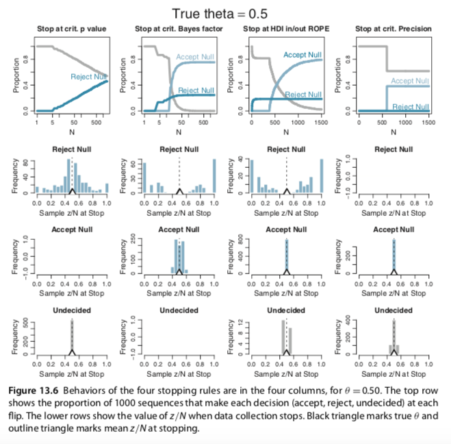
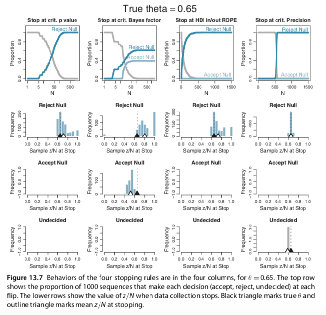
Figures 13.6 and 13.7

In Section 13.3.2, Average behavior of sequential tests, Kruschke presented simulations of outcomes based on various stopping rules (p-values, Bayes factors, and so on). From the text, we read:

The plots in Figures 13.6 and 13.7 were produced by running 1000 random sequences like those shown in Figures 13.4 and 13.5. For each of the 1000 sequences, the simulation kept track of where in the sequence each stopping rule would stop, what decision it would make at that point, and the value of z/N at that point. Each sequence was allowed to continue up to 1500 flips. Figure 13.6 is for when the null hypothesis is true, with θ = 0.50. Figure 13.7 is for when the null hypothesis is false with θ = 0.65. Within each figure, the upper row plots the proportion of the 1000 sequences that have come to each decision by the Nth flip. One curve plots the proportion of sequences that have stopped and decided to accept the null, another curve plots the proportion of sequences that have stopped and decided to reject the null, and a third curve plots the remaining proportion of undecided sequences. The lower rows plot histograms of the 1000 values of z/N at stopping. The true value of θ is plotted as a black triangle, and the mean of the z/N values is plotted as an outline triangle.

Consider Figure 13.6 for which the null hypothesis is true, with θ = 0.50. The top left plot shows decisions by the p value. You can see that as N increases, more and more of the sequences have falsely rejected the null. The abscissa shows N on a logarithmic scale, so you see that the proportion of sequences that falsely rejects the null rises linearly on log(N). If the sequences had been allowed to extend beyond 1500 flips, the proportion of false rejections would continue to rise. This phenomenon has been called “sampling to reach a foregone conclusion” (Anscombe, 1954).

The second panel of the top row (Figure 13.6) shows the decisions reached by the Bayes’ factor (BF). Unlike the p value, the BF reaches an asymptotic false alarm rate far less than 100%; in this case the asymptote is just over 20%. The BF correctly accepts the null, eventually, for the remaining sequences. The abscissa is displayed on a logarithmic scale because most of the decisions are made fairly early in the sequence.

The third panel of the top row (Figure 13.6) shows the decisions reached by the HDI- with-ROPE criterion. Like the BF, the HDI-with-ROPE rule reaches an asymptotic false alarm rate far below 100%, in this case just under 20%. The HDI-with-ROPE rule eventually accepts the null in all the remaining sequences, although it can take a large N to reach the required precision. As has been emphasized in Figure 12.4, p. 347, the HDI-with-ROPE criterion only accepts the null value when there is high precision in the estimate, whereas the BF can accept the null hypothesis even when there is little precision in the parameter estimate. (And, of course, the BF by itself does not provide an estimate of the parameter.)

The fourth panel of the top row (Figure 13.6) shows the decisions reached by stopping at a criterial precision. Nearly all sequences reach the criterial decision at about the same N. At that point, about 40% of the sequences have an HDI that falls within the ROPE, whence the null value is accepted. None of the HDIs falls outside the ROPE because the estimate has almost certainly converged to a value near the correct null value when the precision is high. In other words, there is a 0% false alarm rate.

The lower rows (Figure 13.6) show the value of z/N when the sequence is stopped. In the left column, you can see that for stopping at p < 0.05 when the null is rejected, the sample z/N can only be significantly above or below the true value of θ = 0.5. For stopping at the limiting N of 1500, before encountering p < 0.05 and remaining undecided, the sample z/N tends to be very close to the true value of θ = 0.5.

The second column (Figure 13.6), for the BF, shows that the sample z/N is quite far from θ = 0.5 when the null hypothesis is rejected. Importantly, the sample z/N can also be noticeably off of θ = 0.5 when the null hypothesis is accepted. The third column, for the HDI-with-ROPE, shows similar outcomes when rejecting the null value, but gives very accurate estimates when accepting the null value. This makes sense, of course, because the HDI-with-ROPE rule only accepts the null value when it is precisely estimated within the ROPE. The fourth column, for stopping at criterial precision, of course shows accurate estimates. (pp. 399--391).

He then went on to explain Figure 13.7. For the sake of space, I'll omit that prose. Here is Kruschke's Figure 13.6:
Screen Shot 2020-02-16 at 11 18 01 AM

And here is Kruschke's Figure 13.7:
Screen Shot 2020-02-16 at 11 18 19 AM

At present, I’m not sure how to pull off the simulations necessary to generate the figures. If you have the chops, please share. If at all possible tidyverse-oriented workflows are preferred.

Metropolis Algorithm with Multiple Chains (Fig. 7.10 and 7.11)

Hi,

I slightly changed your codes for the Metropolis single-chain algorithm and reproduced several plots of figures 7.10 and 7.11 (page 179-180). In the bookdown, you have used brms to build the models and check for representativeness, so I am not sure if the Metropolis algorithm is useful to be added. Anyway, here it is:

library(tidyverse)
library(patchwork)
library(RColorBrewer)
library(coda)

# specify the data, to be used in the likelihood function.
my_data <- c(rep(0, 15), rep(1, 35))

# define the Bernoulli likelihood function, p(D|theta).
likelihood <- function(theta, data) {
  z <- sum(data)
  n <- length(data)
  p_data_given_theta <- theta^z * (1 - theta)^(n - z)
  p_data_given_theta[theta > 1 | theta < 0] <- 0
  return(p_data_given_theta)
}

# define the prior density function. 
prior_d <- function(theta) {
  p_theta <- dbeta(theta, 1, 1)
  p_theta[theta > 1 | theta < 0] = 0
  return(p_theta)
}

# Define the relative probability of the target distribution. For our application, 
# this target distribution is the unnormalized posterior distribution.
target_rel_prob <- function(theta, data) {
  target_rel_prob <- likelihood(theta, data) * prior_d(theta)
  return(target_rel_prob)
}

# specify the length of the trajectory, i.e., the number of jumps to try:
traj_length <- 50000

# initialize the vector that will store the results
trajectory1 <- rep(0, traj_length)
trajectory2 <- rep(0, traj_length)
trajectory3 <- rep(0, traj_length)

# specify where to start the trajectory:
trajectory1[1] <- 0.01 # another arbitrary value
trajectory2[1] <- 0.5 # another arbitrary value
trajectory3[1] <- 0.99 # another arbitrary value

# specify the burn-in period
burn_in <- ceiling(0.0 * traj_length) # arbitrary number, less than `traj_length`

# initialize accepted, rejected counters, just to monitor performance:
n_accepted1 <- 0
n_rejected1 <- 0
n_accepted2 <- 0
n_rejected2 <- 0
n_accepted3 <- 0
n_rejected3 <- 0

proposal_sd = .02

# now generate the random walk. the 't' index is time or trial in the walk.
#set.seed(47405)
  
for (t in 1:(traj_length - 1)) {
  current_position1 <- trajectory1[t]
  current_position2 <- trajectory2[t]
  current_position3 <- trajectory3[t]
  # use the proposal distribution to generate a proposed jump
  proposed_jump1 <- rnorm(1, mean = 0, sd = proposal_sd)
  proposed_jump2 <- rnorm(1, mean = 0, sd = proposal_sd)
  proposed_jump3 <- rnorm(1, mean = 0, sd = proposal_sd)
  # compute the probability of accepting the proposed jump
  prob_accept1 <- min(1,
                     target_rel_prob(current_position1 + proposed_jump1, my_data)
                     / target_rel_prob(current_position1, my_data))
  prob_accept2 <- min(1,
                      target_rel_prob(current_position2 + proposed_jump2, my_data)
                      / target_rel_prob(current_position2, my_data))
  prob_accept3 <- min(1,
                      target_rel_prob(current_position3 + proposed_jump3, my_data)
                      / target_rel_prob(current_position3, my_data))
  # generate a random uniform value from the interval [0, 1] to
  # decide whether or not to accept the proposed jump
  # Chain 1......
  if (runif(1) < prob_accept1) {
    # accept the proposed jump
    trajectory1[t + 1] <- current_position1 + proposed_jump1
    # increment the accepted counter, just to monitor performance
    if (t > burn_in) {n_accepted1 <- n_accepted1 + 1}
  } else {
    # reject the proposed jump, stay at current position
    trajectory1[t + 1] <- current_position1
    # increment the rejected counter, just to monitor performance
    if (t > burn_in) {n_rejected1 <- n_rejected1 + 1}
  }
  # Chain 2........
  if (runif(1) < prob_accept2) {
    # accept the proposed jump
    trajectory2[t + 1] <- current_position2 + proposed_jump2
    # increment the accepted counter, just to monitor performance
    if (t > burn_in) {n_accepted2 <- n_accepted2 + 1}
  } else {
    # reject the proposed jump, stay at current position
    trajectory2[t + 1] <- current_position2
    # increment the rejected counter, just to monitor performance
    if (t > burn_in) {n_rejected2 <- n_rejected2 + 1}
  }
  # Chain 3........
  if (runif(1) < prob_accept3) {
    # accept the proposed jump
    trajectory3[t + 1] <- current_position3 + proposed_jump3
    # increment the accepted counter, just to monitor performance
    if (t > burn_in) {n_accepted3 <- n_accepted3 + 1}
  } else {
    # reject the proposed jump, stay at current position
    trajectory3[t + 1] <- current_position3
    # increment the rejected counter, just to monitor performance
    if (t > burn_in) {n_rejected3 <- n_rejected3 + 1}
  }
  # end of Metropolis algorithm
}
  
# extract the post-burn_in portion of the trajectory
accepted_traj1 <- trajectory1[(burn_in + 1) : length(trajectory1)]
accepted_traj2 <- trajectory2[(burn_in + 1) : length(trajectory2)]
accepted_traj3 <- trajectory3[(burn_in + 1) : length(trajectory3)]

# Convert all the chains into tibbles and then join all of them together
chain1 <- tibble(
  chain = 1,
  accepted_traj = accepted_traj1,
  n_accepted    = n_accepted1, 
  n_rejected    = n_rejected1,
  iter = rep(1:traj_length, times =1))

chain2 <- tibble(
  chain = 2,
  accepted_traj = accepted_traj2,
  n_accepted    = n_accepted2, 
  n_rejected    = n_rejected2,
  iter = rep(1:traj_length, times =1))

chain3 <- tibble(
  chain = 3,
  accepted_traj = accepted_traj3,
  n_accepted    = n_accepted3, 
  n_rejected    = n_rejected3,
  iter = rep(1:traj_length, times =1))

all_chains <- do.call("rbind", list(chain1, chain2, chain3)) %>%
  mutate(chain= factor(chain))


# Calculate effectiveSize and MCSE: in the book ESS= 605.8 and MCSE = .00254
require(coda)
all_chains %>%
  filter(iter %in% (500:10000)) %>%
  summarise(eff_size = effectiveSize(accepted_traj),
            mcse= sd(accepted_traj) / sqrt(eff_size))


# Now, let's do some plots
density_earlier_chain <- all_chains %>%
  filter(iter < 500) %>%
  ggplot(aes(x = accepted_traj)) +
  geom_density(aes(color= chain)) +
  tidybayes::stat_pointinterval(aes(y = 0, color= chain), 
                          point_interval = mode_hdi, .width = .95) +
  scale_x_continuous(breaks = seq(from = 0, to = 1, length.out = 6)) +
  scale_y_continuous(NULL, breaks = NULL) +
  labs(x = expression(theta), title= "Earlier Steps") +
  theme(panel.grid = element_blank()) +
  theme_classic()+
  scale_color_brewer(palette = "PuBu")


density_later_chain <- all_chains %>%
  filter(iter %in% (500:10000)) %>%
  ggplot(aes(x = accepted_traj)) +
  geom_density(aes(color= chain)) +
  tidybayes::stat_pointinterval(aes(y = 0, color= chain), 
                                point_interval = mode_hdi, .width = .95) +
  scale_x_continuous(breaks = seq(from = 0, to = 1, length.out = 6)) +
  scale_y_continuous(NULL, breaks = NULL) +
  labs(x = expression(theta), title = "Later Steps") +
  theme(panel.grid = element_blank()) +
  theme_classic()+
  scale_color_brewer(palette = "PuBu")


traceplot_earlier_chain <- all_chains %>% 
  ggplot(aes(x = accepted_traj, y = iter)) +
  geom_path(size = 1/4, aes(color= chain)) + #color = "skyblue"
  geom_point(size = .8, alpha = 1/2, aes(color= chain)) + #color = "skyblue"
  coord_flip(xlim = c(0,1), ylim = c(1,500))+
  scale_x_continuous(expression(theta), breaks = seq(from = 0, to = 1, length.out = 6)) +
  labs(title = "Earlier Steps", y = "Iterations") +
  theme(panel.grid = element_blank()) +
  theme_classic() +
  scale_color_brewer(palette = "PuBu")


traceplot_later_chain <- all_chains %>% 
  ggplot(aes(x = accepted_traj, y = iter)) +
  geom_path(size = 1/4, aes(color= chain)) + #color = "skyblue"
  geom_point(size = .8, alpha = 1/2, aes(color= chain)) + #color = "skyblue"
  coord_flip(xlim = c(0,1), ylim = c(500,10000))+
  scale_x_continuous(expression(theta), breaks = seq(from = 0, to = 1, length.out = 6)) +
  labs(title = "Later Steps", y = "Iterations") +
  theme(panel.grid = element_blank()) +
  theme_classic() +
  scale_color_brewer(palette = "PuBu")


(traceplot_earlier_chain + traceplot_later_chain)/(density_earlier_chain+density_later_chain) & theme(legend.position = "none")

combined

To draw a Gelman plot to check shrinkage factors, we can use the coda package. However, the graph is not as beautiful as the previous ones.

# Shrinkage plot for the earlier steps
chain1_mcmc <- chain1 %>% filter(iter < 500) %>%
  select (accepted_traj) %>%
  mcmc()

chain2_mcmc <- chain2 %>% filter(iter < 500) %>%
  select (accepted_traj) %>%
  mcmc()

chain3_mcmc <- chain3 %>% filter(iter < 500) %>%
  select (accepted_traj) %>%
  mcmc()

combined_chains <- mcmc.list(chain1_mcmc,chain2_mcmc,chain3_mcmc)
gelman_plot <- gelman.plot(combined_chains)

gelman_plot

Inconsistent and super wide HDIs

Dear @ASKurz,

Reading chapter 20, section 20.2.3, I found out that the HDIs and estimates that you calculated do not match the ones in the book. In that section, Krushcke ran a model with Salary as DV and two IDs (Pos and Org). Then, he presented the main effect comparisons as the figure below shows. For example, the left panel shows that the mode is 13400 with 9720 to 16700 HDIs.

Screen Shot 2021-08-26 at 2 02 48 pm

In the bookdown, to plot this figure, the fitted function is used:

# define the new data
nd <- 
  tibble(Pos = c("Assis", "Assoc"),
         Org = "mu")

# feed the new data into `fitted()`
f <-
  fitted(fit20.1,
         newdata = nd,
         summary = F,
         allow_new_levels = T) %>% 
  as_tibble() %>% 
  set_names("Assis", "Assoc") %>% 
  mutate(`Assoc vs Assis` = Assoc - Assis)

# plot
f %>% 
  ggplot(aes(x = `Assoc vs Assis`, y = 0)) +
  stat_beedrill() +
  scale_y_continuous(NULL, breaks = NULL) +
  labs(title = "Assoc vs Assis",
       x = "Difference")

And, this creates the following figure:

Screen Shot 2021-08-26 at 1 58 33 pm

As you can see, the HDIs do not match with the ones in the book. Just to make sure, let's check them more carefully:

f %>% 
  mode_hdi(`Assoc vs Assis`) %>% 
  select(`Assoc vs Assis`:.upper) %>% 
  mutate_if(is.double, round, digits = 0)
## # A tibble: 1 x 3
##   `Assoc vs Assis` .lower .upper
##              <dbl>  <dbl>  <dbl>
## 1            11260 -13545  40783

I am not familiar with the fitted function, but it seems that HDIs of main effect comparisons are not correct. Interestingly, using this method for plotting simple effect and interaction comparisons produces correct HDIs. I guess the solution would be easy, but since I am not familiar at all with fitted, I used another method that you have used in previous chapters. This method gave the correct HDIs for main effect comparisons:

post_pos <- coef(fit20.1, summary = F)$Pos %>% 
  as_tibble() %>%
  select(Assis = Assis.Intercept, Assoc = Assoc.Intercept) %>%
  mutate(`Assoc vs Assis` = Assoc - Assis)

post_pos %>% 
  ggplot(aes(x = `Assoc vs Assis`, y = 0)) +
  stat_beedrill() +
  scale_y_continuous(NULL, breaks = NULL) +
  labs(title = "Assoc vs Assis",
       x = "Difference")

Screen Shot 2021-08-26 at 1 59 15 pm

post_pos %>% 
  mode_hdi(`Assoc vs Assis`)
#  `Assoc vs Assis` .lower .upper .width .point .interval
#             <dbl>  <dbl>  <dbl>  <dbl> <chr>  <chr>    
#1           13681.  8475. 18027.   0.95 mode   hdi  

However, the problem with this method is that while it gives the correct HDIs and estimates for main and interaction comparisons, it does not work well with simple effects:

post_pos_org <- coef(fit20.1, summary = F)$`Pos:Org` %>% 
  as_tibble() %>% 
select(Assis_PSY.Intercept, Full_PSY.Intercept, Assis_CHEM.Intercept,Full_CHEM.Intercept) %>%
  transmute (`Full - Assis @ PSY`  = Full_PSY.Intercept - Assis_PSY.Intercept,
             `Full - Assis @ CHEM` = Full_CHEM.Intercept - Assis_CHEM.Intercept) %>% 
  mutate(`Full.v.Assis (x) CHEM.v.PSY` = `Full - Assis @ CHEM` - `Full - Assis @ PSY`) %>%
  gather()


post_pos_org %>% 
  group_by(key) %>%
  mode_hdi(value)
# key                           value  .lower .upper .width .point .interval
# <chr>                         <dbl>   <dbl>  <dbl>  <dbl> <chr>  <chr>    
#   1 Full - Assis @ CHEM          25846.  10907. 40284.   0.95 mode   hdi      
# 2 Full - Assis @ PSY          -11968. -26198.  2658.   0.95 mode   hdi      
# 3 Full.v.Assis (x) CHEM.v.PSY  38480.  17523. 57330.   0.95 mode   hdi    

If you compare the output to the following figure, you can see that while they match the values in the interaction plot (the right one), they are extremely inconsistent with the left and middle plots.

Screen Shot 2021-08-26 at 2 19 54 pm

While it would be great to know the problem with the first method (i.e., fitted), I would be grateful if you could tell me what is wrong with the second method (i.e., coef(fit20.1, summary = F)$Pos:Org).

Thanks a lot.

Figure 6.1

You made a mistake in the code for figure 6.1:

d %>% 
  ggplot(aes(x = x, group = group)) +
  
  geom_line(aes(y = dbeta(x, shape1 = shape1, shape2 = shape2)),
            color = "grey50", size = 1.25) +
  scale_x_continuous(breaks = c(0, .5, 1)) +
  coord_cartesian(ylim = 0:3) +
  labs(x = expression(theta),
       y = expression(paste("p(", theta, "|a, b)"))) +
  theme(panel.grid = element_blank()) +
  facet_grid(b~a)

It has to be coord_cartesian(ylim = c(0,3)) +

Friendly greetings

Two minor issues in the model comparison chapter (Ch 10)

Hi Solomon,

I detected some minor issues in the model comparison chapter of the book. They are really minor non-important issues, but I thought they might confuse some readers.

1. Section: 10.2.2 Solution by grid approximation

At the end of the grid approximation section, you added the following code to calculate BF:

d %>% 
  filter(omega %in% c(.25, .75)) %>% 
  group_by(omega) %>% 
  summarise(sum_posterior = sum(posterior)) %>% 
  mutate(model = c("model_2", "model_1")) %>% 
  select(-omega) %>% 
  spread(key = model, value = sum_posterior) %>% 
  summarise(BF = model_1 / model_2)
#BF
#1  4.68

This code gives the correct BF at the end, but if you change the summarise function to mutate at the final step, you can find a minor mistake.

d %>% 
  filter(omega %in% c(.25, .75)) %>% 
  group_by(omega) %>% 
  summarise(sum_posterior = sum(posterior)) %>% 
  mutate(model = c("model_2", "model_1")) %>% 
  select(-omega) %>% 
  spread(key = model, value = sum_posterior) %>% 
  mutate(BF = model_1 / model_2)
# model_1 model_2    BF
#   0.824   0.176  4.68

The problem is the order of the model’s names in the mutate function. The posterior probabilities do not sound correct. p(M1|D) = .17. So, you only need to change the order of the model’s names in both mutate functions to match the book:

d %>% 
  filter(omega %in% c(.25, .75)) %>% 
  group_by(omega) %>% 
  summarise(sum_posterior = sum(posterior)) %>% 
  mutate(model = c("model_1", "model_2")) %>% 
  select(-omega) %>% 
  spread(key = model, value = sum_posterior) %>% 
  mutate(BF = model_2 / model_1)
# model_1 model_2    BF
#   0.176   0.824  4.68

2. Section: 10.6.1 Priors of different models should be equally informed

Below the model_weight function to compare your three models, you wrote:

model_weights(fit10.6, fit10.7, fit10.8, weights = "loo") %>% 
  round(digits = 2)
## fit10.6 fit10.7 fit10.8 
##    0.03    0.49    0.48

The evidence varied a bit by the specific weighting scheme. Across both, the model with the Haldane prior (fit10.8) did arguably the best, but the model with the uniform prior (fit10.9) was clearly in the running. Overall, the evidence for one versus another was weak.

But as you can see, there is no fit10.9 here. I think the text needs to be updated accordingly (fit10.7).

Moreover, running the pp_average function, I got the following error:

pp_average(fit7, fit8, fit9, 
           newdata = nd,
           weights = mw,
           method = "fitted",
           summary = F) %>% 
  as_tibble() %>%
  ggplot(aes(x = V1)) +
  geom_histogram(color = "grey92", fill = "grey67",
                 size = .2, bins = 30) +
  stat_pointintervalh(aes(y = 0), 
                      point_interval = mode_hdi, .width = c(.95, .5))


# Error in "subset" %in% names(list(...)) : object 'nd' not found

Hope these help. Thanks.
Omid

Use `brms::vcov()`

Use the brms::vcov() function more often when computing the correlations among fixed effects. To get the results in a correlation metric, use the correlation = T setting. E.g.,

  • 21.2.3, use it at the end to show the correlations for fit5

dbern() instead of bernoulli_likelihood()

Replace the bernoulli_likelihood() function with either a simple version of dbern()

dbern <- function(x, z = NULL, n = NULL) {
  
  # x = success probability parameter ranging from 0 to 1
  # z = number of 1's
  # n = total number of Bernoulli trials
  
  return(x^z * (1 - x)^(n - z))  
  
}

which takes n and z input, or with a more complicated version of dbern()

dbern <- function(x, data = NULL, z = NULL, n = NULL) {
  
  # x = success probability parameter ranging from 0 to 1
  # data = vector of 0's and 1's
  # z = number of 1's
  # n = total number of Bernoulli trials
  
  if (!is.null(data) & !is.null(z)) {
    stop("Either use the data argument, or use the z and n arguments, but not both.")
  }
  
  if (!is.null(data) & !is.null(n)) {
    stop("Either use the data argument, or use the z and n arguments, but not both.")
  }
  
  if (!is.null(data)) {
    # Create summary values from the data vector
    z <- sum(data)
    n <- length(data)
  }
  
  return(x^z * (1 - x)^(n - z))  
  
}

which optionally allows the user to input a data vector into data, or use the z and n arguments.

Kruschke-style model diagrams

Add Kruschke-style model diagrams based on the method in your blog post, Make model diagrams, Kruschke style.

  • 8.2, p. 196, Figure 8.2
  • 8.4, p. 209, Figure 8.5
  • 9.1, p. 225, Figure 9.1
  • 9.2, p. 231, Figure 9.4
  • 9.2.2, p. 236, Figure 9.7
  • 9.5, p. 252, Figure 9.13
  • 10.2, p. 269, Figure 10.2
  • 16.1.2, p. 455, Figure 16.2
  • 16.3, p. 468, Figure 16.11
  • 17.2, p. 480, Figure 17.2
  • 17.3.1, p. 493, Figure 17.6
  • 18.1.2, p. 515, Figure 18.4
  • 18.3, p. 531, Figure 18.10
  • 19.3, p. 558, Figure 19.2
  • 19.4, p. 570, Figure 19.4
  • 19.5, p. 574, Figure 19.6
  • 20.2, p. 588, Figure 20.2
  • 20.4, p. 603, Figure 20.7
  • 21.1.1, p. 624, Figure 21.2
  • 21.4.1, p. 640, Figure 21.10
  • 21.4.2.2, p. 642, Figure 21.12
  • 22.3.1, p. 660, Figure 22.4
  • 24.1.4, p. 709, Figure 24.2

hyperlinks

  • Check all links to convert http: to https: and to insure you are using the canonical form for CRAN links.

Progress log

Chapter 14

First attempt is ready for bookdown. However, I still need help with Figures 14.1 through 14.3. I do not know how to properly simulate the data in the third rows from the top.

plot_bar_den()

Look at the final results of plot_bar_den () in section 23.1. The lower x-axis labels are partially cut off for the top three subplots. You'll need to find a way to adjust the spacing.

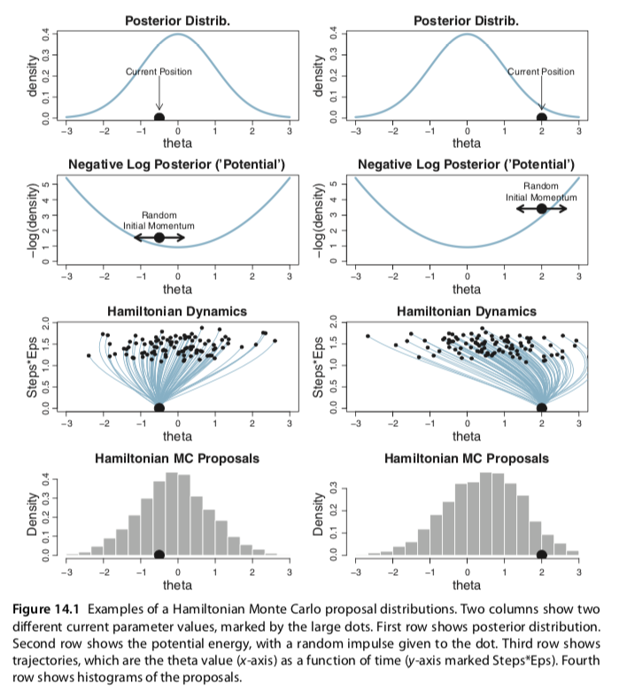
Figures 14.1 through 14.3

In Section 14.1, HMC Sampling, Kruschke presented a schematic of how Hamiltonian Monte Carlo proposal distributions work in his Figure 14.1. From the text, we read:

The third row of Figure 14.1 shows examples of many trajectories taken by balls that start on the current position and are given random impulses. The ordinate (y-axis) is mysteriously labeled as “Steps∗Eps.” Its exact meaning will be revealed below, but you can think of it simply as duration. Time increases as Steps∗Eps increases. The trajectories in Figure 14.1 have random durations constrained within a fairly narrow range of possibilities. The trajectories show the theta value as a function of time as the ball rolls after it receives the random initial impulse. The end point of each trajectory is marked with a small dot; this is the proposed position.

The bottom row of Figure 14.1 shows histograms of all the proposed positions. In particular, you can see that the proposal distribution is not centered on the current position. Instead, the proposal distribution is shifted toward the mode of the posterior distribution. Notice that the proposal distributions are quite different for the different current positions. In both cases, however, the proposals are shifted toward the mode of the posterior distribution. You can imagine that for high-dimensional posterior distributions that have narrow diagonal valleys and even curved valleys, the dynamics of HMC will find proposed positions that are much more promising than a vanilla symmetric proposal distribution, and more promising than Gibbs sampling which can get stuck at diagonal walls (as was described at the very end of Section 7.4.4). (pp. 402--403)

Here's Kruschke's Figure 14.1:
Screen Shot 2020-02-16 at 11 31 20 AM

I get how to reproduce the top two rows. That’s no problem. I could hack together a sham version of the bottom two rows, but I don’t actually know how to simulate the data necessary to reproduce them faithfully. If your knowledge of HMC and the underlying math is sound enough to reproduce the bottom two panels, please share your code. If at all possible tidyverse-oriented workflows are preferred.

The same basic issue holds for Kruschke’s Figures 14.2 and 14.3. For the sake of space, I’ll refrain from posting them, here.

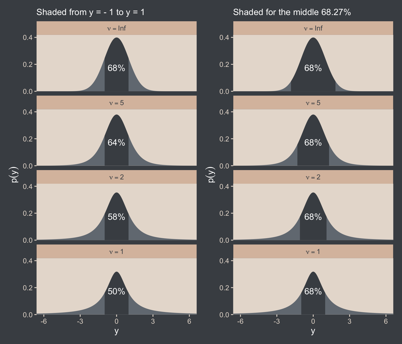
A minor error in the final plot of the section 16.2

Hi @ASKurz,

I think there is a minor problem with the final plot of the t-distribution section (16.2, or Figure 16.6 of the book). You can find the plot from the bookdown below. As you can see, the left column shows the percentage of the distribution under σ = ±1. The right column shows the area under the curve that is needed to include 68.27% of the distribution. Consider the first row, when ν = inf (in which t approaches a normal distribution) 68.27% of the distribution is under σ = ±1, but this is not the case for the right column. Moreover, the grey areas for plots in the right column do not match those in the book (the plots in the left column are fine).

unnamed-chunk-35-1

This problem can simply be solved by changing the order of values when defining the ymin variable when you create the primary data for the right column plots. I commented out the problematic line and added a new line there.

# the primary data
d <-
  crossing(y  = seq(from = -8, to = 8, length.out = 1e3),
           nu = c(Inf, 5, 2, 1)) %>%
  mutate(label = str_c("nu == ", nu) %>% 
           factor(., levels = c("nu == Inf", "nu == 5", "nu == 2", "nu == 1")))

# the subplot
p1 <-
  d %>% 
  ggplot(aes(x = y)) +
  geom_area(aes(y = dt(y, df = nu)),
            fill = bp[2]) +
  geom_area(data = . %>% filter(y >= -1 & y <= 1),
            aes(y = dt(y, df = nu)),
            fill = bp[1]) +
  # note how this function has its own data
  geom_text(data = tibble(
    y     = 0,
    text  = c("68%", "64%", "58%", "50%"),
    label = factor(c("nu == Inf", "nu == 5", "nu == 2", "nu == 1"))),
    aes(y = .175, label = text),
    color = "white") +
  scale_y_continuous(expression(p(y)), expand = expansion(mult = c(0, 0.05)), breaks = c(0, .2, .4)) +
  labs(subtitle = "Shaded from y = - 1 to y = 1") +
  coord_cartesian(xlim = c(-6, 6)) +
  facet_wrap(~ label, ncol = 1, labeller = label_parsed)


# Right Column
# the primary data
d <-
  tibble(nu   = c(Inf, 5, 2, 1),
         #ymin = c(-1.84, -1.32, -1.11, -1) # the order of values here is not correct
         ymin = c(-1, -1.11, -1.32, -1.84)) %>%
  mutate(ymax = -ymin) %>% 
  expand(nesting(nu, ymin, ymax),
         y = seq(from = -8, to = 8, length.out = 1e3)) %>%
  mutate(label = factor(str_c("nu==", nu), 
                        levels = str_c("nu==", c(Inf, 5, 2, 1))))

# the subplot
p2 <-
  d %>% 
  ggplot(aes(x = y)) +
  geom_area(aes(y = dt(y, df = nu)),
            fill = bp[2]) +
  geom_area(data = . %>% 
              # notice our `filter()` argument has changed
              filter(y >= ymin & y <= ymax),
            aes(y = dt(y, df = nu)),
            fill = bp[1]) +
  annotate(geom = "text", 
           x = 0, y = .175, 
           label = "68%", color = "white") +
  scale_y_continuous(expression(p(y)), expand = expansion(mult = c(0, 0.05)), breaks = c(0, .2, .4)) +
  labs(subtitle = "Shaded for the middle 68.27%") +
  coord_cartesian(xlim = c(-6, 6)) +
  facet_wrap(~ label, ncol = 1, labeller = label_parsed)

p1 + p2

This code will make the plot that matches the one in the book:

tplot

Hope that helps.
Omid

Figure 11.5

In Section 11.1.4, With intention to fix duration, Kruschke presented the results of a simulation of a sampling distribution. From the text, we read:

An example of the sampling distribution appears in right side of Figure 11.5. In principle, the distribution has spikes at every possible sample proportion, including 0/N,1/N,2/N,...,N/N for all N ≥ 0. But only values of N near λ have a visible appearance in the plot because the Poisson distribution makes values far from λ very improbable. In other words, the sampling distribution shown in the right side of Figure 11.5 is a weighted mixture of binomial distributions for Ns near λ. (The parameter λ was chosen to be 24 in this example merely because it matches N of the observed data and makes the plots most comparable to Figures 11.3 and 11.4.)

The p value for this fixed-duration stopping rule is shown in Figure 11.5 to be p = 0.024. This p value barely squeaks beneath the rejection limit of 2.5%, and might be reported as “marginally significant.” Compare this conclusion with the conclusion from assuming fixed N, which was “not significant,” and the conclusion from assuming fixed z, which was “significant.” The key point, however, is not the decision criterion. The point is that the p value changes when the imaginary sample space changes, while the data are unchanged.

In the example of Figure 11.5, λ was set to 24 merely to match N and make the example most comparable to the preceding examples. But the value of λ should really be chosen on the basis of real-world sampling constraints. Thus, if it takes about 6 s to manually toss a coin and record its outcome, the typical number of flips in 2 min is λ = 20, not 24. The sampling distribution for λ = 20 is different than the sampling distribution for λ = 24, resulting in a p value of 0.035 (not 0.024 as in Figure 11.5). (pp. 309--310)

Here's a copy of Figure 11.5:
Screen Shot 2020-02-16 at 10 19 21 AM

I played around with the simulation a bit, but the version in my bookdown project is still a bit off. [And to be clear, I'm only focusing on the right panel, here.] If you have a solution that more faithfully reproduces what Kruschke did, please share your code. If at all possible tidyverse-oriented workflows are preferred.

Text Misspelling

Section 4.3.1

Denerator should be Generator

In order to recreate Figure 4.2, we need to generate the heights data with Kruschke’s HtWtDataDenerator() function. You can find the original code in Kruschke’s HtWtDataDenerator.R script, and we first used this function in Section 2.3. Once again, here’s how to make the function.

stat_histintervalh()

Based on the current dev version of tidybayes, this now works:

library(tidyverse)
library(tidybayes)

set.seed(1)
tibble(x = rnorm(1e5)) %>% 
  ggplot(aes(x = x, y = 0)) +
  stat_histintervalh(point_interval = mode_hdi, .width = .95,
                     fill = "grey67", slab_color = "grey92",
                     breaks = 40, slab_size = .25, outline_bars = T) +
  theme(panel.grid = element_blank())

Or use

stat_histintervalh(point_interval = mode_hdi, .width = .95,
                     fill = "grey67", slab_color = "grey92",
                     breaks = 40, slab_size = .25, outline_bars = T,
                     normalize = "xy") +
  

For more, see issue #222.

A tiny error in setting the contrasts (section 19.3.3)

Hi @ASKurz,

Reading Chapter 19, section 19.3.3, I found a possible typo in the codes. However, it might be my misunderstanding. Anyway, it is worth checking :)

Just as a reminder, the model gave us the following coefs:

post %>% colnames()
#[1] "b_Intercept"                            "sd_CompanionNumber__Intercept"          "sigma"                                 
 #[4] "r_CompanionNumber[None0,Intercept]"     "r_CompanionNumber[Pregnant1,Intercept]" "r_CompanionNumber[Pregnant8,Intercept]"
# [7] "r_CompanionNumber[Virgin1,Intercept]"   "r_CompanionNumber[Virgin8,Intercept]"   "lp__"                                  
#[10] "chain"

In setting the contrast for Pregnant1.Pregnant8 vs None0, you set it this way (look at the transmute function):

post %>% 
  transmute(c = (`r_CompanionNumber[Pregnant1,Intercept]` + `r_CompanionNumber[Pregnant1,Intercept]`) / 2 - `r_CompanionNumber[None0,Intercept]`) %>% 
  
  ggplot(aes(x = c, y = 0)) +
  stat_dotsinterval(point_interval = mode_hdi, .width = .95,
                    slab_color = pp[5], slab_fill = pp[5], color = pp[4]) +
  scale_y_continuous(NULL, breaks = NULL) +
  labs(subtitle = "Pregnant1.Pregnant8 vs None0",
       x = expression(Difference~(mu[1]-mu[2])))

I guess one of the Pregnant groups should be changed to r_CompanionNumber[Pregnant8,Intercept]:

post %>% 
  transmute(c = (`r_CompanionNumber[Pregnant1,Intercept]` + `r_CompanionNumber[Pregnant8,Intercept]`) / 2 - `r_CompanionNumber[None0,Intercept]`) %>% 
  
  ggplot(aes(x = c, y = 0)) +
  stat_dotsinterval(point_interval = mode_hdi, .width = .95,
                    slab_color = pp[5], slab_fill = pp[5], color = pp[4]) +
  scale_y_continuous(NULL, breaks = NULL) +
  labs(subtitle = "Pregnant1.Pregnant8 vs None0",
       x = expression(Difference~(mu[1]-mu[2])))

This possible typo is repeated in three more places of that section.

  1. In extracting the HDIs for the contrast:
post %>% 
  transmute(difference = (`r_CompanionNumber[Pregnant1,Intercept]` + `r_CompanionNumber[Pregnant1,Intercept]`) / 2 - `r_CompanionNumber[None0,Intercept]`) %>% 
  
  mode_hdi(difference)
  1. In creating the dot plot for the same contrast:
post %>% 
  transmute(es = ((`r_CompanionNumber[Pregnant1,Intercept]` + `r_CompanionNumber[Pregnant1,Intercept]`) / 2 - `r_CompanionNumber[None0,Intercept]`) / sigma) %>% 
  
  ggplot(aes(x = es, y = 0)) +
  stat_dotsinterval(point_interval = mode_hdi, .width = .95,
                    slab_fill = pp[5], color = pp[4], 
                    slab_size = 0, quantiles = 100) +
  scale_y_continuous(NULL, breaks = NULL) +
  labs(subtitle = "Pregnant1.Pregnant8 vs None0",
       x = expression(Effect~Size~("["*mu[1]-mu[2]*"]"/sigma[italic(y)])))
  1. In creating the differences dataframe:
differences <-
  post %>% 
  transmute(`Pregnant1.Pregnant8.None0 vs Virgin1` = (`r_CompanionNumber[Pregnant1,Intercept]` + `r_CompanionNumber[Pregnant1,Intercept]` + `r_CompanionNumber[None0,Intercept]`) / 3 - `r_CompanionNumber[Virgin1,Intercept]`,
            
            `Virgin1 vs Virgin8` = `r_CompanionNumber[Virgin1,Intercept]` - `r_CompanionNumber[Virgin8,Intercept]`,
            
            `Pregnant1.Pregnant8.None0 vs Virgin1.Virgin8` = (`r_CompanionNumber[Pregnant1,Intercept]` + `r_CompanionNumber[Pregnant1,Intercept]` + `r_CompanionNumber[None0,Intercept]`) / 3 - (`r_CompanionNumber[Virgin1,Intercept]` + `r_CompanionNumber[Virgin8,Intercept]`) / 2)

Hope that helps.

Cheers,
Omid

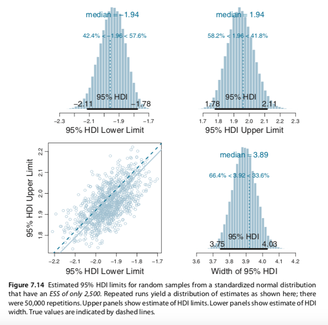
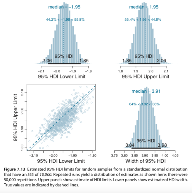
Figures 7.13 and 7.14

In Section 7.5.2., MCMC accuracy, Kruschke presented the results of a couple simulation studies on effective sample size. From the text, we read:

To get an intuition for the (in-)stability of the estimates of the 95% HDI limits, we will repeatedly generate MCMC chains from a known distribution, which has precisely known true 95% HDI limits. In particular, a standardized normal distribution has 95% HDI limits at very nearly −1.96 and +1.96. We will repeatedly generate MCMC chains from the normal distribution, each time using an ESS of 10,000. For each MCMC sample, we will estimate the 95% HDI. Then we will look at the estimates and assess how much they depart from the known true values.

Figure 7.13 shows the results of 50,000 repetitions (each using an ESS of 10,000). The upper panels show that the estimate of each HDI limit, where it can be seen that the median estimate of ±1.95 is a little less extreme than the true value of ±1.96. The distribution of the estimated HDI limit has a SD of about 0.053. The sample of parameter values should have a SD of 1.0 because it comes from a standardized normal. Hence, the SD of the estimate of the 95% HDI limit, when using an ESS of 10,000, is roughly 5% of the SD of the MCMC chain.

The width of the HDI is slightly underestimated, but not by as much as might be suggested by the marginal distributions of the HDI limits. The estimates of the HDI limits are strongly correlated, as shown in the lower-left panel of Figure 7.13. (See Section 12.1.2.1, p. 340, for more discussion.) The distribution of the estimated widths is shown in the lower right panel, where it can be seen that the median estimated width is only slightly less than the true width. The true width of the 95% HDI is 3.920, and the median of the estimated widths is 3.907, which indicates that the estimated width is about 99.7% of the true width in this case.

The SD of the HDI estimate gets bigger for skewed tails of distributions, and for smaller ESS. For instance, when the ESS is only 2,500 instead of 10,000, the estimated HDI is more unstable across repeated Monte Carlo runs, as shown in Figure 7.14. When compared with Figure 7.13, it can be seen that the smaller ESS produces, on average, slightly worse underestimates of the HDI limits and width, and less stable estimates. (pp. 184--186)

Here is Figure 7.13:
Screen Shot 2020-02-16 at 10 06 49 AM

Here is Figure 7.14:
Screen Shot 2020-02-16 at 10 06 31 AM

At present, I’m not sure how to pull off the simulation necessary to generate the figure. If you have the simulation chops, please share. If at all possible tidyverse-oriented workflows are preferred.

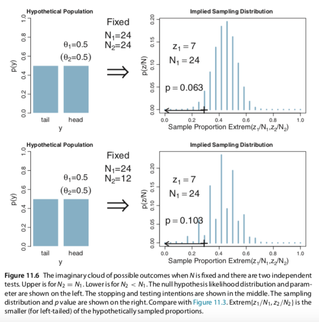
Figure 11.6

In Section 11.1.5, With intention to make multiple tests, Kruschke presented an NHST simulation. From the text, we read:

Suppose that we want to test the hypothesis of fairness for a coin, and we have a second coin in the same experiment that we are also testing for fairness. In real biological research, for example, this might correspond to testing whether the male/female ratio of babies differs from 50/50 in each of two species of animal. We want to monitor the false alarm rate overall, so we have to consider the probability of a false alarm from either coin. Thus, the p value for the first coin is the probability that a proportion, equal to or more extreme than its actual proportion, could arise by chance from either coin....

For concreteness, suppose we flip both coins N1 = N2 = 24 times, and the first coin comes up heads z1 = 7 times. This is the same result as in the previous examples. Suppose that we intended to stop when the number of flips reached those limits. The p value for the outcome of the first coin is the probability that either z1/N1 or z2/N2 would be as extreme, or more extreme, than 7/24 when the null hypothesis is true. This probability will be larger than when considering a single coin, because even if the imaginary flips of the first coin do not exceed 7/24, there is still a chance that the imaginary flips of the second coin will. For every imaginary sample of flips from the two coins, we need to consider the sample proportion, either z1/N1 or z2/N2, that is most extreme relative to θ. The p value is the probability that the extreme proportion meets or exceeds the actual proportion.

Figure 11.6 shows the numerical details for this situation. The upper-right panel shows the sampling distribution of the extreme of z1/N1 or z2/N2, when the null hypothesis is true and the stopping intention is fixed N for both coins. You can see that the p value for z1/N1 = 7/24 is p = 0.063. (pp. 310--311)

Here's a copy of Figure 11.6:
Screen Shot 2020-02-16 at 10 40 39 AM

If you have the chops to reproduce this simulation and plot, please share your code. If at all possible tidyverse-oriented workflows are preferred.

Figure 7.3

In Section 7.2.3, General properties of a random walk, Kruschke covered Figure 7.3. From the beginning of the section, we read:

The trajectory shown in Figure 7.2 is just one possible sequence of positions when the movement heuristic is applied. At each time step, the direction of the proposed move is random, and if the relative probability of the proposed position is less than that of the current position, then acceptance of the proposed move is also random. Because of the randomness, if the process were started over again, then the specific trajectory would almost certainly be different. Regardless of the specific trajectory, in the long run the relative frequency of visits mimics the target distribution.

Figure 7.3 shows the probability of being in each position as a function of time. At time t = 1, the politician starts at θ = 4. This starting position is indicated in the upper- left panel of Figure 7.3, labeled t = 1, by the fact that there is 100% probability of being at θ = 4.

We want to derive the probability of ending up in each position at the next time step. To determine the probabilities of positions for time t = 2, consider the possibilities from the movement process. The process starts with the flip of a fair coin to decide which direction to propose moving. (p. 149)

We see the figure on the next page:
Screen Shot 2020-02-16 at 9 50 08 AM

At present, I’m not sure how to pull off the simulation necessary to generate the figure. If you have the random-walk simulation chops, please share. If at all possible tidyverse-oriented workflows are preferred.

Recommend Projects

  • React photo React

    A declarative, efficient, and flexible JavaScript library for building user interfaces.

  • Vue.js photo Vue.js

    🖖 Vue.js is a progressive, incrementally-adoptable JavaScript framework for building UI on the web.

  • Typescript photo Typescript

    TypeScript is a superset of JavaScript that compiles to clean JavaScript output.

  • TensorFlow photo TensorFlow

    An Open Source Machine Learning Framework for Everyone

  • Django photo Django

    The Web framework for perfectionists with deadlines.

  • D3 photo D3

    Bring data to life with SVG, Canvas and HTML. 📊📈🎉

Recommend Topics

  • javascript

    JavaScript (JS) is a lightweight interpreted programming language with first-class functions.

  • web

    Some thing interesting about web. New door for the world.

  • server

    A server is a program made to process requests and deliver data to clients.

  • Machine learning

    Machine learning is a way of modeling and interpreting data that allows a piece of software to respond intelligently.

  • Game

    Some thing interesting about game, make everyone happy.

Recommend Org

  • Facebook photo Facebook

    We are working to build community through open source technology. NB: members must have two-factor auth.

  • Microsoft photo Microsoft

    Open source projects and samples from Microsoft.

  • Google photo Google

    Google ❤️ Open Source for everyone.

  • D3 photo D3

    Data-Driven Documents codes.