JSONPlaceholder API used to fetch data
Pagination of albums: https://jsonplaceholder.typicode.com/albums?_start=0&_limit=5
Photos of a specific album: https://jsonplaceholder.typicode.com/photos?albumId=5&_start=0&_limit=5
Information on users: https://jsonplaceholder.typicode.com/users
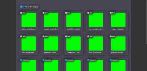
- Album Page
- display the albums in a grid
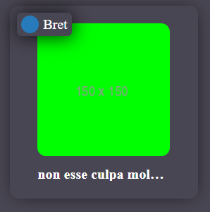
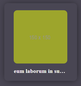
- use https://via.placeholder.com/150/00ff as album cover image
- use a different image placeholder color and album owner for each user in avatar
- display the title of the album
- paginate the albums
- offer 3 choices of how many albums are shown- on a page (20, 30, 50)
- Clicking on an album leads to a photo page
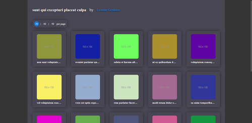
- Photo Page
- display a page title consisting of album owner and album title
- display the photos in a grid
- display the title of the photo
- paginate the photo thumbnails
- offer 3 choices of how many photos are shown on a page (20, 30, 50)
- Photo Detail Modal
- clicking on a photo thumbnail opens a modal
- the modal shows the photo in full size
- also the photos owner, album and title are shown
Testing was done to ensure that the app will work as intended for you. Jest and React Testing Library were used for this purpose.
A total of 24 test cases have been developed for this project, covering the most important requirements
here is the custom types used in the project
type ApiLoading = "idle" | "pending" | "succeeded" | "failed";

interface AlbumData {
  userId: number;
  id: number;
  title: string;
}

interface PhotoData {
  albumId: number;
  id: number;
  title: string;
  url: string;
  thumbnailUrl: string;
}

interface UserData {
  id: number;
  name: string;
  username: string;
  email: string;
  address: {
    street: string;
    suite: string;
    city: string;
    zipcode: string;
    geo: {
      lat: string;
      lng: string;
    };
  };
  phone: string;
  website: string;
  company: {
    name: string;
    catchPhrase: string;
    bs: string;
  };
}

interface AlbumsReduxState {
  data: Readonly<AlbumData>[];
  loading: ApiLoading;
  error: string;
}

interface AlbumReduxState {
  data: Readonly<PhotoData>[];
  loading: ApiLoading;
  error: string;
}

interface UsersReduxState {
  data: Readonly<UserData>[];
  loading: ApiLoading;
  error: string;
}

interface FetchAlbumsParams {
  params: Record<"_start" | "_limit", number>;
}

interface FetchAlbumParams {
  params: Record<"_start" | "_limit" | "albumid", number>;
}

interface AlbumInfo {
  user: Partial<UserData>;
  album: AlbumData;
}

interface UserInfo {
  user: UserData;
  color: string;
}

type AvatarInfo = Record<number, UserInfo>;
AlbumList fetches user data and albums and render the albums in Cards
url search params used to fetch data in a paginated way
Avatar component shows username and avatar of the album owner
the below interface shows its props:
interface Props {
user: Partial;
color: string;
}
Card is a general component and it is specialized to build Album and Photo Cards
the interface shows the necessary props
interface Props {
  data: AlbumData | PhotoData;
  user: Partial<UserData>;
  color?: string;
  onClick: (data: AlbumData | PhotoData, userData: Partial<UserData>) => void;
  withAvatar?: boolean;
  imageSrc?: string;
}
color and withAvatar and imageSrc are optional props because when we use card component as Photo component it does not contain Avatar component and its required data
here Card is used as Album Card:
 data.map((item: AlbumData) => (
            <Card
              data={item}
              user={usersData[item.userId]?.user}
              color={usersData[item.userId]?.color}
              key={item.id}
              onClick={handleClick}
              withAvatar={true}
            />
          ))
here Card is used as Photo Card:
    data.map((item: PhotoData) => (
          <Card
            data={item}
            onClick={() => handleClick(item)}
            key={item.id}
            user={user}
            imageSrc={item.thumbnailUrl}
          />
        ))
Container component wrapp all the components
it gives the wrapped component a fixed width and centralize them
modal component is a window that appears in front of app content
Modal component is created based on Dialog MU component
it takes children and three other props as following:
interface Props extends PropsWithChildren<any> {
  open: boolean;
  onClose: () => void;
  title?: string;
}
PageLimit component gives three options to user to change number of cards in a paginated page
it changes query params
PaginatedBox provide a grid container for cards, loading component and empty state component
it takes three props, children and two other props that are defined as following:
    interface Props extends PropsWithChildren<any> {
      data: any[];
      loading: boolean;
    }
- when the loading is true the PaginatedBox shows Loading component
- when the data array is empty, the PaginatedBox shows EmptyState component
- when data array has items, it renders the items in a grid box
Pagination component created based on built-in MU pagination
<MuPagination
          count={10}
          className={styles.pagination}
          color="primary"
          onChange={handleChange}
          page={page}
          size="small"
        />
it changes the query params and data will be fetched by every page
count is is given a fixed value because the number of data can not be extracted from the jsonplaceholder apis
PhotoDetail shows the photo in fullsize and information about album and album owner
it takes following props:
interface Props {
photo: PhotoData;
albumTitle: string;
owner: string;
}
PhotoList fetches photos and render the photos in Cards
the name of the album and its owner is showed on the header of the component, it gets the data from redux store which is persisted
url search params used to fetch data in a paginated way
clicking on each photo opens a modal and shows detail about that photo
This project was bootstrapped with Create React App.
In the project directory, you can run:
Runs the app in the development mode.
Open http://localhost:3000 to view it in your browser.
The page will reload when you make changes.
You may also see any lint errors in the console.
Launches the test runner in the interactive watch mode.
See the section about running tests for more information.
Builds the app for production to the build folder.
It correctly bundles React in production mode and optimizes the build for the best performance.
The build is minified and the filenames include the hashes.
Your app is ready to be deployed!
See the section about deployment for more information.
Note: this is a one-way operation. Once you eject, you can't go back!
If you aren't satisfied with the build tool and configuration choices, you can eject at any time. This command will remove the single build dependency from your project.
Instead, it will copy all the configuration files and the transitive dependencies (webpack, Babel, ESLint, etc) right into your project so you have full control over them. All of the commands except eject will still work, but they will point to the copied scripts so you can tweak them. At this point you're on your own.
You don't have to ever use eject. The curated feature set is suitable for small and middle deployments, and you shouldn't feel obligated to use this feature. However we understand that this tool wouldn't be useful if you couldn't customize it when you are ready for it.
You can learn more in the Create React App documentation.
To learn React, check out the React documentation.
This section has moved here: https://facebook.github.io/create-react-app/docs/code-splitting
This section has moved here: https://facebook.github.io/create-react-app/docs/analyzing-the-bundle-size
This section has moved here: https://facebook.github.io/create-react-app/docs/making-a-progressive-web-app
This section has moved here: https://facebook.github.io/create-react-app/docs/advanced-configuration
This section has moved here: https://facebook.github.io/create-react-app/docs/deployment
This section has moved here: https://facebook.github.io/create-react-app/docs/troubleshooting#npm-run-build-fails-to-minify


 React
React
 Typescript
 Django
 Laravel
 Facebook
 Microsoft
 Google
 Alibaba
 D3
D3
 Tencent