It is a flexible and usable component.

1.You need install @flywine93/ngx-notification by npm
npm install @flywine93/ngx-notification --save
2.You need install @flywine93/ngx-autounsubscrb
npm i @flywine93/ngx-autounsubscrb --save
3.You need install @angular/animations
npm install --save @angular/animations
You need to import NgxNotificationModule, BrowserAnimationsModule.
import {BrowserAnimationsModule} from '@angular/platform-browser/animations';
import { NgxNotificationModule } from '@flywine93/ngx-notification';

@NgModule({
  declarations: [
    AppComponent
  ],
  imports: [
    BrowserModule,
    BrowserAnimationsModule,
    AppRoutingModule,
    CommonModule,
    NgxNotificationModule,
  ],
  providers: [],
  bootstrap: [AppComponent]
})
export class AppModule { }
1.Add ngx-notification to the component, which should be global.
eg. app.component.html
<ngx-notification></ngx-notification>
2.The message is triggered through the NgxNotificationService service.
import { NgxNotificationService } from '@flywine93/ngx-notification';

@Component({
  selector: 'app-root',
  templateUrl: './app.component.html',
  styleUrls: ['./app.component.scss']
})
export class AppComponent {
  constructor(private notification: NgxNotificationService) {
  }
}
- Send message by service.
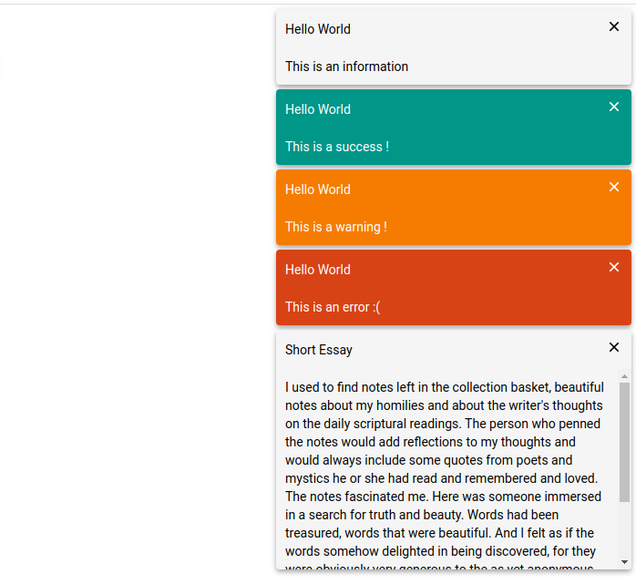
  sendInfo() {
    this.notification.notify(NotificationType.INFO, 'Hello World', 'This is an information', 0);
  }

  sendSuccess() {
    this.notification.notify(NotificationType.SUCCESS, 'Hello World', 'This is a success !', 3000);
  }

  sendWarning() {
    this.notification.notify(NotificationType.WARNING, 'Hello World', 'This is a warning !');
  }

  sendError() {
    this.notification.notify(NotificationType.ERROR, 'Hello World', 'This is an error :(');
  }
It's that simple!!!
options: NotifyOptions
export type NotificationPosition = 't' | 'b' | 'lt' | 'lb' | 'rt' | 'rb';
export interface NotifyOptions {
    position?: NotificationPosition;
    startDistance?: number;
    animation?: boolean;
    shadow?: boolean;
    title?: {
        infoFontColor?: string,
        successFontColor?: string,
        warningFontColor?: string,
        errorFontColor?: string,
        background?: string;
        bold?: boolean;
    };
    msg?: {
        infoFontColor?: string,
        successFontColor?: string,
        warningFontColor?: string,
        errorFontColor?: string,
        background?: string;
        maxHeight?: number;
    };
    infoBgColor?: string;
    successBgColor?: string;
    warningBgColor?: string;
    errorBgColor?: string;
}
| Option | Description | Default Value |
|---|---|---|
position |
The position of the notification message box, `'t' | 'b' |
startDistance |
The distance between the starting position of the notification box and the top or bottom.number |
0 |
animation |
Whether to turn on the appear and disappear animations.boolean |
true |
shadow |
Whether to turn on shadow effects.boolean |
true |
title |
The theme of the title in the notification box. | material theme |
msg |
The theme of the message in the notification box. | material theme |
infoBgColor |
general notification box background color | material theme |
successBgColor |
success notification box background color | material theme |
warningBgColor |
warning notification box background color | material theme |
errorBgColor |
error notification box background color | material theme |
- position--
t: top,b: bottom,lt: left top,lb: left bottom,rb: right bottom,rt: right top
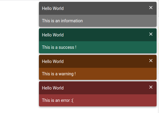
There are now two themes available, material theme and darkWindstorm theme.
- material theme
2.darkWindstorm theme
1.change notification box position to b.
app.component.html
<button mat-raised-button color="basic" (click)="sendInfo()">Info</button>
<button mat-raised-button color="primary" (click)="sendSuccess()">Success</button>
<button mat-raised-button color="accent" (click)="sendWarning()">Warning</button>
<button mat-raised-button color="warn" (click)="sendError()">Error</button>

<ngx-notification [options]="options"></ngx-notification>
app.component.ts
import {
  NgxNotificationService,
  NotificationType,
  NotificationThemes, NotifyOptions, ThemeName } from '@flywine93/ngx-notification';
export class AppComponent {

  theme = ThemeName.MATERILA;
  options: NotifyOptions;

  constructor(private notification: NgxNotificationService) {
    this.options = {
      position: 'b'
    };
  sendInfo() {
    this.notification.notify(NotificationType.INFO, 'Hello World', 'This is an information', 0);
  }

  sendSuccess() {
    this.notification.notify(NotificationType.SUCCESS, 'Hello World', 'This is a success !');
  }

  sendWarning() {
    this.notification.notify(NotificationType.WARNING, 'Hello World', 'This is a warning !');
  }

  sendError() {
    this.notification.notify(NotificationType.ERROR, 'Hello World', 'This is an error :(');
  }
  }
}

2.change theme
app.component.html
<ngx-notification [theme]="theme" [options]="options"></ngx-notification>
app.component.ts
import {
  NgxNotificationService,
  NotificationType,
  NotificationThemes,
  NotifyOptions,
  ThemeName } from '@flywine93/ngx-notification';
export class AppComponent {

  theme = ThemeName.DARK_WINDSTORM;
  options: NotifyOptions;

  constructor(private notification: NgxNotificationService) {
    this.options = {
      position: 'b'
    };
  }
}
You can also customize colors by options property.
eg.
export class AppComponent {

  theme = ThemeName.MATERILA;
  options: NotifyOptions;

  constructor(private notification: NgxNotificationService) {
    this.options = {
      title: {
        infoFontColor: '#fff',
        successFontColor: '#fff',
        warningFontColor: '#fff',
        errorFontColor: '#fff',
        background: 'rgba(0, 0, 0, 0.6)',
        bold: true
      },
      msg: {
        infoFontColor: '#fff',
        successFontColor: '#fff',
        warningFontColor: '#fff',
        errorFontColor: '#fff',
        background: 'rgba(0, 0, 0, 0.4)'
      },
      infoBgColor: 'rgba(189, 189, 189, 0.9)',
      successBgColor: 'rgba(27, 158, 119, 0.9)',
      warningBgColor: 'rgba(217, 95, 2, 0.9)',
      errorBgColor: 'rgba(246, 71, 71, 0.9)'
    };
  }
}
The custom configuration will override the default configuration.
- notify --- Send a message.
notify(type: NotificationType, title: string, message: string, timeout = 3000): void- type: NotificationType enum,
SUCCESS|WARNING|ERROR|INFO。 - title: message title
- message: text
- timeout: delay closing time,If it is 0ms, it will not close actively, it needs to close manually.
- type: NotificationType enum,
- update --- Forced update options, eg. change position.
- changeTheme --- change notification box theme
- changeOptions --- change notification options then update
1.send a info notification.
You need inject NgxNotificationService service.
import {
  NgxNotificationService,
  NotificationType,
  ThemeName } from '@flywine93/ngx-notification';
export class AppComponent {

  theme = ThemeName.MATERILA;
  options: NotifyOptions;

  constructor(private notification: NgxNotificationService) {
  }

  sendInfo() {
    this.notification.notify(NotificationType.INFO, 'Hello World', 'This is an information', 1000);
  }
}
2.change options
export class AppComponent {

  theme = ThemeName.MATERILA;
  options: NotifyOptions = {position: 'rt'};

  constructor(private notification: NgxNotificationService) {
  }

  changeOptions(): void  {
    this.options.position = 'b';
    this.notification.update();
  }
}
If the update is not forced, it will be updated at the next change.
3.change options or theme by service
changePosition(dir: NotificationPosition): void {
  this.notification.changeOptions({position: dir});
}
changeTheme(theme: ThemeName): void {
  this.notification.changeTheme(theme);
}
- add update options by service
- add change theme by service
The MIT License (see the LICENSE file for the full text)
 React
React
 Typescript
 Django
 Laravel
 Facebook
 Microsoft
 Google
 Alibaba
 D3
D3
 Tencent