Comments (15)
 jhiney
commented on May 17, 2024
1
jhiney
commented on May 17, 2024
1
I went through and made some edits to grammar and punctuation. Any larger edits that could change the idea of what you were going for have been made using Google Docs suggestion system so you can approve or reject as you see fit.
from skeleton.
jhiney
commented on May 17, 2024
1
If needed, I can implement the docs page once you have reviewed.
from skeleton.
 endigo9740
commented on May 17, 2024
endigo9740
commented on May 17, 2024
@ Jacob H. (sorry, don't know your GitHub user) - I saw you request access to the document and have granted this. Feel free to make edits directly. I can review the document history to see what changes are made over time
Thanks for the help!
from skeleton.
endigo9740
commented on May 17, 2024
Awesome, thanks Jacob! We're about to launch a big update to Skeleton today, so I'll be plenty busy rolling that out, providing support, and promoting today. However, I'll give this a look asap! Thank you for the help!
from skeleton.
endigo9740
commented on May 17, 2024
FYI I've accepted most of your suggestions and merged a few of the more notable changes.
Note I'm on the fence about mentioning the "upcoming guides" for Daisy/Flowbite. Perhaps it's better to introduce these alongside this page? Maybe the guides would be short enough to be embedded directly below each section? Even if they are long, perhaps they could exist in expandable sections, so not to dominate space?
Thoughts?
from skeleton.
jhiney
commented on May 17, 2024
I think the guides would be short enough to be include. One or two code snippets of utilizing both Skeleton and Daisy/Flowbite would get the idea across that you can use one with the other.
I do think examples beyond your theming example would require more documentation. For example, showing how to put a Skeleton button with a DaisyUI card. Maybe that could be on another page? If hybrid-ing Daisy/Flowbite becomes more official, I don't see why that can't have its own page with a link in the comparison one.
It's definitely an interesting concept. Before I read the doc I had never considered combining UI library's in a single project and I don't think any other libraries have guides on how to do so out-of-the-box.
from skeleton.
endigo9740
commented on May 17, 2024
Yeah I agree with all that.
Combining libraries would put us in a unique position. While Skeleton can focus on functional/svelte-based components, users can augment presentation using components from these libraries (heros, cta, etc)
Obviously the lines blur a bit if you introduce something like Flowbite Svelte. But perhaps at some point we reach out to the maintainers of those projects and see if they're open to more official collaboration. I'm definitely open to working with them if they're open to helping with us.
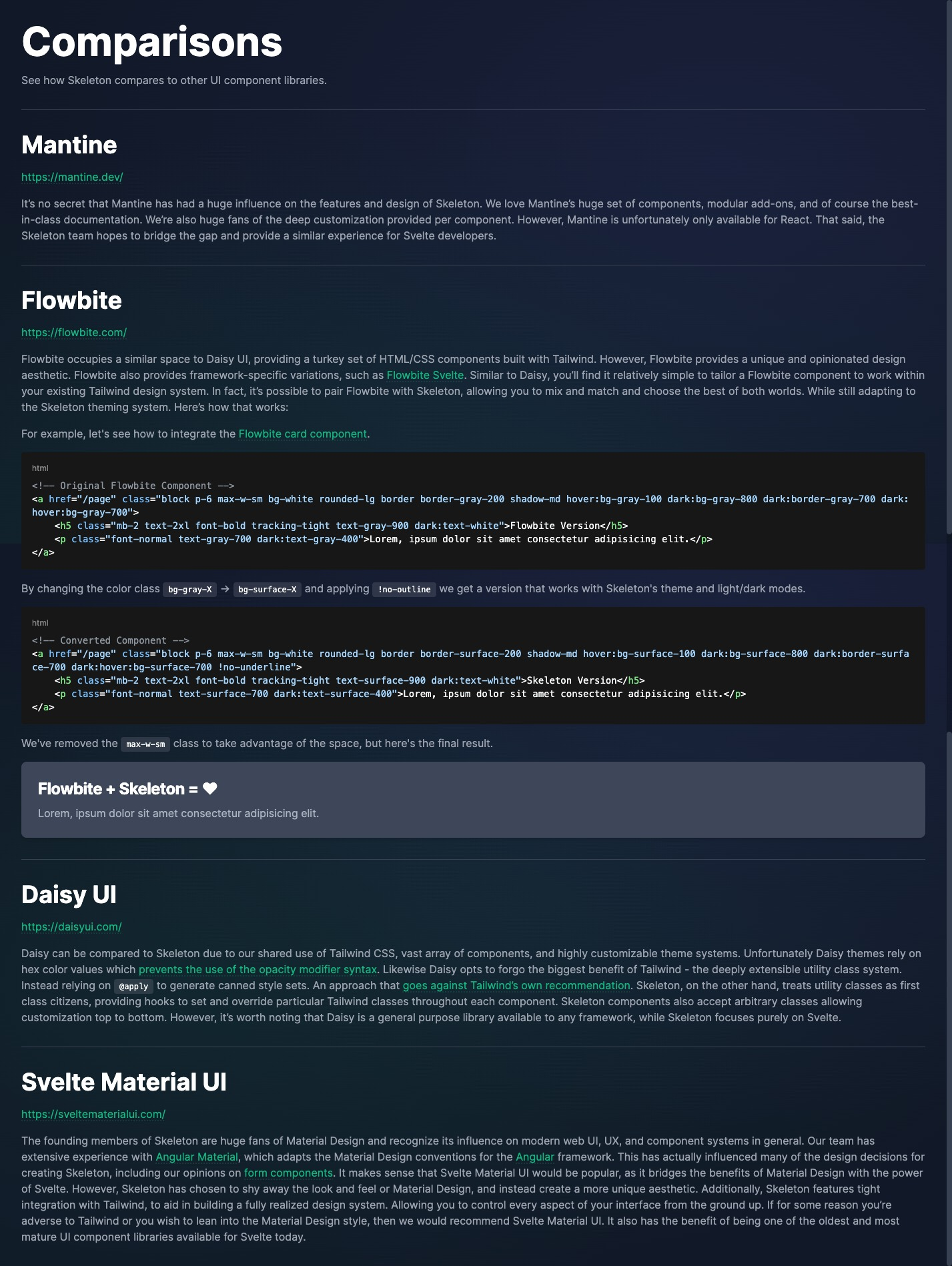
So far I believe Flowbite (their basic free version) to be the easiest to document this process for. Here's how it works for their card component:
https://flowbite.com/docs/components/card/
Here I changed color values as added a no-underline TW class:
<!-- Flowbite -->
<a href="/foo" class="block p-6 max-w-sm bg-white rounded-lg border border-gray-200 shadow-md hover:bg-gray-100 dark:bg-gray-800 dark:border-gray-700 dark:hover:bg-gray-700">
    <h5 class="mb-2 text-2xl font-bold tracking-tight text-gray-900 dark:text-white">Noteworthy technology acquisitions 2021</h5>
    <p class="font-normal text-gray-700 dark:text-gray-400">Here are the biggest enterprise technology acquisitions of 2021 so far, in reverse chronological order.</p>
</a>

<!-- Skeleton -->
<a href="/foo" class="block p-6 max-w-sm bg-surface-50 rounded-lg border border-surface-200 shadow-md hover:bg-surface-100 dark:bg-surface-800 dark:border-surface-700 dark:hover:bg-surface-700 !no-underline">
    <h5 class="mb-2 text-2xl font-bold tracking-tight text-surface-900 dark:text-white">Noteworthy technology acquisitions 2021</h5>
    <p class="font-normal text-surface-700 dark:text-surface-400">Here are the biggest enterprise technology acquisitions of 2021 so far, in reverse chronological order.</p>
</a>
Looks pretty similar right? We appear to be using the same color values for our default theme:

However, change the theme and you'll immediately see the difference:

Easy right? Daisy does something similar to us as well, note the bg-base-100 color style:
<!-- Daisy Card -->
<div class="card w-96 bg-base-100 shadow-xl">
  <figure><img src="https://placeimg.com/400/225/arch" alt="Shoes" /></figure>
  <div class="card-body">
    <h2 class="card-title">Shoes!</h2>
    <p>If a dog chews shoes whose shoes does he choose?</p>
    <div class="card-actions justify-end">
      <button class="btn btn-primary">Buy Now</button>
    </div>
  </div>
</div>
from skeleton.
jhiney
commented on May 17, 2024
I'm wondering now how easy it would be to have your Skeleton theme be used by Daisy using their custom themes. I know it would take a little work but I think it could be done pretty seamlessly. You would just wrap <html data-theme="skeleton"></html> around the Daisy components you would want to style and follow their guidelines.
For example, the default theme would look like this:
daisyui:{
 themes: [
  {
   skeleton: {
      primary: "##34d399",
      secondary: "#6366f1",
      accent: "#f43f5e",
      neutral: "#6b7280"
      },
   }
The colors could be tweaked of course but that is the general idea.
from skeleton.
endigo9740
commented on May 17, 2024
The idea of some kind of combined or universal theme did occur to me. However, the problem is Daisy themes are not fully optimized for Tailwind theme support. Namely, you provide pure hex color values, which means no support of color opacity!
Take a look at our default theme for comparison:
https://github.com/Brain-Bones/skeleton/blob/dev/src/themes/theme-skeleton.css
We talk a bit about this at the top of the Theme section:
https://skeleton.brainandbonesllc.com/guides/themes
Skeleton themes integrate with Tailwind using CSS custom properties converted to RGB values. This enables the use of background opacity as well as support for dark mode. Components intelligently implement each color from the theme's palette. Follow the instructions below to get started.
So the inverse would probably be better - some way to translate Skeleton themes back to hex values and inject them into the Tailwind config. That might make Daisy components usable turnkey. However, I don't know how many color "slots" they have offhand, so I cannot guarantee things would match up 1:1. That would require a deeper review as well as deciding if level of effort is worthwhile right now.
EDIT
FYI we're accepting hex colors upfront during theme generation, so it would be more a matter of preserving those or generating the boilerplate needed to inject in your TW config.
from skeleton.
jhiney
commented on May 17, 2024
I thought about the opacity as soon as I finished, and it's a very good point. Supporting opacity out-of-the-box is great and would need some thinking if combining with Daisy. I think on a comparison page it would be much easier to show the use of Skeleton theming and Flowbite like you did here.
I think the Daisy portion would require a little more thought and effort, but could definitely be added later.
from skeleton.
endigo9740
commented on May 17, 2024
Yep, I think with a little effort we can make it work. For now, don't hate me, but I've rewritten a good bit of the comparison document. A lot of the ideas you brought forth are still there, but after coming back with a fresh set of eyes I was not happy with the tone. I also needed to make some adjustments to segue into the tutorials for Flowbite and Daisy.
By all means, feel free to review the latest draft. Though I'm planning to go ahead and create the the branch and begin implement a version of this now. I'll happily apply updates as relevant though.
I'll also work to add a couple quick examples of converting Flowbite/Daisy components so we have something more concrete to reference. Expect that soon!
from skeleton.
endigo9740
commented on May 17, 2024
I've pushed my first commit to the docs/comparison branch if you would like to review. Here's a quick preview:
https://i.imgur.com/AkfzeY4.png
Note that I also did a review of how Daisy is handling themes and component styles, and must say, it's not ideal. In fact I'm a bit shocked at the popularity of the library, given the fact they are kind of missing the point of Tailwind and misusing it.
We already discussed the misstep of using hex values for themes, but it appears they are also leaning heavily into using the @apply directive. At that point Tailwind isn't really providing any benefit over vanilla CSS. They are greatly inflating the final stylesheet produced for everyone by default.
Let me know if the links I included explain this well enough, or if we need to tailor the copy to better explain this. I'm very adverse to recommending them given the affects of this, though I don't want to come across too harshly in our message. I'm sure they've put a lot of time into building what they have and I don't mean to knock them. Let me know you have ideas for softening that up Jacob.
from skeleton.
jhiney
commented on May 17, 2024
I think it looks very good. I hadn't realized until reading your explanation and then looking for myself that Daisy was going against Tailwind's own recommendation. I think perhaps their popularity comes from ease of use, and those utilizing it are probably looking for something they can plug and play in a personal project.
From reading it, I think the only thing that sounds "harsh" would be where you say Daisy goes against the Tailwind recommendation. I think without it you are still getting your point across without knocking the other project, instead you are just remarking about the difference approach Skeleton takes.
Maybe consider in the Flowbite section adding the images you showed earlier in this issue? The HTML is great, but the final image you showed doesn't match with the "Flowbite + Skeleton" card. It looks to me that all that would need to be changed is what is in your <h5></h5> in the converted component. I know it is small, but speaking as someone who often takes code snippets from docs and pastes them to see if it matches, small differences matter.
from skeleton.
endigo9740
commented on May 17, 2024
Ok, that sounds fair. I'll see what I can do. Yeah I want to include the theme comparison images, but right now I've not settled on the best place for hosting those. I know we can just embed them into the project, which I may do, however I'd rather wait until we have a proper CDN in place for this sort of thing. I agree with the benefit of those though, however maybe recommending folks toggle light/dark mode would suffice for now?
Also I'll update the heading tag as well, good catch!
from skeleton.
endigo9740
commented on May 17, 2024
I've pushed an update to address the concerns above.
- This drops the "goes against" line and instead links the
@applycallout, allowing Tailwind to deliver the news. Lead a horse to water and all that :) - It collapses the Flowbite example into a Skeleton Accordion, which helps avoid interruption to the flow of the page.
- I'm also recommending user toggle dark mode. In a future iteration it'll be a similar process to adjust the documentation theme (ala Daisy). We'll recommend toggling that as well in the future.
I'll await your final review of latest text copy, otherwise unless @niktek and @thomasbjespersen have other suggestions, we'll look to merge. I'll send a PR asap guys, just let me know!
Thanks for the help with this Jacob! I always struggle with writing text copy, so I really appreciate the help. If you're up to it, we would gladly welcome your contributions to any other part of the project! Code, copy, messaging, or whatever!

from skeleton.
Related Issues (20)
- v2 CLI: themes are dropped into the `/lib` directory instead of project root HOT 1
- Drawer Improvements HOT 2
- v2 doc feature deprecation warnings
- Multiple typos in the autocomplete component documentation
- Tailwind PurgeCSS Config - Highlight.js - Incorrectly Typed (Docs/Installation) HOT 3
- tw-plugin v0.4.0 removing tailwind class definitions HOT 15
- Issue with breadcrums with 3 entries or more HOT 1
- Button and Form Element Size Normalization
- Add view transitions when switching themes
- v2 Avatar Additions
- v2 Stackblitz dependency updates HOT 1
- Add style prop to TreeViewItem to allow control of content's width HOT 3
- Resolve a11y warnings in multiple components HOT 3
- Chore: Update LICENSE year
- Skeleton v2 migration to Svelte 5 HOT 3
- LightSwitch breaks in multiple tabs HOT 3
- Migrate the v2 docs to Svelte 4 and SvelteKit v2
- Fix onMount import on the Chat block docs
- Svelte v5 RC: TreeView component is non-function HOT 1
- Svelte v5 RC: Theme Generator live previews are non-functional HOT 1
Recommend Projects
-
 React
React
A declarative, efficient, and flexible JavaScript library for building user interfaces.
-
Vue.js
🖖 Vue.js is a progressive, incrementally-adoptable JavaScript framework for building UI on the web.
-
 Typescript
TypeScript is a superset of JavaScript that compiles to clean JavaScript output.
-
TensorFlow
An Open Source Machine Learning Framework for Everyone
-
Django
The Web framework for perfectionists with deadlines.
-
 Laravel
A PHP framework for web artisans
-
D3
Bring data to life with SVG, Canvas and HTML. 📊📈🎉
-
Recommend Topics
-
javascript
JavaScript (JS) is a lightweight interpreted programming language with first-class functions.
-
web
Some thing interesting about web. New door for the world.
-
server
A server is a program made to process requests and deliver data to clients.
-
Machine learning
Machine learning is a way of modeling and interpreting data that allows a piece of software to respond intelligently.
-
Visualization
Some thing interesting about visualization, use data art
-
Game
Some thing interesting about game, make everyone happy.
Recommend Org
-
Facebook
We are working to build community through open source technology. NB: members must have two-factor auth.
-
Microsoft
Open source projects and samples from Microsoft.
-
Google
Google ❤️ Open Source for everyone.
-
Alibaba
Alibaba Open Source for everyone
-
D3
Data-Driven Documents codes.
-
Tencent
China tencent open source team.
from skeleton.