Comments (51)
 julio8a
commented on June 1, 2024
2
julio8a
commented on June 1, 2024
2
I'll work with @jcfranco on it. There shouldn't be any drastic changes. I will post here if they are significant.
from calcite-design-system.
 macandcheese
commented on June 1, 2024
2
macandcheese
commented on June 1, 2024
2
Cool, no rush, just doing some issue 🧹🧹
from calcite-design-system.
julio8a
commented on June 1, 2024
1
Handle, changes color when dragged based on value

from calcite-design-system.
 paulcpederson
commented on June 1, 2024
1
paulcpederson
commented on June 1, 2024
1
It's 7.4 timeframe, so no rush, really
from calcite-design-system.
 jcfranco
commented on June 1, 2024
1
jcfranco
commented on June 1, 2024
1
whoa really?!
I'm afraid so. We can only sample pixels from a canvas we draw to.
what is your avatar?
It's an illustration I saw on Twitter a looooong time ago. I set it as my avatar because it reminded me of one my puppers. I truly wish I had the source.
from calcite-design-system.
 mitc7862
commented on June 1, 2024
1
mitc7862
commented on June 1, 2024
1
For Map Viewer beta, we need a simplified color picker for some workflows. I think it would be nice if the individual piece could be toggles on/off and rearranged. That way we can show it like a dropdown like so.
we should also vet this design with Jennifer Bell from Esri's content team to see if it meets their needs. They use this stuff every day.
from calcite-design-system.
jcfranco
commented on June 1, 2024
1
Sorry for the delay. I've been on and off on this. 😞 I have a branch with a functional version of it with a few things pending. I'll shoot for a PR next week.
from calcite-design-system.
paulcpederson
commented on June 1, 2024
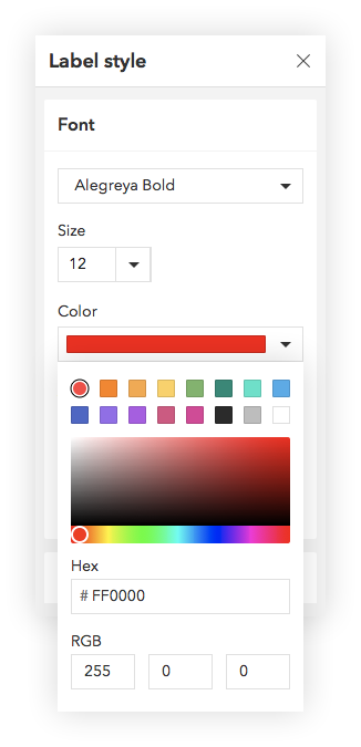
Draft spec for calcite-color-picker. Assigning to @julio8a to complete the designs, and then we can assign to a dev to pick up the implementation work. Discussion of the spec can happen in this issue.
calcite-color-picker
Allows the selection of a color via a visible spectrum ui, or via direct entry into a text input. Set value to beginning hex value. Will default to #000
<calcite-color-picker value="#3a471a"></calcite-color-picker>We suggest you wrap the component and add a visible label for clarity:
<label>
  Theme background color
  <calcite-color-picker value="#3a471a"></calcite-color-picker>
</label>
When using with React, an input can be passed in which will act as the source of truth:
<label>
  Due date
  <calcite-date>
    <input type="color" value="#3a471a">
  </calcite-date>
</label>
Client-side storage
A set of colors can be saved on the client and displayed as a readily available set of swatches. The API for this is much like calcite-tabs, simply pass the storage-id you'd like to use and the UI will read the data from local storage and display the swatches:
<calcite-color-picker value="#3a471a" storage-id="app-theme-colors"></calcite-color-picker>
calcite-color-picker will be responsible for adding and removing swatches from this store.
Events:
calciteColorPickerChangeemitted with standard event properties plus currently selected values in CSS-readable format for all available color systems:
details: {
  hex: "#3a471a",
  rgb: "rgb(58, 71, 26)",
  hsl: "hsl(78, 47%, 19%)"
}
calcite-color-swatch
It may be useful to also create a component for showing a single color.
<calcite-color-swatch value="#3a471a"/>
This element should also have an "active" state if it's the selected swatch:
<calcite-color-swatch value="#3a471a" is-active/>
Events:
calciteColorSwatchSelectemitted on click or keyboard select of the swatch with details indicating which color was selected (see above details object).
from calcite-design-system.
julio8a
commented on June 1, 2024
Designs: 
@jcfranco, I can work on the styling once you get the structure started.
from calcite-design-system.
macandcheese
commented on June 1, 2024
This should be built independently of an accordion as shown above, but we should doc and show examples of how to combine multiple in collapsible accordions since that will be a super common use case.
from calcite-design-system.
jcfranco
commented on June 1, 2024
@julio8a I've been making progress on this one and had a few questions.

- (blue) I noticed there's no indicator for the current hue, can you update the mock to include this?
- (purple) is the eye dropper icon decorative or functional? If the latter, I don't think this is possible due to security concerns.
from calcite-design-system.
julio8a
commented on June 1, 2024
I'll work on item 1. Item two, maybe we need more discussion on this. We can talk about it in our next meeting.
from calcite-design-system.
julio8a
commented on June 1, 2024
Narrow color picker wrap inputs:

^ for when the color picker needs to fit inside a panel
from calcite-design-system.
paulcpederson
commented on June 1, 2024
@jcfranco how's it going, any blockers? Working on a UI right now that needs a nifty little color picker, wondering if I can just hold out until you're done.
from calcite-design-system.
jcfranco
commented on June 1, 2024
@julio8a @paulcpederson Sorry for not giving any updates. I'm wrapping up some stuff and I'll get back to this. Do you have a timeframe for your UI work or an issue you could link to? Just to keep it on my mind.
from calcite-design-system.
paulcpederson
commented on June 1, 2024
So I just got some bugs on a different color picker we're using in high contrast mode and thought I'd mention it in this thread. Basically the issue is that the color swatches/color fields are implemented with background-color, which gets lost in high-contrast mode:

I think the safest way to do the swatches, etc is a <svg> with a rect that has a fill of the color. That way high-contrast will treat it as an image and leave it be.
Thought I'd mention it as sort of a note-to-self.
from calcite-design-system.
jcfranco
commented on June 1, 2024
@paulcpederson Thanks for sharing. I'll make sure to take this into consideration.
from calcite-design-system.
julio8a
commented on June 1, 2024
From a conversation with Fred:
It's important that we could pass the color to the component as a string with the following supported formats:
#RRGGBB
#RRGGBBAA
rgb(....)
rgba(....)
hsl(....)
hsla(....)
And the value returned by the component should be the string type chosen by the user.
from calcite-design-system.
 snoakes
commented on June 1, 2024
snoakes
commented on June 1, 2024
Hello,
I don't know if this is the correct place to ask, but I'd love to know a rough date for this.
Thanks for all your hard work,
Sarah
from calcite-design-system.
jcfranco
commented on June 1, 2024
@snoakes Thanks for showing interest in this component's progress! 😄 I'm guesstimating early January for this.
from calcite-design-system.
 kumarGayu
commented on June 1, 2024
kumarGayu
commented on June 1, 2024
@julio8a is this need to have a transperancy?
from calcite-design-system.
julio8a
commented on June 1, 2024
Yes, from one of the requirements from the Operations Dashboard, we did need RGBA.
from calcite-design-system.
kumarGayu
commented on June 1, 2024
@julio8a yes we were also thinking to have the opacity. However, I could not see that in the design. will there be any new design?
from calcite-design-system.
jcfranco
commented on June 1, 2024
@julio8a I was under the impression that the component should be able to parse CSS colors with alpha, but not allow users to update it (based on the design).
from calcite-design-system.
macandcheese
commented on June 1, 2024
I think another tab next to "hsb / rgb" with rgba and then a 4th "alpha" field could work.
If it needed to be more apparent - a mutually exclusive slider / explicit value input combination could provide that functionality for hsb / rgb options.
from calcite-design-system.
jcfranco
commented on June 1, 2024
I really like how https://github.com/Simonwep/pickr handles this. Among other things, it supports multiple modes and has an opacity slider (all configurable).
from calcite-design-system.
macandcheese
commented on June 1, 2024
I like that with the feedback: it'd be nice if there were individual fields for each RGBA/HSVA value. I could see that their implementation is easier for pasting in, but seems weird to make a user worry about formatting commas, %, parens, etc.
from calcite-design-system.
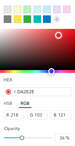
 bstifle
commented on June 1, 2024
bstifle
commented on June 1, 2024
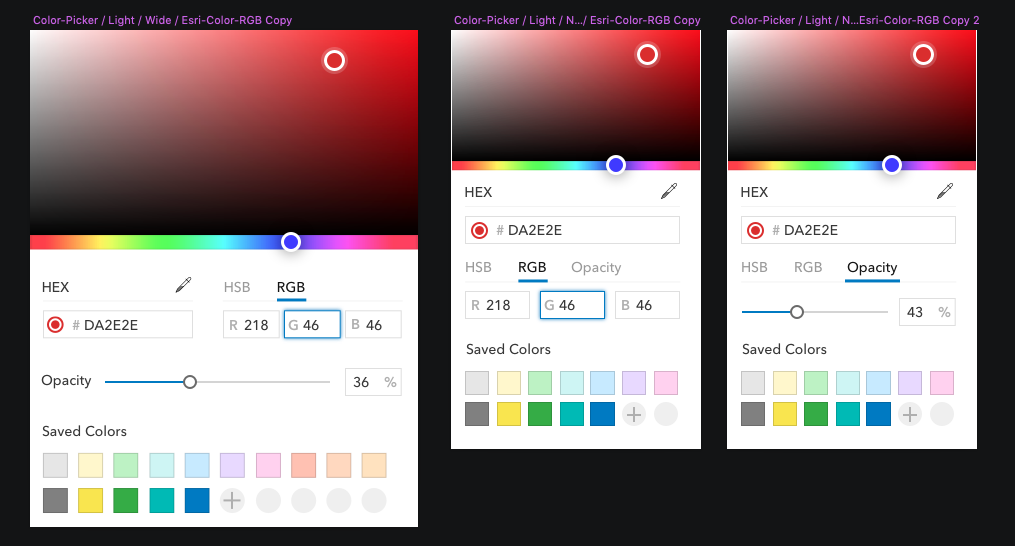
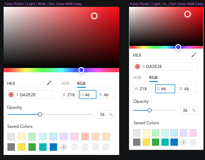
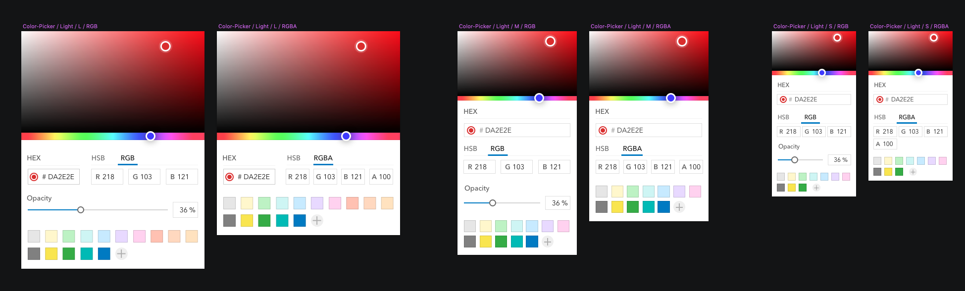
here's a design layout for opacity on the large and small pickers
from calcite-design-system.
macandcheese
commented on June 1, 2024
Feedback on above:
I think the "opacity" slider should (IMO) always be visible, if requested by a user via configuration because it can be used in combination with HSB / RGB, so weird to have it on a "sibling" tab.
Also would be nice to have opacity label in the same orientation / layout as saved colors where it's a label on top of the slider lockup.
The "tab list" should (IMO) support any combinations of "HSB / RGB / RGBA / HSLA", and if the latter two are selected, display 4 input fields for each value (with no slider).
from calcite-design-system.
bstifle
commented on June 1, 2024
from calcite-design-system.
jcfranco
commented on June 1, 2024
@julio8a BTW, the eye dropper won't be possible to implement due to security restrictions.
from calcite-design-system.
bstifle
commented on June 1, 2024
whoa really?! @jcfranco
from calcite-design-system.
bstifle
commented on June 1, 2024
Also @jcfranco what is your avatar? asking for a friend.
from calcite-design-system.
bstifle
commented on June 1, 2024
sounds good. thanks man.
from calcite-design-system.
bstifle
commented on June 1, 2024
here are the latest designs
from calcite-design-system.
bstifle
commented on June 1, 2024
are you building the component in a way that can handle rearrangements like this?:
from calcite-design-system.
jcfranco
commented on June 1, 2024
Just synced up w/ @julio8a: For the first iteration, the color picker will follow the designs that @bstifle shared (sans opacity/alpha; that'll come later).
are you building the component in a way that can handle rearrangements like this?:
This will probably be an update to the component after the first iteration.
@julio8a @mitc7862 @bstifle WRT saved colors:
- Should the amount of numbers be capped?
- How would a user delete a color? Maybe CTRL+clicking (or similar) removes items?
from calcite-design-system.
macandcheese
commented on June 1, 2024
For color swatch list.. IMO seems like we need two modes:
One is "non editable" in that a user can't add or remove them (use case - "recommended colors based on your theme", like Story maps, or, "recently used colors", etc. that an app could provide)
The other would be the saved items / "editable" type with some affordance to enter an "edit" mode where items can be deleted (maybe rearranged down the line as a follow up feature).
Random thoughts... For the editable one, not sure how discoverable ONLY having a keyboard shortcut would be vs. Something more explicit like a "pencil" icon that when clicked places a user in an editing mode where they can be deleted or rearranged like iOS apps on home screen or something (sans jiggle, lol?).
That means there would need to be a way to "save" or exit that edit that state which could be annoying and non-atomic vs.
Always allowing editing and rearranging with "long hover to display an x" or something.
from calcite-design-system.
bstifle
commented on June 1, 2024
- Should the amount of numbers be capped?
- How would a user delete a color? Maybe CTRL+clicking (or similar) removes items?
- yes 3
- my thoughts would be dragging it out to delete, or no deletions. Since we have no "save" button... i would rather just show the last x-number of colors used
from calcite-design-system.
bstifle
commented on June 1, 2024

@jcfranco @macandcheese @mitc7862 @julio8a @asangma
design idea for + / -
Also, idea for stacking instances of "provided" vs "user added" colors
from calcite-design-system.
jcfranco
commented on June 1, 2024
Nice!
In your proposed design for the +/-, does it require changing the color to delete it? If so, this may cause unintentional changes.
from calcite-design-system.
macandcheese
commented on June 1, 2024
Yes agree an app should be able to add as many "calcite-color-picker-swatch-list" or whatever it's called as they want.
How are these swatch lists created? I was under the impression it'd be up to the app to pass an array of color values that render as swatches, with a title="" attribute, and an attribute for "is-editable".
Assuming the "plus minus" example is the "is-editable" version, coupla q's
- Would "-" be disabled until a swatch is selected to remove?
- Is there a confirmation or "undo" affordance for removed items
- How does "+" work
- Is this idea that any "is-editable" swatch lists support drag and drop for re-ordering?
Use cases in my mind:
Recommended Colors - not editable, app passes an array at initial render
Saved Colors - editable, rearrangeable, app passes an array at initial render, on any update the component emits these changes for the app to... save to a user object ?
Recent Colors - not editable by a user, component updates order as colors are selected? or is this still up to the app to listen for those changes and then provide the updates back to the component?
Note - we'll eventually be able to replace the inputs with calcite-inputs which include an affordance for "prefix" which will be a nice addition.
from calcite-design-system.
bstifle
commented on June 1, 2024
yeah + should only be there if there is an RGB or hex (etc) module associated.
if no association to add colors, then only have - (if editable prop=true)
I agree - should appear disabled until a color in that menu is selected.
from calcite-design-system.
jcfranco
commented on June 1, 2024
I was under the impression it'd be up to the app to pass an array of color values that render as swatches, with a title="" attribute, and an attribute for "is-editable".
The component will support an array of color values.
Saved Colors - editable, rearrangeable, app passes an array at initial render, on any update the component emits these changes for the app to... save to a user object ?
I have saving colors working, but will wait for the final remove color design before adding it. Colors will not be rearrangeable (at least for the first release). When no storage-id is provided, users will have full control of these colors; otherwise, it's controlled by the component.
Recent Colors - not editable by a user, component updates order as colors are selected? or is this still up to the app to listen for those changes and then provide the updates back to the component?
This would be a new requirement since it's not part of the first design. cc @julio8a
Note - we'll eventually be able to replace the inputs with calcite-inputs which include an affordance for "prefix" which will be a nice addition.
Awesome! 🎉
from calcite-design-system.
macandcheese
commented on June 1, 2024
@jcfranco Cool - yes agree on "recent colors" - apps should be able to provide those updates if they want to. Maybe in the future component can handle it but, not for now for sure.
from calcite-design-system.
bstifle
commented on June 1, 2024


@jcfranco here are the latest. hopefully this doesn't screw things up too bad
also realized how i forgot to include hover states for the color swatches, see new designs
from calcite-design-system.
 rmstinson
commented on June 1, 2024
rmstinson
commented on June 1, 2024
Any thoughts or ideas on a mixed-state for the color picker input field? The direction the Charts team is taking this is to leave the input field blank, and filled back in once a change has happened on all selected elements, or just a single element is selected to display that color.
Like so:

from calcite-design-system.
bstifle
commented on June 1, 2024
@rmstinson thats one way, but my first hunch is it could look disabled
sketch does this:

illustrator:

and photoshop just shows the color of the first thing you select. (not very helpful)
from calcite-design-system.
macandcheese
commented on June 1, 2024
Hey @jcfranco - is this still in the works, or maybe close to a draft PR for someone else to pick up if need be?
from calcite-design-system.
jcfranco
commented on June 1, 2024
New calcite-color component installed! 🎉 See PR for more info.
from calcite-design-system.
paulcpederson
commented on June 1, 2024

from calcite-design-system.
Related Issues (20)
- [Navigation Logo/Navigation User] Truncate text for smaller widths, such as mobile devices
- Nested child list items are displayed briefly until component recognizes them and adds the caret and hides them
- Combobox: When you tab into the input, the options do not appear HOT 1
- Support a non-transparent state for FAB HOT 3
- Please add a way to customize the height of the CalciteSlider.
- Split Button tokens and E2E test
- [Color Picker] Adjust component's scope and color swatch sizing HOT 1
- Audit: Determine internal borders for masking inputs
- [Color Picker] Use Select in place of tabs for color channels HOT 1
- [Color Picker] Color field design improvement for values and scales HOT 1
- calcite-modal is being blocked by another element, but only in Safari HOT 2
- Consolidate storybook and component types
- [split-button] Drop down items do not fully display using Safari HOT 1
- Add support for `step` constraint to `input-date-picker`
- input-date-picker: selecting day activates previous day in certain cases HOT 1
- Build storybook interfaces using component's class
- Add `clearable` behavior to date and time picker inputs
- [Block Section] When `toggle-display` is set to `"switch"` unable to toggle
- bug(calcite-flow): visual stuttering if reduce-motion is on
- External content included in dragged list item (Safari only) HOT 3
Recommend Projects
-
 React
React
A declarative, efficient, and flexible JavaScript library for building user interfaces.
-
Vue.js
🖖 Vue.js is a progressive, incrementally-adoptable JavaScript framework for building UI on the web.
-
 Typescript
TypeScript is a superset of JavaScript that compiles to clean JavaScript output.
-
TensorFlow
An Open Source Machine Learning Framework for Everyone
-
Django
The Web framework for perfectionists with deadlines.
-
 Laravel
A PHP framework for web artisans
-
D3
Bring data to life with SVG, Canvas and HTML. 📊📈🎉
-
Recommend Topics
-
javascript
JavaScript (JS) is a lightweight interpreted programming language with first-class functions.
-
web
Some thing interesting about web. New door for the world.
-
server
A server is a program made to process requests and deliver data to clients.
-
Machine learning
Machine learning is a way of modeling and interpreting data that allows a piece of software to respond intelligently.
-
Visualization
Some thing interesting about visualization, use data art
-
Game
Some thing interesting about game, make everyone happy.
Recommend Org
-
Facebook
We are working to build community through open source technology. NB: members must have two-factor auth.
-
Microsoft
Open source projects and samples from Microsoft.
-
Google
Google ❤️ Open Source for everyone.
-
Alibaba
Alibaba Open Source for everyone
-
D3
Data-Driven Documents codes.
-
Tencent
China tencent open source team.
from calcite-design-system.